- Robert Lynn
- All Artworks
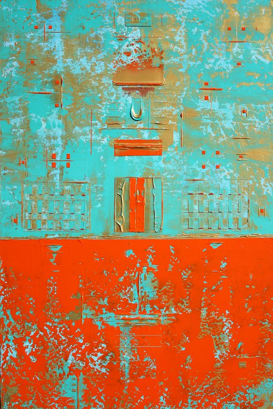
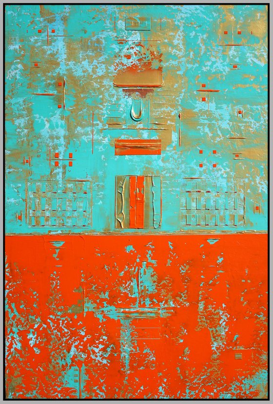
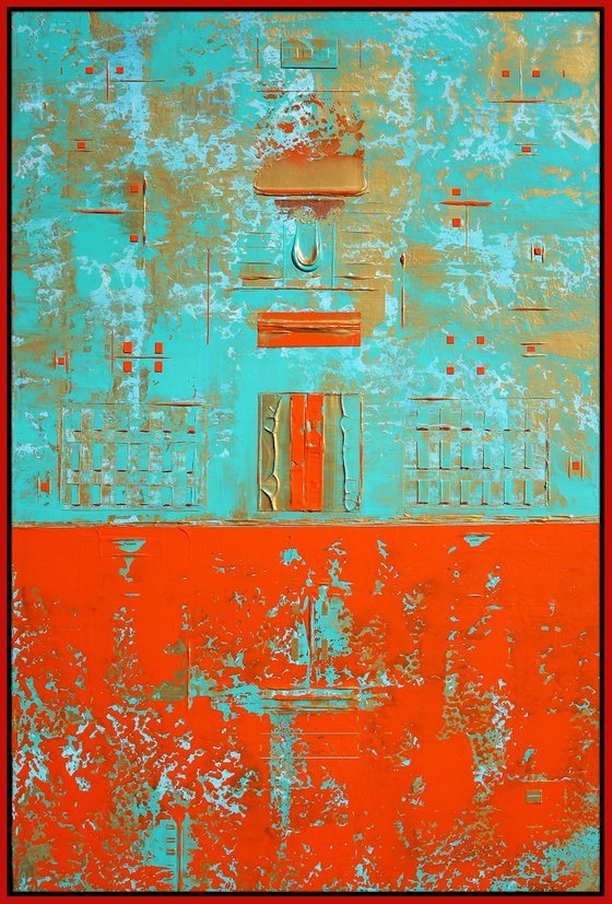
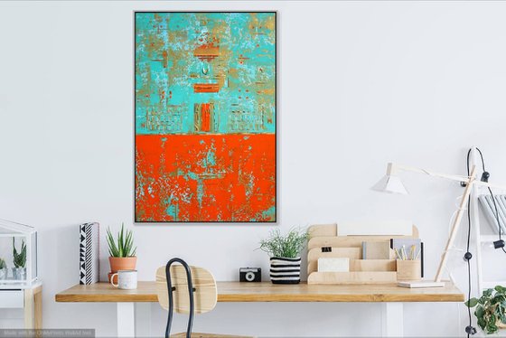
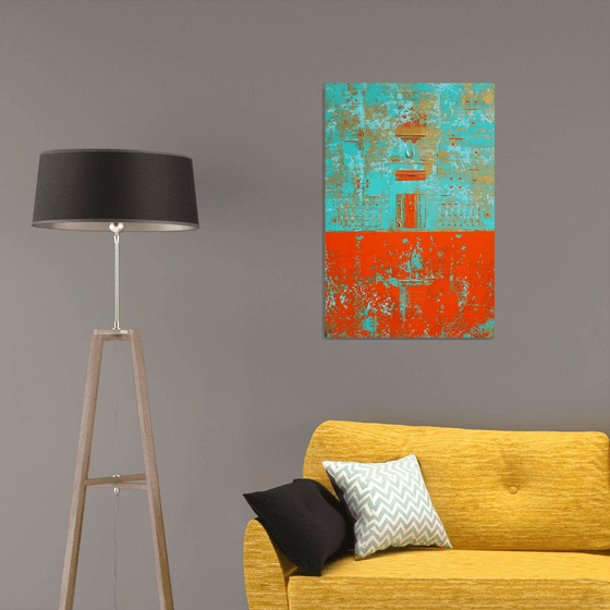
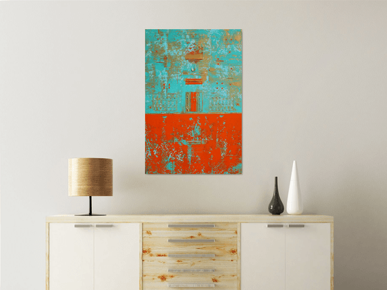
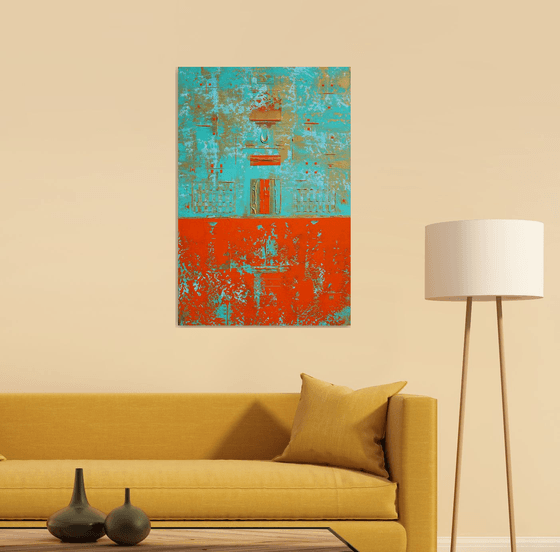
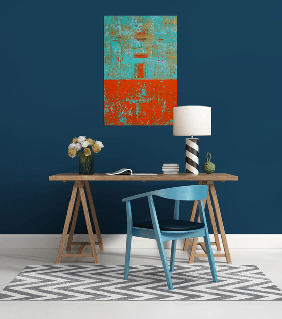
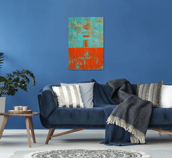
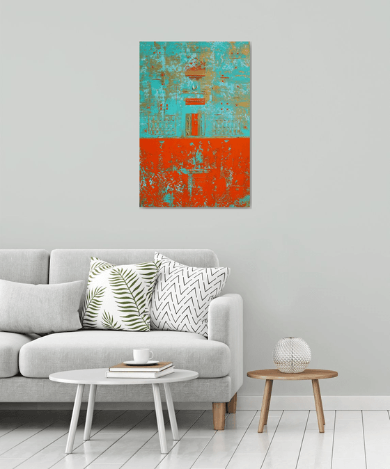
- Two Contrasts Connecting II
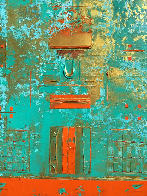
Two Contrasts Connecting II (2022) Original Acrylic Painting by Robert Lynn
60.96 x 91.44 x 3.81cm (unframed) / 60.96 x 91.44cm (actual image size)
£1,323.6Sold
Original artwork description
***Please note there is a calculated shipping price given for this painting on Artfinder. Please contact me if you are interested in this painting so I can see if I am able to offer a better shipping price. Everything depends on your location as well. Shipping costs for paintings have gone up in the past few months. I will do the best I can for you.
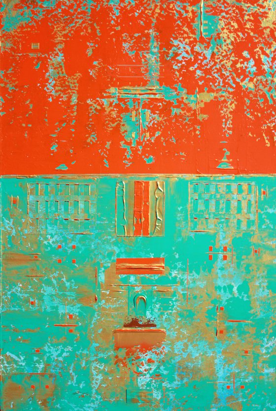
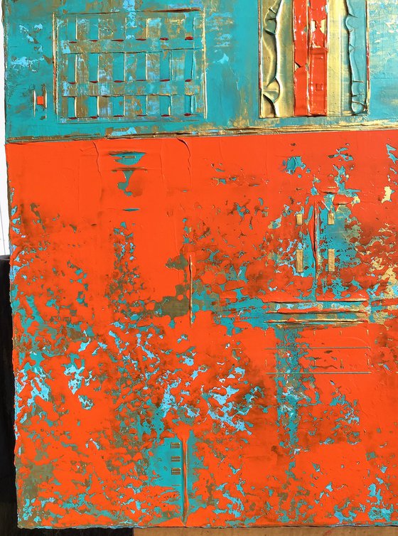
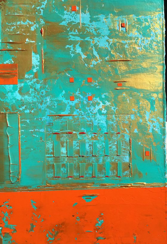
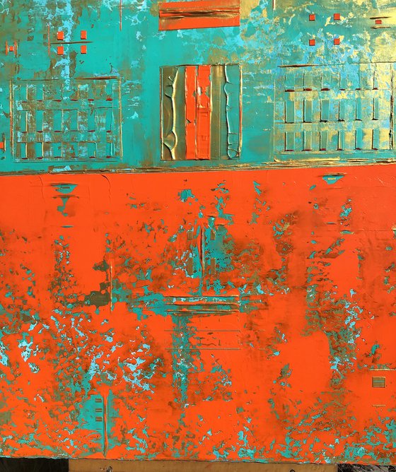
Feb. 1, 2022 (Unframed) Textured Abstract Acrylic Painting. Use of Gallery Wrapped Cotton Canvas 24 x 36 x 1.5. (17 Layers & 3 additional top layers) I like building my canvases with layers of paint. There is a richness by doing this for my paintings. I like using palette knives to blend the colors & to create my unique patterns. As well, I like my main layers to show depth. I have specific colors I have used for this Abstract Painting with the 2 Contrasting designs. For the Orange Contrast section, I have used Cadmium Orange & the Bright Aqua Green as the main colors with Gold accented lines and patterns & there is a touch of Copper in this section. With the 2nd Contrast section of this painting, I have used the Bright Aqua Green, Lite Blue, & Gold to be the main colors. I have used touches of Red & a touch of Copper color in this section. I have created unique Lines and Squares & Patterns with both sections. Giving both sections a relationship and a dimensional scope.
For me, the Contrasts enhance the painting appearance. There is also a Primitive aspect & feeling to this painting. I like using this Primitive aspect in many of my paitnings. The Viewers eye might see something totally different than what I do. I have only used my palette knives to create this painting. There are 2 Vertical hangings on the backside and 2 Horizontal hangings on the backside. Felt pads on 4 corners to protect the wall. Golden Professional Archival Gloss Varnish Spray has been applied to protect the painting. Certificate of Authenticity included 1/1.
Lighting will be important for this painting or any other painting to bring out the brilliance of the colors. Overhead lighting/Spot Lighting/and/Indirect Lighting from a window are the best forms of lighting. If you do not have the proper lighting-this painting or any painting can look "dull". Also, be aware of Wall/Paint colors with paintings. Some darker wall colors can make a painting look dull or not interesting as well. So, be aware when you purchase a painting and the placing of the painting. Always play around with lighting and wall colors for paintings in different locations.
^^^^^^Please Note-I have taken my photos with my Apple iPad & Canon Rebel. The colors on the painting are true to color the best I could take with the Apple iPad & Canon Rebel. I always have the painting next to me when posting my painting photos to make sure the colors are exact or 99%. I took these photos early in the Afternoon Sun.
***Note: I base my pricing on amount of Time to create the painting, Art Supplies used, Amount of paint used, and Artfinder's % which is important since they are promoting my artwork.
Materials used:
Professional Arcylics applied with Palette Knives. Painted on Gallery Wrapped Cotton Canvas. Coated with Golden Professional Gloss Varnish.
Details:
- Acrylic painting on Canvas
- One of a kind artwork
- Size: 60.96 x 91.44 x 3.81cm (unframed) / 60.96 x 91.44cm (actual image size)
- Ready to hang
- Signed on the back
- Style: Abstract
- Subject: Abstract and non-figurative
14 day money back guaranteeLearn more
Original artwork description
***Please note there is a calculated shipping price given for this painting on Artfinder. Please contact me if you are interested in this painting so I can see if I am able to offer a better shipping price. Everything depends on your location as well. Shipping costs for paintings have gone up in the past few months. I will do the best I can for you.
Feb. 1, 2022 (Unframed) Textured Abstract Acrylic Painting. Use of Gallery Wrapped Cotton Canvas 24 x 36 x 1.5. (17 Layers & 3 additional top layers) I like building my canvases with layers of paint. There is a richness by doing this for my paintings. I like using palette knives to blend the colors & to create my unique patterns. As well, I like my main layers to show depth. I have specific colors I have used for this Abstract Painting with the 2 Contrasting designs. For the Orange Contrast section, I have used Cadmium Orange & the Bright Aqua Green as the main colors with Gold accented lines and patterns & there is a touch of Copper in this section. With the 2nd Contrast section of this painting, I have used the Bright Aqua Green, Lite Blue, & Gold to be the main colors. I have used touches of Red & a touch of Copper color in this section. I have created unique Lines and Squares & Patterns with both sections. Giving both sections a relationship and a dimensional scope.
For me, the Contrasts enhance the painting appearance. There is also a Primitive aspect & feeling to this painting. I like using this Primitive aspect in many of my paitnings. The Viewers eye might see something totally different than what I do. I have only used my palette knives to create this painting. There are 2 Vertical hangings on the backside and 2 Horizontal hangings on the backside. Felt pads on 4 corners to protect the wall. Golden Professional Archival Gloss Varnish Spray has been applied to protect the painting. Certificate of Authenticity included 1/1.
Lighting will be important for this painting or any other painting to bring out the brilliance of the colors. Overhead lighting/Spot Lighting/and/Indirect Lighting from a window are the best forms of lighting. If you do not have the proper lighting-this painting or any painting can look "dull". Also, be aware of Wall/Paint colors with paintings. Some darker wall colors can make a painting look dull or not interesting as well. So, be aware when you purchase a painting and the placing of the painting. Always play around with lighting and wall colors for paintings in different locations.
^^^^^^Please Note-I have taken my photos with my Apple iPad & Canon Rebel. The colors on the painting are true to color the best I could take with the Apple iPad & Canon Rebel. I always have the painting next to me when posting my painting photos to make sure the colors are exact or 99%. I took these photos early in the Afternoon Sun.
***Note: I base my pricing on amount of Time to create the painting, Art Supplies used, Amount of paint used, and Artfinder's % which is important since they are promoting my artwork.
Materials used:
Professional Arcylics applied with Palette Knives. Painted on Gallery Wrapped Cotton Canvas. Coated with Golden Professional Gloss Varnish.
Details:
- Acrylic painting on Canvas
- One of a kind artwork
- Size: 60.96 x 91.44 x 3.81cm (unframed) / 60.96 x 91.44cm (actual image size)
- Ready to hang
- Signed on the back
- Style: Abstract
- Subject: Abstract and non-figurative

Robert Lynn
United States
About
-Personal Information and Bio and Artist Statement for Artist Robert K. Lynn-
Robert is originally from Iowa. He relocated to Reno, Nevada in 2011 from Sarasota, Florida. He recently has moved... Read more