- Robert Lynn
- All Artworks
- Two Contrasts Connecting
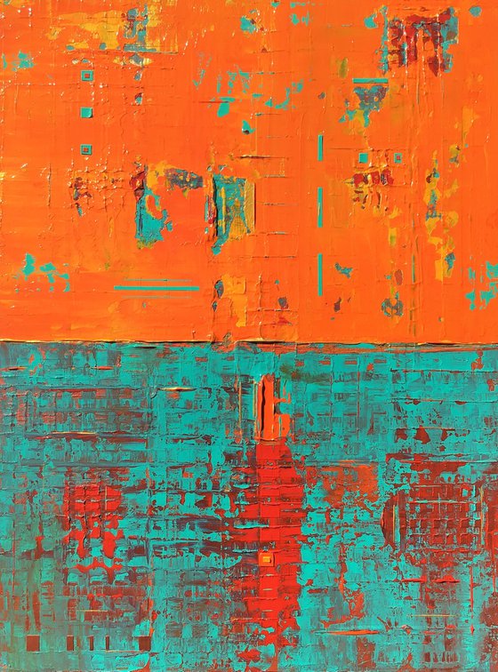

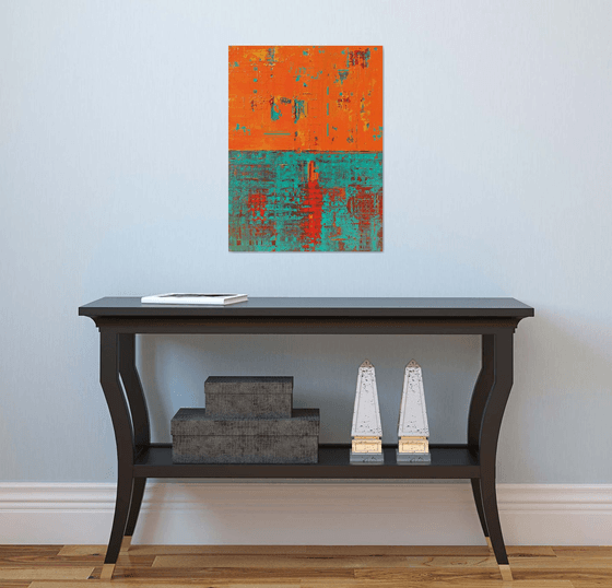
Two Contrasts Connecting (2021) Original Acrylic Painting by Robert Lynn
45.72 x 60.96 x 3.81cm (unframed) / 45.72 x 60.96cm (actual image size)
£442.46Sold
Original artwork description
***Please note there is a calculated shipping price given for this painting on Artfinder. Please contact me if you are interested in this painting so I can see if I am able to offer a better shipping price. Everything depends on your location as well. Shipping costs for paintings have gone up in the past few months. I will do the best I can for you.
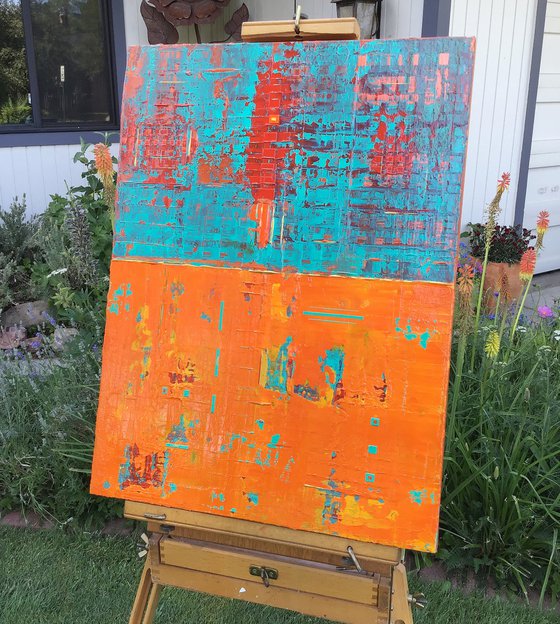
June 2021 (Unframed) Textured Abstract Acrylic Painting. Use of Gallery Wrapped Cotton Canvas 18 x 24 x 1.5. (12 Layers & 3 additional top layers) I like building my canvases with layers of paint. There is a richness by doing this for my paintings. I like using palette knives to blend the colors & to create patterns. I have been able to create several layers with patterns below the main 3 layers to show through with the different textures with this painting. I have several colors I have used for this Abstract Painting with the 2 Contrasting designs. For the Orange Contrast section the main focus is on the 2 shades of Orange. There is also a Yellow Orange shade I have used which shows up in the Orange Contrast section. I have used hits of Red, Bright Aqua Green, and Gold with palette strokes. I have also created small Bright Aqua Green Lines and Squares giving the Orange Contrast more surface dimension.
I have created the 2nd half of the painting focusing on Bright Aqua Green, Red, and Copper Colors. While blending the Bright Aqua Green with the Copper Color it has given the Bright Aqua Green a more subtle feeling. There is almost a 3 dimensional feel to the Bright Aqua Green, Red, and Copper with the under lying box patterns I created. I also focused on loose line patterns with the Orange and Bright Aqua Green. I have also create additional small box shapes & lines with the the Bright Aqua Green. I purposely created 1 Orange Box to stand out and added an additional small Yellow Orange box to connect to the Orange Contract section. For me, this enhanced the painting appearance. Again, I wanted to give this painting a primitive feeling with the Two Contrasts. The Viewers eye might see something totally different. I have only used my palette knives to create this painting. There are 2 Vertical hangings on the backside and 2 Horizontal hangings on the backside. Felt pads on 4 corners to protect the wall. Golden Professional Archival Gloss Varnish Spray has been applied to protect the painting. Certificate of Authenticity included 1/1.
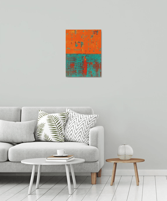
Lighting will be important for this painting or any other painting to bring out the brilliance of the colors. Overhead lighting/Spot Lighting/and/Indirect Lighting from a window are the best forms of lighting. If you do not have the proper lighting-this painting or any painting can look "dull". Also, be aware of Wall/Paint colors with paintings. Some darker wall colors can make a painting look dull or not interesting as well. So, be aware when you purchase a painting and the placing of the painting. Always play around with lighting and wall colors for paintings in different locations.
^^^^^^Please Note-I have taken my photos with my Apple iPad. The colors on the painting are true to color the best I could take with the Apple iPad. I always have the painting next to me when posting my painting photos to make sure the colors are exact or 99%. I took these photos late in the Afternoon Sun around 4ish pm.
***Note: I base my pricing on amount of Time to create the painting, Art Supplies used, Amount of paint used, and Artfinder's % which is important since they are promoting my artwork.
Materials used:
Professional Arcylics applied with Palette Knives. Painted on Gallery Wrapped Cotton Canvas. Coated with Golden Professional Gloss Varnish.
Details:
- Acrylic painting on Canvas
- One of a kind artwork
- Size: 45.72 x 60.96 x 3.81cm (unframed) / 45.72 x 60.96cm (actual image size)
- Ready to hang
- Signed on the back
- Style: Abstract
- Subject: Abstract and non-figurative
14 day money back guaranteeLearn more
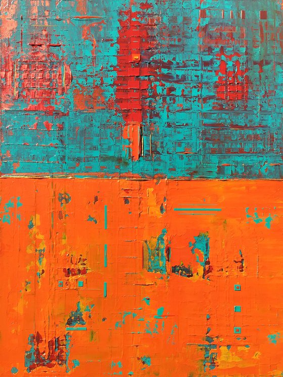
Original artwork description
***Please note there is a calculated shipping price given for this painting on Artfinder. Please contact me if you are interested in this painting so I can see if I am able to offer a better shipping price. Everything depends on your location as well. Shipping costs for paintings have gone up in the past few months. I will do the best I can for you.
June 2021 (Unframed) Textured Abstract Acrylic Painting. Use of Gallery Wrapped Cotton Canvas 18 x 24 x 1.5. (12 Layers & 3 additional top layers) I like building my canvases with layers of paint. There is a richness by doing this for my paintings. I like using palette knives to blend the colors & to create patterns. I have been able to create several layers with patterns below the main 3 layers to show through with the different textures with this painting. I have several colors I have used for this Abstract Painting with the 2 Contrasting designs. For the Orange Contrast section the main focus is on the 2 shades of Orange. There is also a Yellow Orange shade I have used which shows up in the Orange Contrast section. I have used hits of Red, Bright Aqua Green, and Gold with palette strokes. I have also created small Bright Aqua Green Lines and Squares giving the Orange Contrast more surface dimension.
I have created the 2nd half of the painting focusing on Bright Aqua Green, Red, and Copper Colors. While blending the Bright Aqua Green with the Copper Color it has given the Bright Aqua Green a more subtle feeling. There is almost a 3 dimensional feel to the Bright Aqua Green, Red, and Copper with the under lying box patterns I created. I also focused on loose line patterns with the Orange and Bright Aqua Green. I have also create additional small box shapes & lines with the the Bright Aqua Green. I purposely created 1 Orange Box to stand out and added an additional small Yellow Orange box to connect to the Orange Contract section. For me, this enhanced the painting appearance. Again, I wanted to give this painting a primitive feeling with the Two Contrasts. The Viewers eye might see something totally different. I have only used my palette knives to create this painting. There are 2 Vertical hangings on the backside and 2 Horizontal hangings on the backside. Felt pads on 4 corners to protect the wall. Golden Professional Archival Gloss Varnish Spray has been applied to protect the painting. Certificate of Authenticity included 1/1.
Lighting will be important for this painting or any other painting to bring out the brilliance of the colors. Overhead lighting/Spot Lighting/and/Indirect Lighting from a window are the best forms of lighting. If you do not have the proper lighting-this painting or any painting can look "dull". Also, be aware of Wall/Paint colors with paintings. Some darker wall colors can make a painting look dull or not interesting as well. So, be aware when you purchase a painting and the placing of the painting. Always play around with lighting and wall colors for paintings in different locations.
^^^^^^Please Note-I have taken my photos with my Apple iPad. The colors on the painting are true to color the best I could take with the Apple iPad. I always have the painting next to me when posting my painting photos to make sure the colors are exact or 99%. I took these photos late in the Afternoon Sun around 4ish pm.
***Note: I base my pricing on amount of Time to create the painting, Art Supplies used, Amount of paint used, and Artfinder's % which is important since they are promoting my artwork.
Materials used:
Professional Arcylics applied with Palette Knives. Painted on Gallery Wrapped Cotton Canvas. Coated with Golden Professional Gloss Varnish.
Details:
- Acrylic painting on Canvas
- One of a kind artwork
- Size: 45.72 x 60.96 x 3.81cm (unframed) / 45.72 x 60.96cm (actual image size)
- Ready to hang
- Signed on the back
- Style: Abstract
- Subject: Abstract and non-figurative
Robert Lynn
United States
About
-Personal Information and Bio and Artist Statement for Artist Robert K. Lynn-
Robert is originally from Iowa. He relocated to Reno, Nevada in 2011 from Sarasota, Florida. He recently has moved... Read more