- V+V Kniazievi
- All Artworks
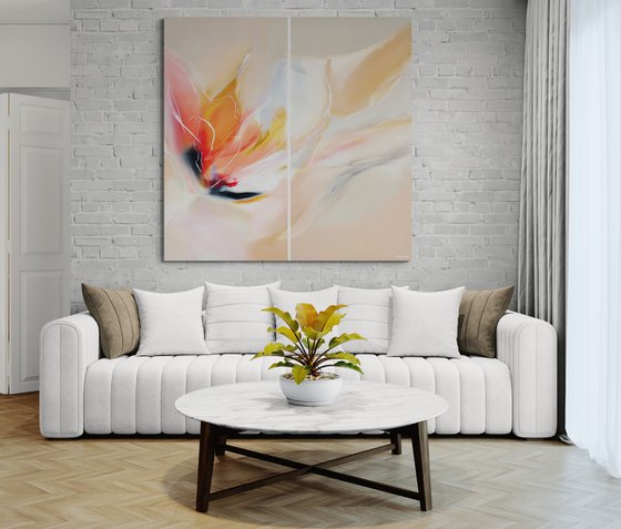
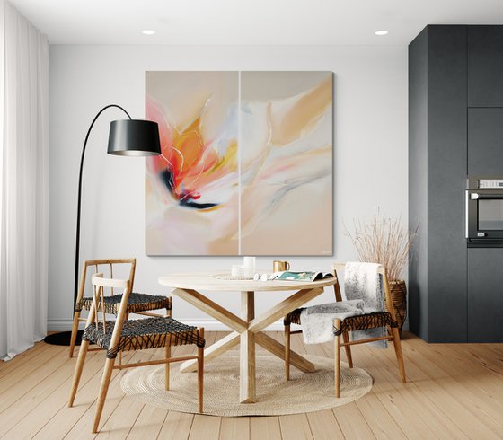
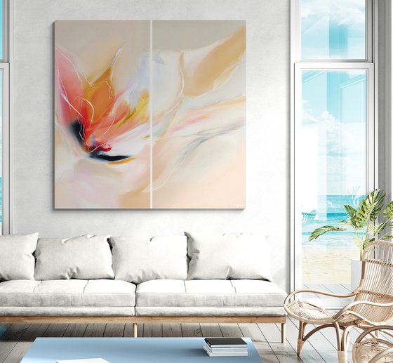
- Fragile Harmony #4
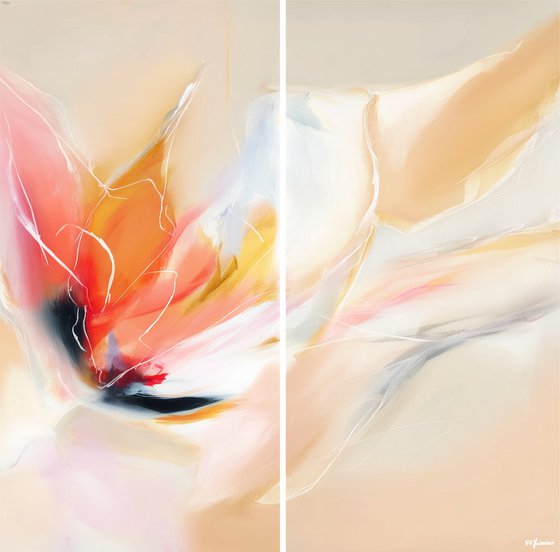
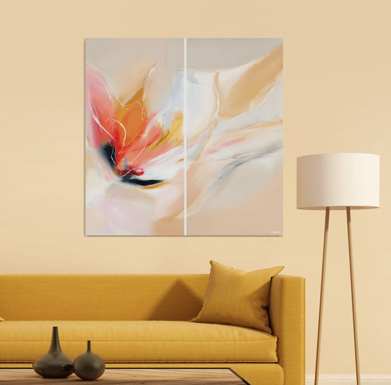
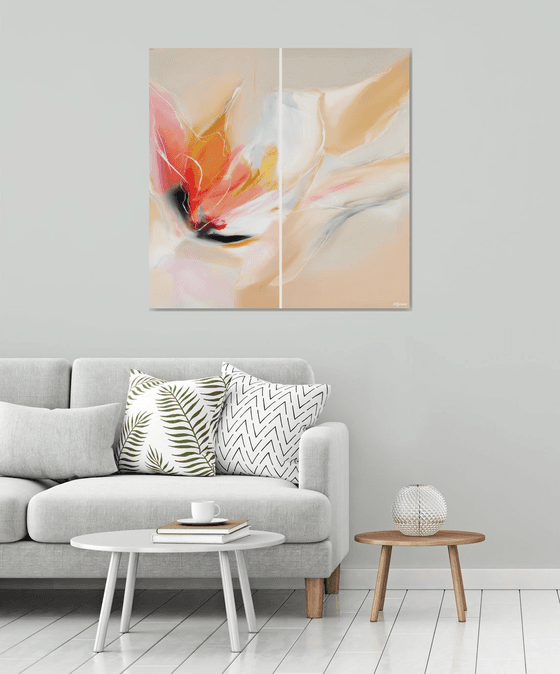
Fragile Harmony #4 (2026) Original Mixed-media Painting by V+V Kniazievi
100 x 100 x 2cm / 100 x 100cm (actual image size)
£1,081.76
Original artwork description
Fragile Harmony was born from the quiet tension between strength and vulnerability. The series explores the delicate balance that exists in moments of emotional transition — where softness meets intensity, and light gently interrupts shadow. These works are inspired by fleeting states: a warm breath on cool air, the last glow of sunset dissolving into dusk, the fragile calm before transformation.
The paintings capture that subtle in-between space — not chaos, not silence — but something tender and alive.
Style & Artistic Language
The series blends elements of Abstract Expressionism, Lyrical Abstraction, and subtle influences of Impressionism.
From Abstract Expressionism, it carries emotional immediacy and expressive, intuitive brushwork.
From Impressionism, it borrows sensitivity to light, atmosphere, and fleeting sensation rather than defined form.
The fluidity and transparency of certain layers echo Color Field painting, where color itself becomes the subject.
The style is gestural yet restrained — expressive but never aggressive. Each stroke feels intentional, yet free.
Color Palette (Detailed Description)
The palette is built around a dialogue between warmth and softness:
Warm spectrum: glowing coral, translucent peach, muted rose, luminous golden yellow, and subtle amber. These tones evoke warmth, intimacy, and emotional openness.
Soft neutrals: creamy ivory, warm beige, pale sand, and diffused off-white create breathing space within the composition.
Cool counterpoints: smoky blue, muted slate, soft gray, and hints of deep navy provide grounding and contrast.
Accents: occasional deeper notes of charcoal or inky black anchor the composition and prevent it from dissolving entirely into light.
The warm colors seem to bloom outward, while the cool tones act as shadows of memory — quiet, stabilizing, contemplative. The transitions are not abrupt; they dissolve into each other through layered glazing and softened edges.
The overall atmosphere feels luminous yet airy — as if light is filtering through silk.
Brushwork & Texture
The brushstrokes are expressive yet controlled:
Broad, fluid strokes create movement and emotional flow.
Thin linear marks introduce fragility and tension — almost like whispered lines drawn in air.
Layered translucent washes build depth without heaviness.
Some edges are softened and blended, while others remain deliberately raw, exposing the gesture of the hand.
Texture plays a subtle role — visible but never overpowering. The surface invites close viewing, revealing quiet complexity beneath apparent simplicity.
Emotional Atmosphere
This series speaks in a quiet voice.
It does not demand attention — it invites it.
It is about balance:
Light and shadow.
Movement and stillness.
Strength and tenderness.
Fragile Harmony suggests that vulnerability is not weakness — it is refinement. It is the moment when emotion becomes light.
Materials used:
Acrylic paint, spray, oil pastel, impasto, linen canvas, mixed media.
Details:
- Mixed-media painting on Canvas
- One of a kind artwork
- Size: 100 x 100 x 2cm / 100 x 100cm (actual image size)
- Ready to hang
- Signed on the front
- Style: Organic
- Subject: Abstract and non-figurative
Tags:
#extra large#statement piece#modern landscape#blue orange#expressive art#bright abstract#modern contemporary#gestural abstraction#muted palette#floral abstraction#square abstraction#soft abstraction#warm abstraction#square 100*100#peach coral14 day money back guaranteeLearn more
Original artwork description
Fragile Harmony was born from the quiet tension between strength and vulnerability. The series explores the delicate balance that exists in moments of emotional transition — where softness meets intensity, and light gently interrupts shadow. These works are inspired by fleeting states: a warm breath on cool air, the last glow of sunset dissolving into dusk, the fragile calm before transformation.
The paintings capture that subtle in-between space — not chaos, not silence — but something tender and alive.
Style & Artistic Language
The series blends elements of Abstract Expressionism, Lyrical Abstraction, and subtle influences of Impressionism.
From Abstract Expressionism, it carries emotional immediacy and expressive, intuitive brushwork.
From Impressionism, it borrows sensitivity to light, atmosphere, and fleeting sensation rather than defined form.
The fluidity and transparency of certain layers echo Color Field painting, where color itself becomes the subject.
The style is gestural yet restrained — expressive but never aggressive. Each stroke feels intentional, yet free.
Color Palette (Detailed Description)
The palette is built around a dialogue between warmth and softness:
Warm spectrum: glowing coral, translucent peach, muted rose, luminous golden yellow, and subtle amber. These tones evoke warmth, intimacy, and emotional openness.
Soft neutrals: creamy ivory, warm beige, pale sand, and diffused off-white create breathing space within the composition.
Cool counterpoints: smoky blue, muted slate, soft gray, and hints of deep navy provide grounding and contrast.
Accents: occasional deeper notes of charcoal or inky black anchor the composition and prevent it from dissolving entirely into light.
The warm colors seem to bloom outward, while the cool tones act as shadows of memory — quiet, stabilizing, contemplative. The transitions are not abrupt; they dissolve into each other through layered glazing and softened edges.
The overall atmosphere feels luminous yet airy — as if light is filtering through silk.
Brushwork & Texture
The brushstrokes are expressive yet controlled:
Broad, fluid strokes create movement and emotional flow.
Thin linear marks introduce fragility and tension — almost like whispered lines drawn in air.
Layered translucent washes build depth without heaviness.
Some edges are softened and blended, while others remain deliberately raw, exposing the gesture of the hand.
Texture plays a subtle role — visible but never overpowering. The surface invites close viewing, revealing quiet complexity beneath apparent simplicity.
Emotional Atmosphere
This series speaks in a quiet voice.
It does not demand attention — it invites it.
It is about balance:
Light and shadow.
Movement and stillness.
Strength and tenderness.
Fragile Harmony suggests that vulnerability is not weakness — it is refinement. It is the moment when emotion becomes light.
Materials used:
Acrylic paint, spray, oil pastel, impasto, linen canvas, mixed media.
Details:
- Mixed-media painting on Canvas
- One of a kind artwork
- Size: 100 x 100 x 2cm / 100 x 100cm (actual image size)
- Ready to hang
- Signed on the front
- Style: Organic
- Subject: Abstract and non-figurative
Tags:
#extra large#statement piece#modern landscape#blue orange#expressive art#bright abstract#modern contemporary#gestural abstraction#muted palette#floral abstraction#square abstraction#soft abstraction#warm abstraction#square 100*100#peach coral
V+V Kniazievi
Spain
About
"Art is like life, art helps us to release our feelings and emotions, sometimes it seems that you are not breathing when you create some new work". V+V Kniazievi is... Read more