- Corné Akkers
- All Artworks
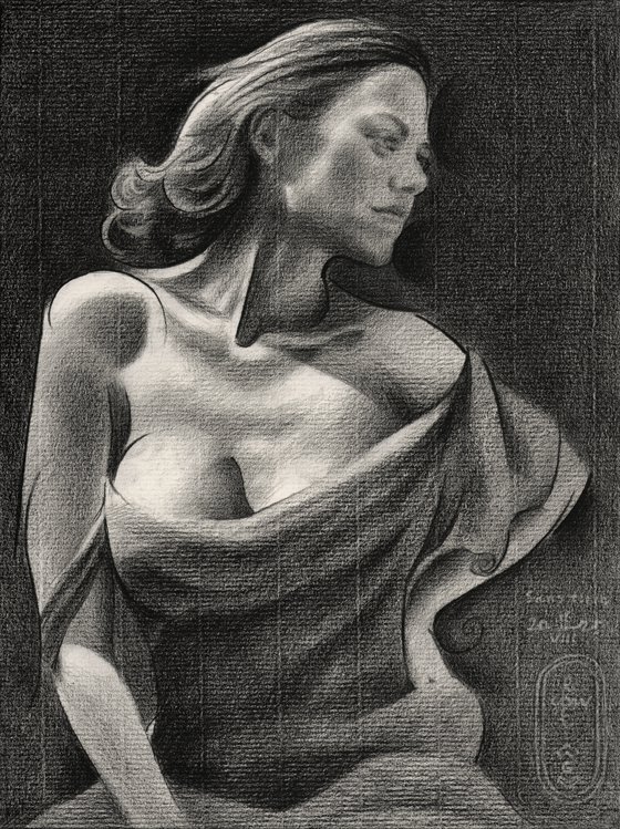
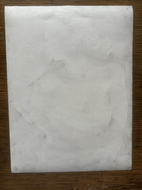
- Sans Titre – 16-08-25
Original artwork description
A Mixture of Styles
This graphite pencil drawing ‘Sans Titre – 16-08-25’ depicts french actress Marion Cotillard. Captured in a mixture of cubism, impressionism and art deco. Strange how something turns out to become. Initially I had it in me to apply some more cubist styling such as in my Veronica Lake sketch. However, I simply loved the play of chiaroscuro light and dark too much. There was this beautiful photo of MS Cotillard I was inspired by. Unfortunately the picture didn’t state the photographer. The position I thought I could improve a bit though. You see, I wanted to have her lean over more towards the right. AI is getting smarter day by day and I thought I’d run the photo through it. Not the first time since I did that a couple of times before. Last time was a new Geesje Kwak back in May of this year.
Clean Lines and Soft Gradients
The flowery dress wasn’t my first choice as well. Patterns like that are a bit too restless for my taste and I very much wanted to abstract a lot. Therefor I decided to depict her in an opaque looking dress. AI even got most of the shadows right this time, even though changing the position of body. The fun part was to both cubist style her as well asto create a rather realist / impressionist look. All in all, I must say I’m quite surprized by the result. The power lines I drew support parts containing much softer tonal gradients such as facial features. The Fabriano Ingres paper proved itself perfect for the job. It’s grainy but rather sturdy. Unlike the fluffy Hahnemühle variety it allows drawing straight and harsh lines into the paper without damaging it.
Graphite pencil (Faber Castell Pitt Graphite Matt pencil 14B) drawing on Fabriano Ingres paper (21 x 28.2 x 0.1 cm)
Artist: Corné Akkers
Materials used:
Graphite pencil (Faber Castell Pitt Graphite Matt pencil 14B) drawing on Fabriano Ingres paper (21 x 28.2 x 0.1 cm)
Details:
- Pencil drawing on Paper
- One of a kind artwork
- Size: 21 x 28.2 x 0.1cm (unframed) / 21 x 28.2cm (actual image size)
- Signed on the front
- Style: Geometric
- Subject: People and portraits
Tags:
#impressionism#cubism#celebrity#art deco#marion cotillard14 day money back guaranteeLearn more
Original artwork description
A Mixture of Styles
This graphite pencil drawing ‘Sans Titre – 16-08-25’ depicts french actress Marion Cotillard. Captured in a mixture of cubism, impressionism and art deco. Strange how something turns out to become. Initially I had it in me to apply some more cubist styling such as in my Veronica Lake sketch. However, I simply loved the play of chiaroscuro light and dark too much. There was this beautiful photo of MS Cotillard I was inspired by. Unfortunately the picture didn’t state the photographer. The position I thought I could improve a bit though. You see, I wanted to have her lean over more towards the right. AI is getting smarter day by day and I thought I’d run the photo through it. Not the first time since I did that a couple of times before. Last time was a new Geesje Kwak back in May of this year.
Clean Lines and Soft Gradients
The flowery dress wasn’t my first choice as well. Patterns like that are a bit too restless for my taste and I very much wanted to abstract a lot. Therefor I decided to depict her in an opaque looking dress. AI even got most of the shadows right this time, even though changing the position of body. The fun part was to both cubist style her as well asto create a rather realist / impressionist look. All in all, I must say I’m quite surprized by the result. The power lines I drew support parts containing much softer tonal gradients such as facial features. The Fabriano Ingres paper proved itself perfect for the job. It’s grainy but rather sturdy. Unlike the fluffy Hahnemühle variety it allows drawing straight and harsh lines into the paper without damaging it.
Graphite pencil (Faber Castell Pitt Graphite Matt pencil 14B) drawing on Fabriano Ingres paper (21 x 28.2 x 0.1 cm)
Artist: Corné Akkers
Materials used:
Graphite pencil (Faber Castell Pitt Graphite Matt pencil 14B) drawing on Fabriano Ingres paper (21 x 28.2 x 0.1 cm)
Details:
- Pencil drawing on Paper
- One of a kind artwork
- Size: 21 x 28.2 x 0.1cm (unframed) / 21 x 28.2cm (actual image size)
- Signed on the front
- Style: Geometric
- Subject: People and portraits
Tags:
#impressionism#cubism#celebrity#art deco#marion cotillard
Corné Akkers
Netherlands
About
Born in 1969 at Nijmegen. Corné's work can be seen in many countries all over the world.
Corné employs a variety of styles that all have one thing in common:... Read more