- Corné Akkers
- All Artworks
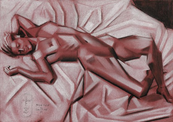
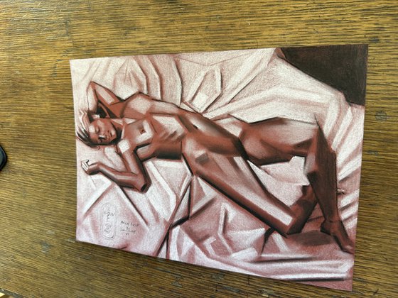
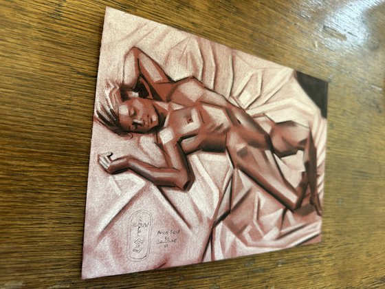
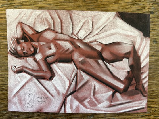
- Neo Deco - 24-06-25
Original artwork description
Terra Cotta Paper
This pastel drawing ‘Neo Deco – 30-06-25’ is a test of Terra Cotta paper I bought. Made by Clairfontaine it matches other sorts of paper I already own such as the ‘Noir’ type. It must have been a long time ago since I used this colour. Frankly, I can’t remember when. The color itself reminds me of old master drawings made with sanguine chalks. However, these are made on whitish or cream paper. I thought it would be fun to reverse this and use whites and blacks on colored paper. See what happens. As already explained in the past I must be the Imelda Marcos of paper sorts. So this is a nice addition.
Stumping Things Smoothly
Estimating the paper I thought it would be wise to use pastel rather than colored pencils. The paper is rather dark and I feared white colored pencils simply wouldn’t cover the dark texture enough. The result would be a weak pinkish apparance. White pastel pencil would cover more. Well, this proved to be not entirely true. Turns out the paper holds no big quantities of pigment so it falls right off when applied. Then I remembered a previous pastel drawing, called ‘Neo Deco – 12-01-25’ I made earlier this year. Even though this proved to be a handicap there still were plenty of possibilities to turn it into a success. Just using my stumper to smooth things out, not covering white parts entirely. Consequently, the red is still shimmering through and that’s only a good thing. Harmony between all colors is guaranteed by this, connected by the common reddish sanguine.
Assia
The reason for this work of art is the work of photographer Emmanuel Sougez. In 1936 he took pictures model Assia Granatouroff, a model not unknown to me. One inspired me to abstract it and I decided not to strive for a likeness. Instead, change the position a bit and turn it into my kind of art deco-ish cubism. Trying to capture sheet folds easily is easier said than done. They can all too quickly take on the appearance of ice floes. This is a risk I faced before such as during painting Foetus (2004) when I was a younger man still. Cubist folds even increase this risk but I’m not worried though. Looking back at the completion of this one I see stumping out those whites and blacks was a good decision. Those folds are soft enough alright, even though squarish.
Pastel drawing on Clairefontaine Paint On Mix Media Terra Cotta paper (29.7 x 21 x 0.1 cm)
Artist: Corné Akkers
Materials used:
Pastel drawing on Clairefontaine Paint On Mix Media Terra Cotta paper (29.7 x 21 x 0.1 cm)
Details:
- Pencil drawing on Paper
- One of a kind artwork
- Size: 29.7 x 21 x 0.1cm (unframed) / 29.7 x 21cm (actual image size)
- Signed on the front
- Style: Geometric
- Subject: Nudes and erotic
Tags:
#chiaroscuro#monochrome#cubism#art deco#clairobscur14 day money back guaranteeLearn more
Original artwork description
Terra Cotta Paper
This pastel drawing ‘Neo Deco – 30-06-25’ is a test of Terra Cotta paper I bought. Made by Clairfontaine it matches other sorts of paper I already own such as the ‘Noir’ type. It must have been a long time ago since I used this colour. Frankly, I can’t remember when. The color itself reminds me of old master drawings made with sanguine chalks. However, these are made on whitish or cream paper. I thought it would be fun to reverse this and use whites and blacks on colored paper. See what happens. As already explained in the past I must be the Imelda Marcos of paper sorts. So this is a nice addition.
Stumping Things Smoothly
Estimating the paper I thought it would be wise to use pastel rather than colored pencils. The paper is rather dark and I feared white colored pencils simply wouldn’t cover the dark texture enough. The result would be a weak pinkish apparance. White pastel pencil would cover more. Well, this proved to be not entirely true. Turns out the paper holds no big quantities of pigment so it falls right off when applied. Then I remembered a previous pastel drawing, called ‘Neo Deco – 12-01-25’ I made earlier this year. Even though this proved to be a handicap there still were plenty of possibilities to turn it into a success. Just using my stumper to smooth things out, not covering white parts entirely. Consequently, the red is still shimmering through and that’s only a good thing. Harmony between all colors is guaranteed by this, connected by the common reddish sanguine.
Assia
The reason for this work of art is the work of photographer Emmanuel Sougez. In 1936 he took pictures model Assia Granatouroff, a model not unknown to me. One inspired me to abstract it and I decided not to strive for a likeness. Instead, change the position a bit and turn it into my kind of art deco-ish cubism. Trying to capture sheet folds easily is easier said than done. They can all too quickly take on the appearance of ice floes. This is a risk I faced before such as during painting Foetus (2004) when I was a younger man still. Cubist folds even increase this risk but I’m not worried though. Looking back at the completion of this one I see stumping out those whites and blacks was a good decision. Those folds are soft enough alright, even though squarish.
Pastel drawing on Clairefontaine Paint On Mix Media Terra Cotta paper (29.7 x 21 x 0.1 cm)
Artist: Corné Akkers
Materials used:
Pastel drawing on Clairefontaine Paint On Mix Media Terra Cotta paper (29.7 x 21 x 0.1 cm)
Details:
- Pencil drawing on Paper
- One of a kind artwork
- Size: 29.7 x 21 x 0.1cm (unframed) / 29.7 x 21cm (actual image size)
- Signed on the front
- Style: Geometric
- Subject: Nudes and erotic
Tags:
#chiaroscuro#monochrome#cubism#art deco#clairobscur
Corné Akkers
Netherlands
About
Born in 1969 at Nijmegen. Corné's work can be seen in many countries all over the world.
Corné employs a variety of styles that all have one thing in common:... Read more