- Corné Akkers
- All Artworks
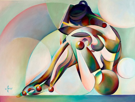
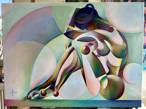
- Neo Deco – 10-07-25
Original artwork description
Color Theoretical Challenges
This oil painting ‘Neo Deco – 10-07-25’ demonstrates everything I know about color theory. In fact, it’s a search to converge all 6 main colours of the color wheel into a majestic scenery. A tall order you might say and I do agree. Didn’t the great Raphael once proclaim to only use a maximum of 5 main colors at the same time? Well, to some extent I do agree. The use of too many colors can lead to screamy kitsch. Almost as if Bob Ross would have set to work his palette with all colors of the rainbow on it. Therefor, using all six of them seems like wanting to have a taste of the forbidden fruit. However, in the past I already used all 6 before such as in my oil painting ‘Nina – 12-10-23’. The reason my inner urge directed me to used them all once more I will explain below.
A Big Gordian Knot
It all began with my graphite pencil drawing ‘Roundism – 05-07-16’ which I sold very quickly after its completion. For years I had this on my to do list of oils yet to start. I always thought of it to be a great cubist concept. Successfully merging cubistic body parts I knew this also held the potential of a grand painting. Somehow I had this concept of matching this mergance to the use of colours as well. Almost as if one would look at a display of mother of pearl-like colors. As stated above, a tall order and a big Gordian Knot. This time not one Alexander The Great would solve by simply cutting through it. Soon I found myself in big trouble because all colours were screaming at me in full force. both in the positive and the negative space.
The Solution
Consequently, this time the forms, composition and proportions weren’t the problem. Those have been sorted out by the prestudy in graphite pencil. For 95% of the time I have suffered because I was constantly looking at a big candy box full of screamy colors. Even though I tuned down many of the color saturation into more subdued colours the solution arrived only today. There was a girdling of greens around the body structures that were too cold and too saturated. I tuned them down as well a some purples and yellows in the body. Basically I just glazed over all parts too strong by using complementary colors. Strange how a day can change from cloudy to pleasantly brilliant.
Oil on portrait linen (60 x 80 x 2 cm)
Artist: Corné Akkers
Materials used:
Oil on linen (60 x 80 cm)
Details:
- Oil painting on Canvas
- One of a kind artwork
- Size: 80 x 60 x 0.9cm (unframed) / 80 x 60cm (actual image size)
- Signed on the front
- Style: Geometric
- Subject: Nudes and erotic
Tags:
#colorful#cubism#art deco#roundism#neo deco14 day money back guaranteeLearn more
Original artwork description
Color Theoretical Challenges
This oil painting ‘Neo Deco – 10-07-25’ demonstrates everything I know about color theory. In fact, it’s a search to converge all 6 main colours of the color wheel into a majestic scenery. A tall order you might say and I do agree. Didn’t the great Raphael once proclaim to only use a maximum of 5 main colors at the same time? Well, to some extent I do agree. The use of too many colors can lead to screamy kitsch. Almost as if Bob Ross would have set to work his palette with all colors of the rainbow on it. Therefor, using all six of them seems like wanting to have a taste of the forbidden fruit. However, in the past I already used all 6 before such as in my oil painting ‘Nina – 12-10-23’. The reason my inner urge directed me to used them all once more I will explain below.
A Big Gordian Knot
It all began with my graphite pencil drawing ‘Roundism – 05-07-16’ which I sold very quickly after its completion. For years I had this on my to do list of oils yet to start. I always thought of it to be a great cubist concept. Successfully merging cubistic body parts I knew this also held the potential of a grand painting. Somehow I had this concept of matching this mergance to the use of colours as well. Almost as if one would look at a display of mother of pearl-like colors. As stated above, a tall order and a big Gordian Knot. This time not one Alexander The Great would solve by simply cutting through it. Soon I found myself in big trouble because all colours were screaming at me in full force. both in the positive and the negative space.
The Solution
Consequently, this time the forms, composition and proportions weren’t the problem. Those have been sorted out by the prestudy in graphite pencil. For 95% of the time I have suffered because I was constantly looking at a big candy box full of screamy colors. Even though I tuned down many of the color saturation into more subdued colours the solution arrived only today. There was a girdling of greens around the body structures that were too cold and too saturated. I tuned them down as well a some purples and yellows in the body. Basically I just glazed over all parts too strong by using complementary colors. Strange how a day can change from cloudy to pleasantly brilliant.
Oil on portrait linen (60 x 80 x 2 cm)
Artist: Corné Akkers
Materials used:
Oil on linen (60 x 80 cm)
Details:
- Oil painting on Canvas
- One of a kind artwork
- Size: 80 x 60 x 0.9cm (unframed) / 80 x 60cm (actual image size)
- Signed on the front
- Style: Geometric
- Subject: Nudes and erotic
Tags:
#colorful#cubism#art deco#roundism#neo deco
Corné Akkers
Netherlands
About
Born in 1969 at Nijmegen. Corné's work can be seen in many countries all over the world.
Corné employs a variety of styles that all have one thing in common:... Read more