Original artwork description:

Gjon Mili’s Inspirational Influence

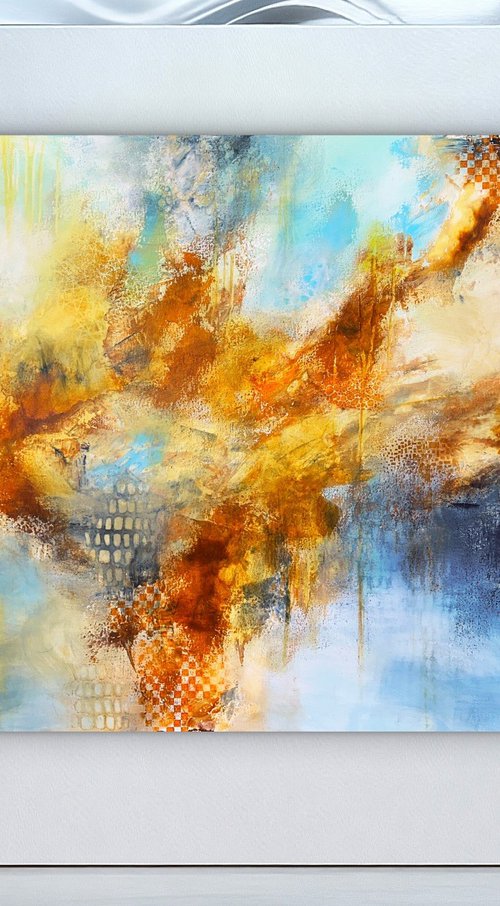
This oil painting ‘Neo Deco – 07-05-25’ is an elaboration of a recent graphite pencil drawing ‘Neo Deco – 10-03-25’. Homage to Albanian photographer Gjon Mili. Last oil painting was from August 2024 so it was high time for a new one. In addition, I always have considered my drawings as prestudies for future oils to come. Now I come to think of it I have so many drawings that to my opinion are good enough to transfer to oil paint. If I only had enough time before time will catch up with me. Maybe I should paint more this year. Perhaps some outdoor sketching. Well, I don’t know really. The artistic wind may carry me to unknown destinations.

6 Main Colors

Anyway, using your own drawing as reference is always a comforting thing. The composition is something to simply take over and then …? Sheer copying is out of the question. Therefor, the most natural inclination is to delve right into the realm of colors. There is true value added! And so I did but I have to confess something. Oh Lord, forgive me for I have sinned. Against the magic rule of max 5 colors according to Raphael’s law. In fact, I used them all (6) in this painting. Hence, it took me quite some time to complete this one. Once you set forth to use a complex color palette you know troubles are bound.

Backlighted

Initially I was in awe with the sheer beauty of the dress. Especially the backlight that turned the scenery into a spectacular tonal vision. For me that’s meat for the beast so I the drawing was finished quickly and with gusto. Now I come to think of it, that was the very reason I used all six main colours. That is, to depict the effect light has when it permiates through structures. You may say the colors I used have got nothing to do with reality or does it? In fact, you might be wrong. Light has the tendency to break up into the full colour spectrum of a rainbow. Furthermore, I strived for a perfect balance between cool and warm, and complementary colors. The yellow and green dominate. Red, purple and orange only were added to counterbalance the more quantitatively occuring green and yellow.

Forms

The drawing already was abstracted cubistically due to the nature of dress with all its folds. From a formal point of view it was an abstract landscape. Wht couldn’t I shape it further to at my own discretion. As the painting progression I had it in me to create these lush banner-like strokes of different colors. The mail goal was to have them contrast in rhythym and color. Some run in the same direction such as in the lower part. Others show contrast direction-wise. Somehow I wanted to emulate Mondriaan’s willow tree branches in gray (1911). Then again, colors just like relations only make things more complicated. In the end that Mondriaan thing only remained a starting point. In fact, I think this painting deviates from his’ quite a bit. Artistic motifs are nothing but a starting point and then the result becomes something completely different.

Oil on portrait linen (60 x 80 x 2 cm)
Artist: Corné Akkers

Materials used:

Oil on linen (60 x 80 cm)

Tags:
#colorful #cubism #art deco #roundism #neo deco 

Neo Deco – 07-05-25 (2025) Oil painting
by Corné Akkers

Star fullStar fullStar fullStar fullStar full 8 Artist Reviews

£5,081.4 Alert

Loading

Original artwork description
Minus

Gjon Mili’s Inspirational Influence

This oil painting ‘Neo Deco – 07-05-25’ is an elaboration of a recent graphite pencil drawing ‘Neo Deco – 10-03-25’. Homage to Albanian photographer Gjon Mili. Last oil painting was from August 2024 so it was high time for a new one. In addition, I always have considered my drawings as prestudies for future oils to come. Now I come to think of it I have so many drawings that to my opinion are good enough to transfer to oil paint. If I only had enough time before time will catch up with me. Maybe I should paint more this year. Perhaps some outdoor sketching. Well, I don’t know really. The artistic wind may carry me to unknown destinations.

6 Main Colors

Anyway, using your own drawing as reference is always a comforting thing. The composition is something to simply take over and then …? Sheer copying is out of the question. Therefor, the most natural inclination is to delve right into the realm of colors. There is true value added! And so I did but I have to confess something. Oh Lord, forgive me for I have sinned. Against the magic rule of max 5 colors according to Raphael’s law. In fact, I used them all (6) in this painting. Hence, it took me quite some time to complete this one. Once you set forth to use a complex color palette you know troubles are bound.

Backlighted

Initially I was in awe with the sheer beauty of the dress. Especially the backlight that turned the scenery into a spectacular tonal vision. For me that’s meat for the beast so I the drawing was finished quickly and with gusto. Now I come to think of it, that was the very reason I used all six main colours. That is, to depict the effect light has when it permiates through structures. You may say the colors I used have got nothing to do with reality or does it? In fact, you might be wrong. Light has the tendency to break up into the full colour spectrum of a rainbow. Furthermore, I strived for a perfect balance between cool and warm, and complementary colors. The yellow and green dominate. Red, purple and orange only were added to counterbalance the more quantitatively occuring green and yellow.

Forms

The drawing already was abstracted cubistically due to the nature of dress with all its folds. From a formal point of view it was an abstract landscape. Wht couldn’t I shape it further to at my own discretion. As the painting progression I had it in me to create these lush banner-like strokes of different colors. The mail goal was to have them contrast in rhythym and color. Some run in the same direction such as in the lower part. Others show contrast direction-wise. Somehow I wanted to emulate Mondriaan’s willow tree branches in gray (1911). Then again, colors just like relations only make things more complicated. In the end that Mondriaan thing only remained a starting point. In fact, I think this painting deviates from his’ quite a bit. Artistic motifs are nothing but a starting point and then the result becomes something completely different.

Oil on portrait linen (60 x 80 x 2 cm)
Artist: Corné Akkers

Materials used:

Oil on linen (60 x 80 cm)

Tags:
#colorful #cubism #art deco #roundism #neo deco 
14 day money back guaranteeFree returns

14 day money back guaranteeLearn more

4.9

Overall Rating

Based on 8 reviews
5 stars
7
4 stars
1
3 stars
0
2 stars
0
1 stars
0

Visit Corné Akkers shop

Corné Akkers

Star fullStar fullStar fullStar fullStar full (8)

Location Netherlands

About
Born in 1969 at Nijmegen. Corné's work can be seen in many countries all over the world. Corné employs a variety of styles that all have one thing in common:... Read more

View all