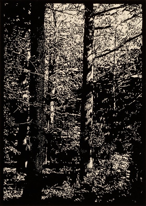
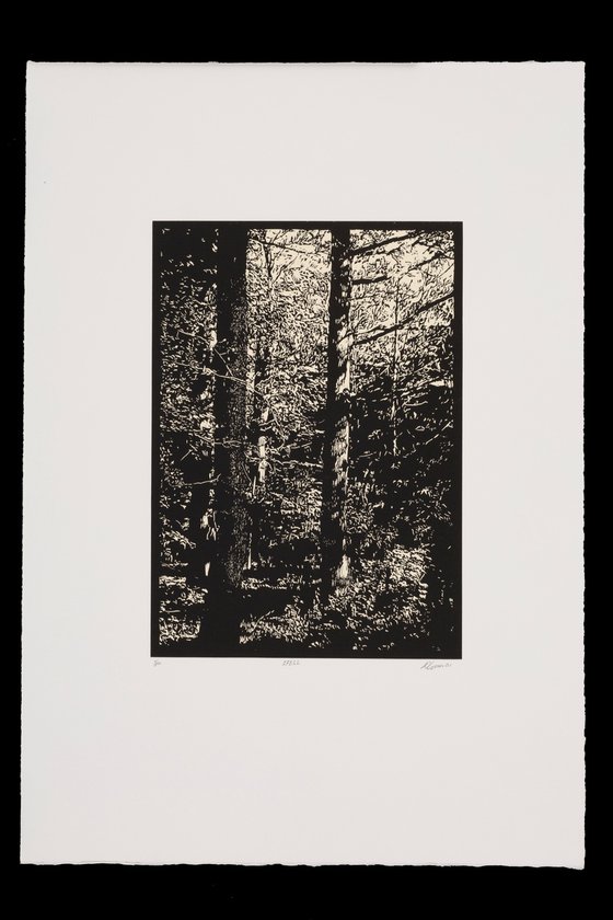
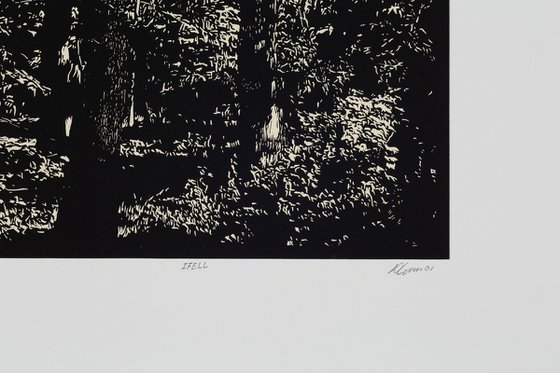
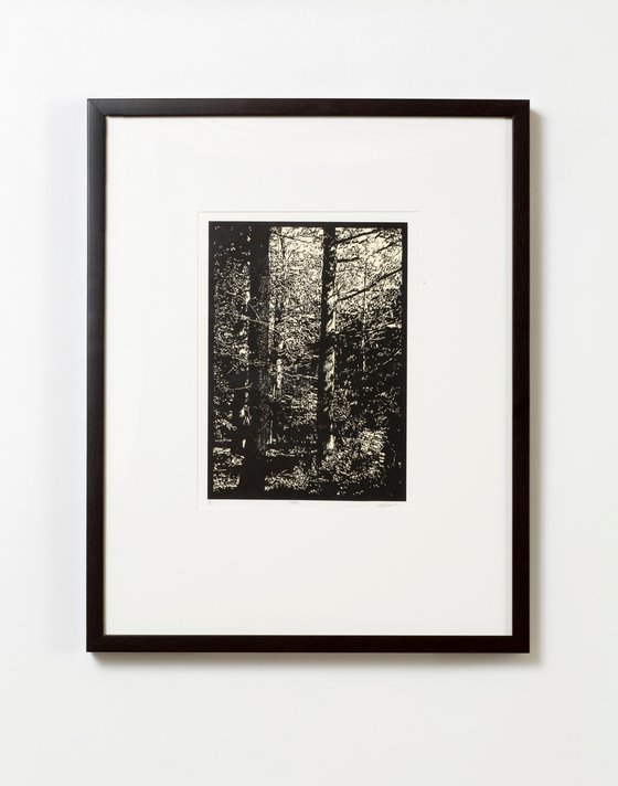
IFELL (2001) Linocut by David Conn
38.1 x 55.88 x 2.54cm (unframed) / 20.32 x 30.48cm (actual image size)
£299.14
Artwork description
The IFELL is the third linocut in the series. The entire block was carved leaving the dominant tree in the foreground a solid black. I hesitated, then decided to make the most delicate marks with my lining tool in contrast with the more spontaneous marks surrounding it. I wanted to test my printing ability, that of touch. The printer must be able to print the most delicate lines and bold with the least amount of Ink, pressure to hold both, true to the matrix. Peter Milton told me that the creative part of being an artist/printer is over once the proofing stage is complete and the plate, stone or block, is ready for the edition. He said now you must put on your printers apron, set the pressure, work the Ink. Now is the time to prepare clean tables. register printing paper and put on your horsehair shirt. These are the actions of a printer whose job is to make identical impressions, judging them to the B.A.T., which means ready to print. Consistency comes through practice and patience while using all your sensory experience. Listening to the ink as it rolls on the glass slab, watching it cover the block like a velvet carpet, feeling the pressure, the Goldilocks' theory, not to hard, not to soft, just right. Then the satisfaction of seeing the prints lined up like a regiment, marching in procession, successfully revealing the artist’s intension.
The source for this print came about on a walk while visiting friends in Germany.
Materials used:
Daniel Smith Traditional Black Relief Ink on Zerkall Book Smooth Cream over Somerset Satin White 250gm
Details:
- Linocut on Paper
- From a limited edition of 50
- Size: 38.1 x 55.88 x 2.54cm (unframed) / 20.32 x 30.48cm (actual image size)
- Signed and numbered on the front
- Style: Impressionistic
- Subject: Landscapes, sea and sky
Tags:
#shadow#light#graphic#harmony#thoughtful#peaceful#spiritual#forrest#balance#dream#delicate#airy#refreshingFeatured by our Editors:
14 day money back guaranteeLearn more
Artwork description
The IFELL is the third linocut in the series. The entire block was carved leaving the dominant tree in the foreground a solid black. I hesitated, then decided to make the most delicate marks with my lining tool in contrast with the more spontaneous marks surrounding it. I wanted to test my printing ability, that of touch. The printer must be able to print the most delicate lines and bold with the least amount of Ink, pressure to hold both, true to the matrix. Peter Milton told me that the creative part of being an artist/printer is over once the proofing stage is complete and the plate, stone or block, is ready for the edition. He said now you must put on your printers apron, set the pressure, work the Ink. Now is the time to prepare clean tables. register printing paper and put on your horsehair shirt. These are the actions of a printer whose job is to make identical impressions, judging them to the B.A.T., which means ready to print. Consistency comes through practice and patience while using all your sensory experience. Listening to the ink as it rolls on the glass slab, watching it cover the block like a velvet carpet, feeling the pressure, the Goldilocks' theory, not to hard, not to soft, just right. Then the satisfaction of seeing the prints lined up like a regiment, marching in procession, successfully revealing the artist’s intension.
The source for this print came about on a walk while visiting friends in Germany.
Materials used:
Daniel Smith Traditional Black Relief Ink on Zerkall Book Smooth Cream over Somerset Satin White 250gm
Details:
- Linocut on Paper
- From a limited edition of 50
- Size: 38.1 x 55.88 x 2.54cm (unframed) / 20.32 x 30.48cm (actual image size)
- Signed and numbered on the front
- Style: Impressionistic
- Subject: Landscapes, sea and sky
Tags:
#shadow#light#graphic#harmony#thoughtful#peaceful#spiritual#forrest#balance#dream#delicate#airy#refreshingFeatured by our Editors: