- By medium
- By subject
- By budget
- Sales
- Gift cards
- Discover all art
- Artists
- Editors’ picks
- Ideas
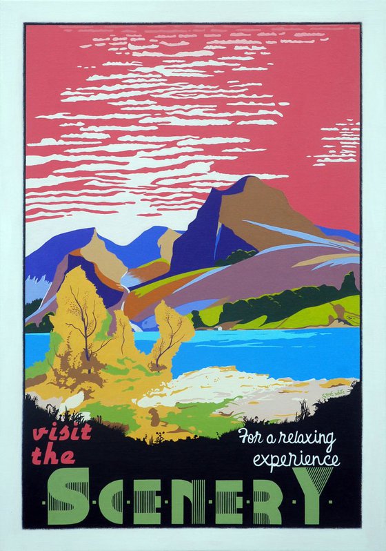
Original artwork description:
The term 'art deco' (contracted from the 1925 title of the Paris exhibition 'Exposition Internationale des Arts Décoratifs et Industriels Modernes') was barely used in the 1920s and 30s when the deco period was at its height. It seems deco was only really was recognised as a true art 'movement' in the 60s when historian Bevis Hiller published the first major book on the style called 'Art Deco of the 20s and 30s.' This begs the question as to whether the deco artists and craftsmen of the time thought they were doing anything special at all: they were just designing stuff - utilitarian objects mostly - in the particular fad at the time. It was no big deal. In 100 years time will we look back to today and write treatises over the Art Ikea period? Perhaps not. Recognizing the brilliance of art deco today is the van-Gogh-only-became-famous-after-he-died syndrome.
As a painter I am a devotee of the art deco poster world - or a 'decotee' as I like to call myself.
Posters are used to sell product: merchandise, events, destinations, ideology, lifestyle, message. The deco poster artists were salesmen. Ukranian born Frenchman Jean Adolphe Mouron – aka the peerless Cassandre – described his job thus: 'The poster artist plays the role of the telegraphist: he doesn’t create the message, he transmits it. No one asks for his advice, we only ask that he makes a clear, powerful and precise communication.'
This doesn't sound much like art to me.
And yet, of course, we now revere these people as true artists. And so we should. They were highly original, creative, skilful.
In another life I was a travel writer so art deco travel posters are a particular interest of mine. I liked the basic simplicity of the images and, of course, the fabulous fonts. As any decotee will know, fonts are crucial to the success of the deco oeuvre. I am a font freak and, saddo that I am, I can become mildly hysterical scrolling through reams and reams of fonts.
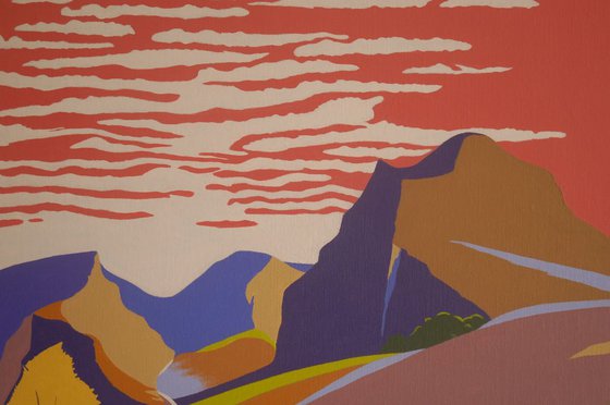
The deco travel posters tried to sell particular destinations, or just the glamour of travel. I have painted a few posters of landmark buildings in a vaguely deco style - flat, bright colours with sharp edges - but I always hankered to paint a destination poster containing one of those arch and slightly twee messages that seemed to be in vogue at the time. You know the sort of thing: 'Skegness is SO bracing'; 'Yosemite: glorious are these rocks and waters'; 'Bournemouth - for health and pleasure'. Who writes this stuff? Not the artist, if Mouron is to be believed. Even in the 20s and 30s would a copywriter seriously think that 'Bournemouth for health and pleasure' was a great line that would pack 'em in on the prom in that famous Dorset resort? Surely they were being ironic? 'Skegness is so bracing' is merely a euphemistic way of saying 'don't forget your thermal underwear.' Alliteration, mostly involving 's' was also very big: London was the place for 'sights, shops and shows' but you should head to Blackpool for 'sea, sand and sunshine'.
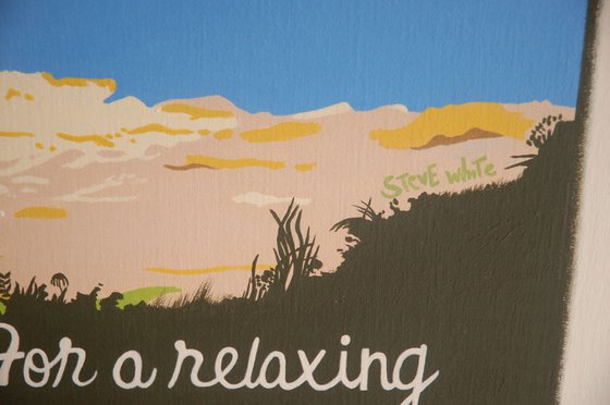
But making up one of these bland bromides for a poster I had already painted of some generic scenery was surprisingly tricky. You need to strike a balance between believable cliche and outright parody: Visit The Scenery - It's ever So Super; It's Packed In The Summer; You'll Never get Parked, etc etc. After days of agonising I settled on 'For a Relaxing Experience.' It seemed to hit the right note of sardonic verisimiltude. I originally painted this tagline in a deco type of font but it felt too impersonal so I changed it to what I felt is a friendlier cursive script, like someone privately inviting you by letter to taste the delights of the countryside.
Have a lovely holiday!
Limited Edition Prints.
Printed on William Turner Hahnemuhle fine art exhibition quality paper (310 g/m2) using Epson Ultrachrome Pro Pigments, the colours remain true to the original up to 100 years.
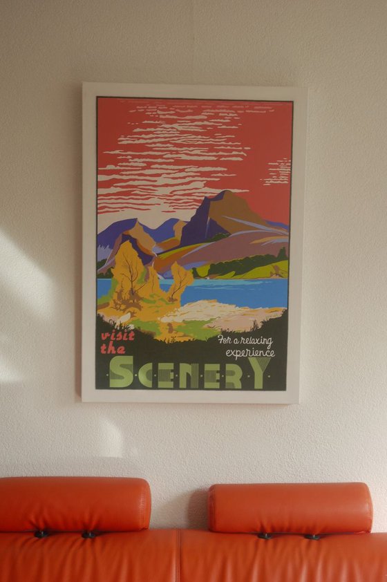
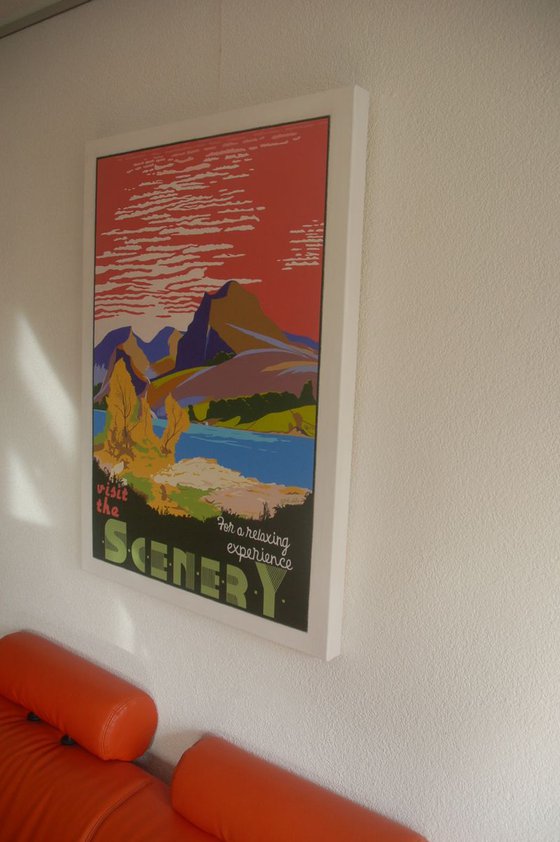
The image size is 43×30 cms and there is an additional 3 cms border all the way round the image (ie total size: 49×36 cms). The artist will sign and number the print in this border. The print is unframed.
Prints will leave the artists studio within 7 days, rolled in a heavy tube, accompanied by a Certificate of Authenticity and sent via track and trace.
Materials used:
Acrylics
Tags:
#poster #mountainscape #art deco landscapeVisit The Scenery For A Relaxing Experience (2017) Acrylic painting
by Steve White
2 Artist Reviews
£647.39
- Acrylic painting on Canvas
- One of a kind artwork
- Size: 70 x 100 x 4.5cm (unframed) / 60 x 90cm (actual image size)
- Ready to hang
- Signed on the front
- Style: Graphic, illustrative and typographic
- Subject: Landscapes, sea and sky
Loading
Original artwork description
The term 'art deco' (contracted from the 1925 title of the Paris exhibition 'Exposition Internationale des Arts Décoratifs et Industriels Modernes') was barely used in the 1920s and 30s when the deco period was at its height. It seems deco was only really was recognised as a true art 'movement' in the 60s when historian Bevis Hiller published the first major book on the style called 'Art Deco of the 20s and 30s.' This begs the question as to whether the deco artists and craftsmen of the time thought they were doing anything special at all: they were just designing stuff - utilitarian objects mostly - in the particular fad at the time. It was no big deal. In 100 years time will we look back to today and write treatises over the Art Ikea period? Perhaps not. Recognizing the brilliance of art deco today is the van-Gogh-only-became-famous-after-he-died syndrome.
As a painter I am a devotee of the art deco poster world - or a 'decotee' as I like to call myself.
Posters are used to sell product: merchandise, events, destinations, ideology, lifestyle, message. The deco poster artists were salesmen. Ukranian born Frenchman Jean Adolphe Mouron – aka the peerless Cassandre – described his job thus: 'The poster artist plays the role of the telegraphist: he doesn’t create the message, he transmits it. No one asks for his advice, we only ask that he makes a clear, powerful and precise communication.'
This doesn't sound much like art to me.
And yet, of course, we now revere these people as true artists. And so we should. They were highly original, creative, skilful.
In another life I was a travel writer so art deco travel posters are a particular interest of mine. I liked the basic simplicity of the images and, of course, the fabulous fonts. As any decotee will know, fonts are crucial to the success of the deco oeuvre. I am a font freak and, saddo that I am, I can become mildly hysterical scrolling through reams and reams of fonts.
The deco travel posters tried to sell particular destinations, or just the glamour of travel. I have painted a few posters of landmark buildings in a vaguely deco style - flat, bright colours with sharp edges - but I always hankered to paint a destination poster containing one of those arch and slightly twee messages that seemed to be in vogue at the time. You know the sort of thing: 'Skegness is SO bracing'; 'Yosemite: glorious are these rocks and waters'; 'Bournemouth - for health and pleasure'. Who writes this stuff? Not the artist, if Mouron is to be believed. Even in the 20s and 30s would a copywriter seriously think that 'Bournemouth for health and pleasure' was a great line that would pack 'em in on the prom in that famous Dorset resort? Surely they were being ironic? 'Skegness is so bracing' is merely a euphemistic way of saying 'don't forget your thermal underwear.' Alliteration, mostly involving 's' was also very big: London was the place for 'sights, shops and shows' but you should head to Blackpool for 'sea, sand and sunshine'.
But making up one of these bland bromides for a poster I had already painted of some generic scenery was surprisingly tricky. You need to strike a balance between believable cliche and outright parody: Visit The Scenery - It's ever So Super; It's Packed In The Summer; You'll Never get Parked, etc etc. After days of agonising I settled on 'For a Relaxing Experience.' It seemed to hit the right note of sardonic verisimiltude. I originally painted this tagline in a deco type of font but it felt too impersonal so I changed it to what I felt is a friendlier cursive script, like someone privately inviting you by letter to taste the delights of the countryside.
Have a lovely holiday!
Limited Edition Prints.
Printed on William Turner Hahnemuhle fine art exhibition quality paper (310 g/m2) using Epson Ultrachrome Pro Pigments, the colours remain true to the original up to 100 years.
The image size is 43×30 cms and there is an additional 3 cms border all the way round the image (ie total size: 49×36 cms). The artist will sign and number the print in this border. The print is unframed.
Prints will leave the artists studio within 7 days, rolled in a heavy tube, accompanied by a Certificate of Authenticity and sent via track and trace.
Materials used:
Acrylics
Tags:
#poster #mountainscape #art deco landscape14 day money back guaranteeLearn more
Artist Reviews (2)
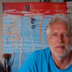
Steve White
Netherlands
About
I started painting, aged 50, after visiting a Wassily Kandinsky exhibition at the Royal Academy in London. I vowed not to fall victim to the infamous New Maths Equation: MODERN... Read more