Original artwork description:
Love for Sheer Textures
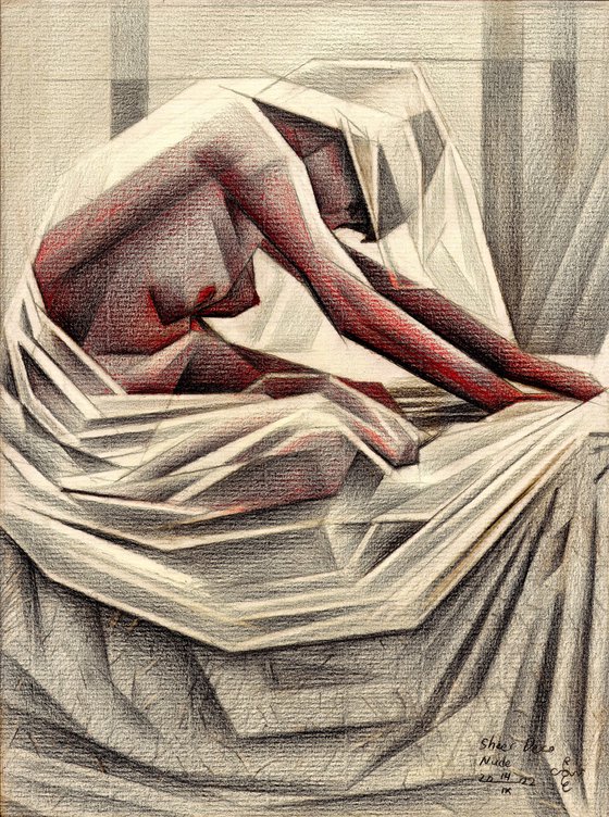
This graphite pencil drawing ‘Sheer Deco Nude – 14-10-22’ is a deepening of my love for texture of
fabrics. My Last drawing of Louise Brooks also bears witness to that and the one before that as well.
Surely my satin fetishes already showed but now it was time to experiment with sheer fabrics on the
female form. Some time ago I saw Pride and Prejudice, starring Keira Knightley as Elizabeth Bennet.
In a particular scene at Mr Darcy’s house she is gazing at a statue with a veiled face. I found that
simply fascinating. Very classic, a bit corny perhaps but I don’t mind. I already explained I am not
living in the era I should have been. I certainly will not burn my art works either like Damien Hirst,
that’s for sure. Instead I gladly refer to art works of eras gone by.
Deco or Not?
Unfortunately I don’t know the origin of the reference picture so I cannot give someone credits. It
must have been in the 1920s since I was searching for art deco photography. Not at all certain deco I
must confess but my added cubist styling could be though. In my art statement to ‘Art Deco Nude –
02-10-22’ I give the generally accepted definition of the style. I state it once more: “Geometric styling
of naturalistic forms with a degree of abstraction and streamlining. As a natural consequence it flows
from bringing them back to the essence geometrically”. I came to realize I did just that, wouldn’t you
agree?
Variation in Repetition, Repetition in Variation
In art class I often tell students about the principle ‘variation in repetition, repetition in variation’. A
further explanation on the subject can be found here. As to this drawing I can mention the repetition
of angles in which certain contours manifest themselves. They are counterbalanced by other
contours placed in a different angle and thus serve as a variation. by this principle eyes are reassured
because the artist offer them structure though which the work can be read. However, too much
repetition can be boring and too much variation only creates incomprehensable entropy. As an artist
I see it as my task to employ this principle optimally and offer viewers a sound interpretation. I try to
give meaning to representations and forms even if they seem meaninglessly chaotic in real life.
Pitt Graphite Matt pencil (Faber-Castell) drawing on Fabriano Ingres paper (21 x 28.2 x 0.1 cm)
Artist: Corné Akkers
Materials used:
Pitt Graphite Matt pencil (Faber-Castell) drawing on Fabriano Ingres paper (21 x 28.2 x 0.1 cm)
Tags:
#cubism #art deco #chiaroscuro #roundismSheer Deco Nude – 14-10-22 (2022)
Pencil drawing
by Corné Akkers
8 Artist Reviews
£1,290.75
- Pencil drawing on Paper
- One of a kind artwork
- Size: 21 x 28.2 x 0.1cm (unframed) / 21 x 28.2cm (actual image size)
- Signed on the front
- Style: Geometric
- Subject: Nudes and erotic
Original artwork description
Love for Sheer Textures
This graphite pencil drawing ‘Sheer Deco Nude – 14-10-22’ is a deepening of my love for texture of
fabrics. My Last drawing of Louise Brooks also bears witness to that and the one before that as well.
Surely my satin fetishes already showed but now it was time to experiment with sheer fabrics on the
female form. Some time ago I saw Pride and Prejudice, starring Keira Knightley as Elizabeth Bennet.
In a particular scene at Mr Darcy’s house she is gazing at a statue with a veiled face. I found that
simply fascinating. Very classic, a bit corny perhaps but I don’t mind. I already explained I am not
living in the era I should have been. I certainly will not burn my art works either like Damien Hirst,
that’s for sure. Instead I gladly refer to art works of eras gone by.
Deco or Not?
Unfortunately I don’t know the origin of the reference picture so I cannot give someone credits. It
must have been in the 1920s since I was searching for art deco photography. Not at all certain deco I
must confess but my added cubist styling could be though. In my art statement to ‘Art Deco Nude –
02-10-22’ I give the generally accepted definition of the style. I state it once more: “Geometric styling
of naturalistic forms with a degree of abstraction and streamlining. As a natural consequence it flows
from bringing them back to the essence geometrically”. I came to realize I did just that, wouldn’t you
agree?
Variation in Repetition, Repetition in Variation
In art class I often tell students about the principle ‘variation in repetition, repetition in variation’. A
further explanation on the subject can be found here. As to this drawing I can mention the repetition
of angles in which certain contours manifest themselves. They are counterbalanced by other
contours placed in a different angle and thus serve as a variation. by this principle eyes are reassured
because the artist offer them structure though which the work can be read. However, too much
repetition can be boring and too much variation only creates incomprehensable entropy. As an artist
I see it as my task to employ this principle optimally and offer viewers a sound interpretation. I try to
give meaning to representations and forms even if they seem meaninglessly chaotic in real life.
Pitt Graphite Matt pencil (Faber-Castell) drawing on Fabriano Ingres paper (21 x 28.2 x 0.1 cm)
Artist: Corné Akkers
Materials used:
Pitt Graphite Matt pencil (Faber-Castell) drawing on Fabriano Ingres paper (21 x 28.2 x 0.1 cm)
Tags:
#cubism #art deco #chiaroscuro #roundismReturns and refunds
We want you to love your art! If you are not completely satisfied with your purchase you can return it free within 14 days, no questions asked. Learn more
Artist Reviews (8)
This artwork is sold by Corné Akkers from Netherlands

Corné Akkers
Netherlands
About
Born in 1969 at Nijmegen. Corné's work can be seen in many countries all over the world.
Corné employs a variety of styles that all have one thing in common:... Read more

