Original artwork description:
Beautifully Arranged
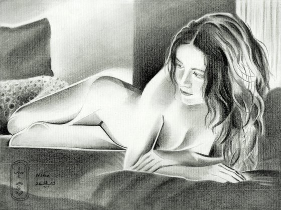
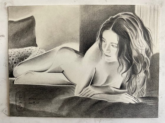
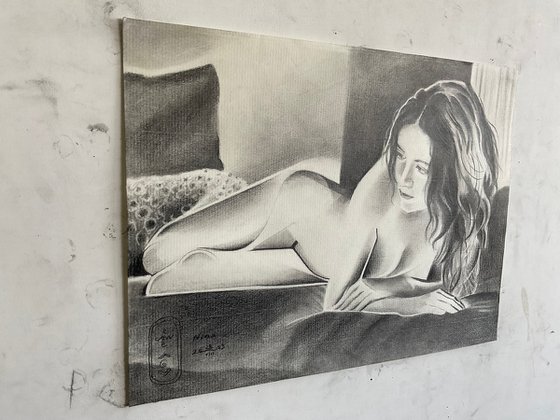
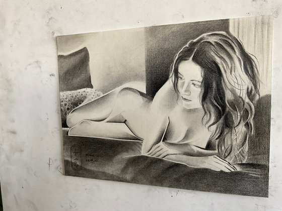
This graphite pencil drawing ‘Nina – 23-08-23’ already is the third I made of this gorgeous lady. What’s next I asked myself? Whereas last drawing showed her in her metallic beauty I was not sure whether I should do a similar one. I have a bunch of reference pictures, also one on which she reclines on a bed. That one caught my attention even though it showed a lot of soft tones. However, the composition was beautifully arranged and her bodily features seem to underlign just that. I found soft flowing curves but also detected hard linear and edgy structures studying it in more detail. Enough to stimulate my artistic fantasy.
Minimalistically
Soon I got the proportions right so I had some extra time to ponder over cubist styling. Implementation of solarisational levels also came to mind. You see, due to the backlighting her body seemed to flow over into the negative space. It made the photographic scenery simply too light. Solarization came to my aid and I didn’t even need to apply a hefty tonal play. I didn’t want to loose the styled legs and abdomen too much. Minimalistically I already liked them and I made sure I left some areas open. This way they would communicate with the space around them.
Polka Dots
There were two pillows near her feet at the left and also a floor lamp near her shoulder. I skipped the latter. The folds in the lampshade would have competed too much with the lush and volumneus hair. The lower pillow was polka-dotted. On a whim in the end I decided to slighty indicated those dots. Through that I got some contrast with the rather opaque looking planes throughtout the depiction.
Balancing out Contrasts
The overall goal often gets revealed in the end. This is what I always tell students. There is no true intention than to play and fool around. See what you may get. Maybe it is that I learnt to be patient and listen to my inner voice. That’s not a rational way of listening but a subconsciousness process, whilst playing that is. All in all the piece makes perfectly sense to me now. There are detailly structures in the middle, to the left and the right. There are contrasts in light and dark, different levels of abstraction. I even am suprized of the fact the limbs look very abstract but credible and convincing. I realize that’s partially caused my the more realistic features in her face. Do you concur?
Graphite pencil (Faber Castell Pitt Graphite Matt pencil 14B) drawing on Fabriano Ingres paper (21 x 29.7 x 0.1 cm)
Artist: Corné Akkers
Materials used:
Graphite pencil (Faber Castell Pitt Graphite Matt pencil 14B) drawing Talens Bristol paper (21 x 29.7 x 0.1 cm)
Tags:
#cubism #female form #art deco #graphite #artistic nudeNina – 23-08-23 (2023)
Pencil drawing
by Corné Akkers
8 Artist Reviews
£1,290.75
- Pencil drawing on Paper
- One of a kind artwork
- Size: 28.2 x 21 x 0.1cm (unframed) / 28.2 x 21cm (actual image size)
- Signed on the front
- Style: Geometric
- Subject: Nudes and erotic
Original artwork description
Beautifully Arranged
This graphite pencil drawing ‘Nina – 23-08-23’ already is the third I made of this gorgeous lady. What’s next I asked myself? Whereas last drawing showed her in her metallic beauty I was not sure whether I should do a similar one. I have a bunch of reference pictures, also one on which she reclines on a bed. That one caught my attention even though it showed a lot of soft tones. However, the composition was beautifully arranged and her bodily features seem to underlign just that. I found soft flowing curves but also detected hard linear and edgy structures studying it in more detail. Enough to stimulate my artistic fantasy.
Minimalistically
Soon I got the proportions right so I had some extra time to ponder over cubist styling. Implementation of solarisational levels also came to mind. You see, due to the backlighting her body seemed to flow over into the negative space. It made the photographic scenery simply too light. Solarization came to my aid and I didn’t even need to apply a hefty tonal play. I didn’t want to loose the styled legs and abdomen too much. Minimalistically I already liked them and I made sure I left some areas open. This way they would communicate with the space around them.
Polka Dots
There were two pillows near her feet at the left and also a floor lamp near her shoulder. I skipped the latter. The folds in the lampshade would have competed too much with the lush and volumneus hair. The lower pillow was polka-dotted. On a whim in the end I decided to slighty indicated those dots. Through that I got some contrast with the rather opaque looking planes throughtout the depiction.
Balancing out Contrasts
The overall goal often gets revealed in the end. This is what I always tell students. There is no true intention than to play and fool around. See what you may get. Maybe it is that I learnt to be patient and listen to my inner voice. That’s not a rational way of listening but a subconsciousness process, whilst playing that is. All in all the piece makes perfectly sense to me now. There are detailly structures in the middle, to the left and the right. There are contrasts in light and dark, different levels of abstraction. I even am suprized of the fact the limbs look very abstract but credible and convincing. I realize that’s partially caused my the more realistic features in her face. Do you concur?
Graphite pencil (Faber Castell Pitt Graphite Matt pencil 14B) drawing on Fabriano Ingres paper (21 x 29.7 x 0.1 cm)
Artist: Corné Akkers
Materials used:
Graphite pencil (Faber Castell Pitt Graphite Matt pencil 14B) drawing Talens Bristol paper (21 x 29.7 x 0.1 cm)
Tags:
#cubism #female form #art deco #graphite #artistic nudeReturns and refunds
We want you to love your art! If you are not completely satisfied with your purchase you can return it free within 14 days, no questions asked. Learn more
Artist Reviews (8)
This artwork is sold by Corné Akkers from Netherlands

Corné Akkers
Netherlands
About
Born in 1969 at Nijmegen. Corné's work can be seen in many countries all over the world.
Corné employs a variety of styles that all have one thing in common:... Read more

