Original artwork description:
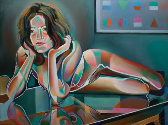
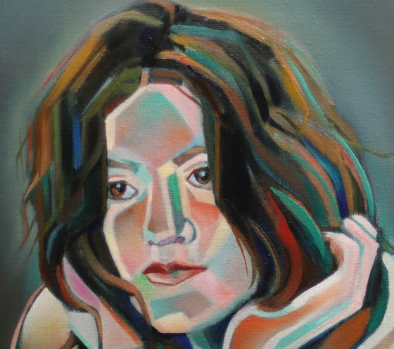
First Oil
This oil painting ‘Nina - 13-10-23’ follows a prestudy I made last August. As stated before, she is a great model with a gorgeous body. I feel honored to draw and paint her. This is the first oil I made of her and I hope you like it. If you like both the painting and the model you can visit her page on deviantart. Perhaps you will even recognize some motifs I used for my drawings in the recent past.
Enter the World of Color
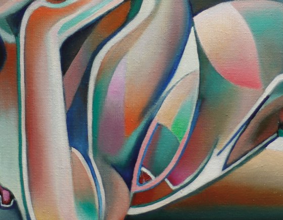
Abovemeant prestudy I rendered in a style one can typify as a hotchpotch of cubism, roundism and solarisation. Worth mentioning is the challenge every artist faces to come up with something coherent in every new painting. An idea can be processed into graphite very easy, at least that’s my experience. Putting it into oil sometimes proves to be a tall order. Enter the realm of color. It’s a world in which relations between colors are never fixed or form predestined succesful combinations. Normally you can easily be inspired by colors you see during a live session. Tweaking a reference photo thereafter is also possible. If you subsequently solarize a motif then it’s opening up a can of worms though.
Solarization
You see, applying solarisation isn’t very difficult. It’s a matter of inverting some tonal regions whereas you keep others as they are. This doesn’t apply to the realm of colour though. In fact, color and solarization don’t match really. They are a world on their own, I think. Throwing in a color scheme almost immediately will cancel the solarized look. Perhaps that is what I wanted but it delivered me exciting yet unexplainable and inconsistent new planes.
Troubles Solved
Such distorted forms can appear to stand on their own too much. You see, arch enemy is a partial or even total loss of coherence in the intended composition. Guess what. That was my fate initially. I happy-go-luckily threw in some colors I liked. Soon, the painting became clotted with to many colors that also were too saturared. Enter a paintstakingly long period of doubts and desperation, searching for solutions. Finally I managed to cut to the chase. It was the color yellow being abundant. I remember my painting ‘Louise Brooks – 26-10-14’ in which I removed it too. Implementing a solution is easy yet very difficult to find. Often I feel like almost going off the rails on finding the right color scheme. However, now I find myself back on track eventually. The result is a hefty but pleasing balance between saturated and unsaturated colours.
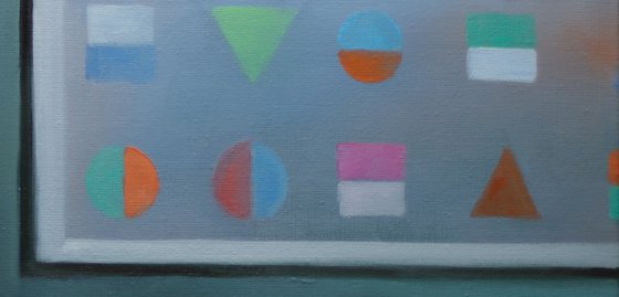
Geometric Shapes
In the end I decided to incorporate a painting from the original reference picture. In the drawing I kept it out but now it came in handy. There were some geometric shapes I altered a bit. Hence, a homage to the triangle, cube and circle in the colors I used in the oil. Next tot his, I hope offer the viewer a spectacular new vision on the female form.
Oil on linen (60 x 80 cm)
Artist: Corné Akkers
Materials used:
Oil on linen (60 x 80 cm)
Tags:
#colorful #cubism #art deco #roundism #neo decoNina – 12-10-23 (2023)
Oil painting
by Corné Akkers
8 Artist Reviews
£4,701.29
- Oil painting on Canvas
- One of a kind artwork
- Size: 80 x 60 x 0.9cm (unframed) / 80 x 60cm (actual image size)
- Signed on the front
- Style: Geometric
- Subject: Nudes and erotic
Original artwork description
First Oil
This oil painting ‘Nina - 13-10-23’ follows a prestudy I made last August. As stated before, she is a great model with a gorgeous body. I feel honored to draw and paint her. This is the first oil I made of her and I hope you like it. If you like both the painting and the model you can visit her page on deviantart. Perhaps you will even recognize some motifs I used for my drawings in the recent past.
Enter the World of Color
Abovemeant prestudy I rendered in a style one can typify as a hotchpotch of cubism, roundism and solarisation. Worth mentioning is the challenge every artist faces to come up with something coherent in every new painting. An idea can be processed into graphite very easy, at least that’s my experience. Putting it into oil sometimes proves to be a tall order. Enter the realm of color. It’s a world in which relations between colors are never fixed or form predestined succesful combinations. Normally you can easily be inspired by colors you see during a live session. Tweaking a reference photo thereafter is also possible. If you subsequently solarize a motif then it’s opening up a can of worms though.
Solarization
You see, applying solarisation isn’t very difficult. It’s a matter of inverting some tonal regions whereas you keep others as they are. This doesn’t apply to the realm of colour though. In fact, color and solarization don’t match really. They are a world on their own, I think. Throwing in a color scheme almost immediately will cancel the solarized look. Perhaps that is what I wanted but it delivered me exciting yet unexplainable and inconsistent new planes.
Troubles Solved
Such distorted forms can appear to stand on their own too much. You see, arch enemy is a partial or even total loss of coherence in the intended composition. Guess what. That was my fate initially. I happy-go-luckily threw in some colors I liked. Soon, the painting became clotted with to many colors that also were too saturared. Enter a paintstakingly long period of doubts and desperation, searching for solutions. Finally I managed to cut to the chase. It was the color yellow being abundant. I remember my painting ‘Louise Brooks – 26-10-14’ in which I removed it too. Implementing a solution is easy yet very difficult to find. Often I feel like almost going off the rails on finding the right color scheme. However, now I find myself back on track eventually. The result is a hefty but pleasing balance between saturated and unsaturated colours.
Geometric Shapes
In the end I decided to incorporate a painting from the original reference picture. In the drawing I kept it out but now it came in handy. There were some geometric shapes I altered a bit. Hence, a homage to the triangle, cube and circle in the colors I used in the oil. Next tot his, I hope offer the viewer a spectacular new vision on the female form.
Oil on linen (60 x 80 cm)
Artist: Corné Akkers
Materials used:
Oil on linen (60 x 80 cm)
Tags:
#colorful #cubism #art deco #roundism #neo decoReturns and refunds
We want you to love your art! If you are not completely satisfied with your purchase you can return it free within 14 days, no questions asked. Learn more
Artist Reviews (8)
This artwork is sold by Corné Akkers from Netherlands

Corné Akkers
Netherlands
About
Born in 1969 at Nijmegen. Corné's work can be seen in many countries all over the world.
Corné employs a variety of styles that all have one thing in common:... Read more

