- By medium
- By subject
- By budget
- Sales
- Gift cards
- Discover all art
- Artists
- Editors’ picks
- Ideas
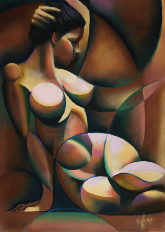
Original artwork description:
Refurbish It
This pastel drawing ‘Golden Roundism – 03-03-21’ is based on a graphite pencil drawing ‘Roundism – 03-01-16 (sold)’. After the previous pastel ‘Golden Purple – 25-02-21’ I thought it would be fun to pull a really old one out of the drawer. Sometimes art works I made a long time ago can make me shy. Often I can see my art grew throughout the years when it comes to diction and technique. In this particular case I have mixed emotions. It is a powerful drawing and on the other hand it is a little shaky from both an anatomical and consistential point of view. Time to refurbish it and turn it into a pastel.
Blushing with Shame
The Golden series I am working on represent another aspect next to the previously described use of yellow hues. That is to overcome the fear of using brown and grey hues. We are talking about the realm of saturated and unsaturated colors now. Some time ago I read Von Goethe’s art statement: “Colors are admired by primitive peoples, the low-educated and children.” Frankly I must admit I was blushing with shame, thinking of my lust for color. Looking back at many pastels and oils in the past, the exuberance use of bright colors (color saturation) is striking.
Saturational Balance
On the other hand, already explained in a previous art statement, I refute sluggish brown paintings. Especially many from the 17th century and many romantic ones from the first half of the 19th century. They hurt my eyes and turn my soul to deeper shades of grey. Therefor, in this pastel I tried to find a way through the middle and I do think I succeeded. The aim was to use a lot of reddish brown and yellow and counterbalance that with some cooler colors. So I used some purples, blues and greens. No real hefty, big and saturated planes but linear or very small mostly. This way I contrasted the large quantity of brown and yellow planes with an array of highly saturated cooler hues. The focus in the latter lies on quality and not on quantity. I think I got away with it. What do you think?
Pastel drawing on Clairfontaine Pastel Mat paper (69.4 x 49.8 x 0.1 cm)
Artist: Corné Akkers
Materials used:
Pastel drawing on paper (49.8 x 69.7 x 0.1 cm)
Tags:
#pastel #expressionism #yellow #cubism #artistic nudeGolden Roundism - 03-03-21 (Sold) (2021) Pastel drawing
by Corné Akkers
8 Artist Reviews
£1,294.8 Sold
- Pastel drawing on Paper
- One of a kind artwork
- Size: 49.8 x 69.4 x 0.1cm (unframed) / 49.8 x 69.4cm (actual image size)
- Signed on the front
- Style: Impressionistic
- Subject: Nudes and erotic
Loading
Original artwork description
Refurbish It
This pastel drawing ‘Golden Roundism – 03-03-21’ is based on a graphite pencil drawing ‘Roundism – 03-01-16 (sold)’. After the previous pastel ‘Golden Purple – 25-02-21’ I thought it would be fun to pull a really old one out of the drawer. Sometimes art works I made a long time ago can make me shy. Often I can see my art grew throughout the years when it comes to diction and technique. In this particular case I have mixed emotions. It is a powerful drawing and on the other hand it is a little shaky from both an anatomical and consistential point of view. Time to refurbish it and turn it into a pastel.
Blushing with Shame
The Golden series I am working on represent another aspect next to the previously described use of yellow hues. That is to overcome the fear of using brown and grey hues. We are talking about the realm of saturated and unsaturated colors now. Some time ago I read Von Goethe’s art statement: “Colors are admired by primitive peoples, the low-educated and children.” Frankly I must admit I was blushing with shame, thinking of my lust for color. Looking back at many pastels and oils in the past, the exuberance use of bright colors (color saturation) is striking.
Saturational Balance
On the other hand, already explained in a previous art statement, I refute sluggish brown paintings. Especially many from the 17th century and many romantic ones from the first half of the 19th century. They hurt my eyes and turn my soul to deeper shades of grey. Therefor, in this pastel I tried to find a way through the middle and I do think I succeeded. The aim was to use a lot of reddish brown and yellow and counterbalance that with some cooler colors. So I used some purples, blues and greens. No real hefty, big and saturated planes but linear or very small mostly. This way I contrasted the large quantity of brown and yellow planes with an array of highly saturated cooler hues. The focus in the latter lies on quality and not on quantity. I think I got away with it. What do you think?
Pastel drawing on Clairfontaine Pastel Mat paper (69.4 x 49.8 x 0.1 cm)
Artist: Corné Akkers
Materials used:
Pastel drawing on paper (49.8 x 69.7 x 0.1 cm)
Tags:
#pastel #expressionism #yellow #cubism #artistic nude14 day money back guaranteeLearn more
Artist Reviews (8)

Corné Akkers
Netherlands
About
Born in 1969 at Nijmegen. Corné's work can be seen in many countries all over the world.
Corné employs a variety of styles that all have one thing in common:... Read more