Original artwork description:
Golden Pink – 13-09-20
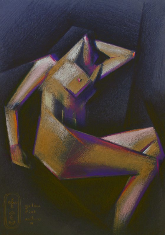
Golden Pink
After my previous colored pencil drawing ‘Golden Brown – 24-08-20’ I wanted to explore the Talens Toned Color Paper futher and see what the motif of a white female model could offer me on dark blue paper. I used the golden pastel and colored pencils because I liked its shine, although it does not look like gold at all when applied. In fact it looks quite tempered and rather matt in stead of shiny but that just adds to the flavor.
Slightly Complementary
I chose some pinks and purples to complement the yellowish hue of the gold and some orange touches just to set it off against the blue of the paper. The slanted linear structures formed by the buttocks, hip bone, abdominal muscle, breast and lower part of the lower arm are all running parallel. Such repetition enhances rhythym and recognition.
Some Mishap
To be honest I planned for a graphite pencil version of this one but when I was working in my studio, waiting for my students last Saturday Morning at Studio Brugman, I accidentally rubbed some paint on the drawing still on the table, left behind by a student the day before. Unlucky me but perhaps all things happen for a reason. Tonight I made this one just out of pure serendipity I guess.
Colored pencil and pastel drawing on Talens toned colour paper (21 x 29.7 x 0.1 c m) - A4 format)
Artist: Corné Akkers
Materials used:
Colored pencil and pastel drawing on Talen toned colour paper (21 x 29.7 x 0.1 cm) - A4 format)
Tags:
#cubism #roundism #akkers #corne #clairobscurGolden Pink – 13-09-20 (2020)
Pencil drawing
by Corné Akkers
8 Artist Reviews
£1,282.17
- Pencil drawing on Paper
- One of a kind artwork
- Size: 21 x 29.7 x 0.1cm (unframed) / 21 x 29.7cm (actual image size)
- Signed on the front
- Style: Geometric
- Subject: Nudes and erotic
Original artwork description
Golden Pink – 13-09-20
Golden Pink
After my previous colored pencil drawing ‘Golden Brown – 24-08-20’ I wanted to explore the Talens Toned Color Paper futher and see what the motif of a white female model could offer me on dark blue paper. I used the golden pastel and colored pencils because I liked its shine, although it does not look like gold at all when applied. In fact it looks quite tempered and rather matt in stead of shiny but that just adds to the flavor.
Slightly Complementary
I chose some pinks and purples to complement the yellowish hue of the gold and some orange touches just to set it off against the blue of the paper. The slanted linear structures formed by the buttocks, hip bone, abdominal muscle, breast and lower part of the lower arm are all running parallel. Such repetition enhances rhythym and recognition.
Some Mishap
To be honest I planned for a graphite pencil version of this one but when I was working in my studio, waiting for my students last Saturday Morning at Studio Brugman, I accidentally rubbed some paint on the drawing still on the table, left behind by a student the day before. Unlucky me but perhaps all things happen for a reason. Tonight I made this one just out of pure serendipity I guess.
Colored pencil and pastel drawing on Talens toned colour paper (21 x 29.7 x 0.1 c m) - A4 format)
Artist: Corné Akkers
Materials used:
Colored pencil and pastel drawing on Talen toned colour paper (21 x 29.7 x 0.1 cm) - A4 format)
Tags:
#cubism #roundism #akkers #corne #clairobscurReturns and refunds
We want you to love your art! If you are not completely satisfied with your purchase you can return it free within 14 days, no questions asked. Learn more
Artist Reviews (8)
This artwork is sold by Corné Akkers from Netherlands

Corné Akkers
Netherlands
About
Born in 1969 at Nijmegen. Corné's work can be seen in many countries all over the world.
Corné employs a variety of styles that all have one thing in common:... Read more

