- By medium
- By subject
- By budget
- Sales
- Gift cards
- Discover all art
- Artists
- Editors’ picks
- Ideas
Original artwork description:
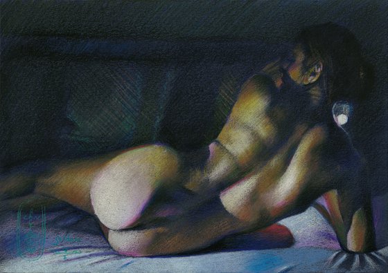
Golden – 15-01-21
Golden Series
In autumn 2020 I made my last drawing in the Golden series, called Golden Reality – 14-09-20. Since then I almost forgot about that series because I started drawing in graphite again after my big Frida Kahlo Project. Colored pencil initially was not my weapon of choice. Instead I was drawn towards the direction of international recognition because of my monochrome drawings. They still sell well. Albeit this success I like to vary as you may know by now.
Work in Progress
The direct reason why I picked up my colored pencils is my work in progress under the working title ‘The Girl and the Pheasant’. Of late I realized I did realistic skin textures in black and white and in pastel for a long timel. Even though the latter is in color the execution thereof is done in my hatched strokes. Nevertheless that one is merely impressionistic because of the lines according to the principles of divisionism.
Jealousy
No, the true reason, my specators and readers, is that I still am jealous of the techniques of masters like Ingres, Van Dyck and so many others. Take The Valpinçon Bather (La Grande Baigneuse) for that matter. My realistic art work is scarce in showing smooth color gradients and subtle color shifts as can be detected and enjoyed in that painting. It is time to expand my view in that direction. Roundism will not walk away but this needs to be developed as well.
Added Value
Now I expressed yet another jealousy (a previous one was my jealousy for Degas’ drawing talents) it is time to express criticism as well. Even though the aforementioned Ingres’ painting show mastery in the depiction of smooth textures as to thousands of different gradients, sometimes I feel the colors look rather bland. Another example is his painting ‘The Turkish Bath’. The value I would like to add to art history is some kind of expressionist color exaggeration or personal choice rather than depicting what I see.
Stronger colors
Then I remembered my oil painting ‘Henriëtte (2013) (sold)’. In that one I used traditional techniques like a verdaccio undercoat and glazed layers but I crancked up the color shits like reds and greens a bit. Just as in oil I applied multiple layers of colored pencil patches on top of one another. As such it is a difficult technique that is very unforgiven but I am pretty sure I want to get to the bottom of this to finetune it. For now I like the fact that the yellows, greens, oranges and blues blend into eachother but not as smoothly as in Ingres’ works. They also show a higher degree of saturation. Perhaps it is a new kind of expressionism secretly wrapped with a golden bow and served out as realism.
Colored pencil drawing on Talens Mixed Toned Color paper (21 x 29.5 x 0.1 cm) - A4 format)
Artist: Corné Akkers
Materials used:
Colored pencil drawing on Talens Mixed Toned Color paper (21 x 29.5 x 0.1 cm) - A4 format)
Tags:
#impressionism #expressionism #realism #artistic nude #colored pencilGolden – 15-01-21 (2021)
Pencil drawing
by Corné Akkers
8 Artist Reviews
£1,281.6
- Pencil drawing on Paper
- One of a kind artwork
- Size: 29.7 x 21 x 0.1cm (unframed) / 29.7 x 21cm (actual image size)
- Signed on the front
- Style: Impressionistic
- Subject: Nudes and erotic
Original artwork description
Golden – 15-01-21
Golden Series
In autumn 2020 I made my last drawing in the Golden series, called Golden Reality – 14-09-20. Since then I almost forgot about that series because I started drawing in graphite again after my big Frida Kahlo Project. Colored pencil initially was not my weapon of choice. Instead I was drawn towards the direction of international recognition because of my monochrome drawings. They still sell well. Albeit this success I like to vary as you may know by now.
Work in Progress
The direct reason why I picked up my colored pencils is my work in progress under the working title ‘The Girl and the Pheasant’. Of late I realized I did realistic skin textures in black and white and in pastel for a long timel. Even though the latter is in color the execution thereof is done in my hatched strokes. Nevertheless that one is merely impressionistic because of the lines according to the principles of divisionism.
Jealousy
No, the true reason, my specators and readers, is that I still am jealous of the techniques of masters like Ingres, Van Dyck and so many others. Take The Valpinçon Bather (La Grande Baigneuse) for that matter. My realistic art work is scarce in showing smooth color gradients and subtle color shifts as can be detected and enjoyed in that painting. It is time to expand my view in that direction. Roundism will not walk away but this needs to be developed as well.
Added Value
Now I expressed yet another jealousy (a previous one was my jealousy for Degas’ drawing talents) it is time to express criticism as well. Even though the aforementioned Ingres’ painting show mastery in the depiction of smooth textures as to thousands of different gradients, sometimes I feel the colors look rather bland. Another example is his painting ‘The Turkish Bath’. The value I would like to add to art history is some kind of expressionist color exaggeration or personal choice rather than depicting what I see.
Stronger colors
Then I remembered my oil painting ‘Henriëtte (2013) (sold)’. In that one I used traditional techniques like a verdaccio undercoat and glazed layers but I crancked up the color shits like reds and greens a bit. Just as in oil I applied multiple layers of colored pencil patches on top of one another. As such it is a difficult technique that is very unforgiven but I am pretty sure I want to get to the bottom of this to finetune it. For now I like the fact that the yellows, greens, oranges and blues blend into eachother but not as smoothly as in Ingres’ works. They also show a higher degree of saturation. Perhaps it is a new kind of expressionism secretly wrapped with a golden bow and served out as realism.
Colored pencil drawing on Talens Mixed Toned Color paper (21 x 29.5 x 0.1 cm) - A4 format)
Artist: Corné Akkers
Materials used:
Colored pencil drawing on Talens Mixed Toned Color paper (21 x 29.5 x 0.1 cm) - A4 format)
Tags:
#impressionism #expressionism #realism #artistic nude #colored pencilReturns and refunds
We want you to love your art! If you are not completely satisfied with your purchase you can return it free within 14 days, no questions asked. Learn more
Artist Reviews (8)

Corné Akkers
Netherlands
About
Born in 1969 at Nijmegen. Corné's work can be seen in many countries all over the world.
Corné employs a variety of styles that all have one thing in common:... Read more

