Original artwork description:
Cubist Expressionism – 08-09-20
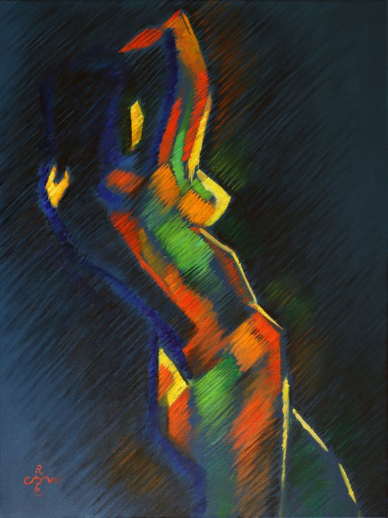
Prestudy
Years ago I made a pastel drawing called ‘Pastel Study 03 (2013)’ and the name suggests a prestudy. Although I did not forget about it, my mind kept wandering on and often it is hard to keep track with all my ideas. I guess we all get ground by the millstones of time and I am only juggling with my talents the best way I see fit. Some works though will make it to the second stage, namely an oil painting. Others I forget about and when I look back sometimes I am quite suprized that I did. Aforementioned pastel study is such a piece I came to appreciate anew.
Odd One Out
I made the pastel study on a whim when I was waiting for my students on a Wednesday evening, I remember. My roundism style and the bulk of my cubist works were not made yet. Perhaps this one this even more different than the rest because it holds certain expressionist elements, I think. It also is not exactly cubistically angular. Still a great shot and I sold it quickly through Saatchiart. It’s with a Canadian collector nowadays.
Oil Painting
After careful considering I chose for a rendering with hatched strokes like I am used to in doing pastels and many a drawing, even though this is the first time in oil. I quite like it I can admit because it conveys the feel and the objective I had in mind. I kept it quite cubistic though, more than the initial pastel. In this respect it is more a synthesis of cubism and expressionism. When I talk about cubism I do not mean Picasso’s multi-perspectivism but my own cubistic style.
Color Usage
Throughout the years my taste for color has changed a bit, even though I still like strong colors. However, I realized already a long time ago an abundance of strong, saturated colors can lead to inflation and therefor to visual fatigue very easily. This the reason I kept the negative space unsaturated (poluted blue) and some of the colours in the positive form I put outside it, just to let them echo faintly. This way I tied them together, creating harmony.
Oil on linen (60 x 80 cm)
Artist: Corné Akkers
Materials used:
Oil on linen (60 x 80 cm)
Tags:
#expressionism #cubism #akkers #corne #فنCubist Expressionism – 08-09-20 (2020)
Oil painting
by Corné Akkers
8 Artist Reviews
£4,701.29
- Oil painting on Paper
- One of a kind artwork
- Size: 60 x 80 x 1cm (unframed) / 60 x 80cm (actual image size)
- Signed on the front
- Style: Geometric
- Subject: Nudes and erotic
Original artwork description
Cubist Expressionism – 08-09-20
Prestudy
Years ago I made a pastel drawing called ‘Pastel Study 03 (2013)’ and the name suggests a prestudy. Although I did not forget about it, my mind kept wandering on and often it is hard to keep track with all my ideas. I guess we all get ground by the millstones of time and I am only juggling with my talents the best way I see fit. Some works though will make it to the second stage, namely an oil painting. Others I forget about and when I look back sometimes I am quite suprized that I did. Aforementioned pastel study is such a piece I came to appreciate anew.
Odd One Out
I made the pastel study on a whim when I was waiting for my students on a Wednesday evening, I remember. My roundism style and the bulk of my cubist works were not made yet. Perhaps this one this even more different than the rest because it holds certain expressionist elements, I think. It also is not exactly cubistically angular. Still a great shot and I sold it quickly through Saatchiart. It’s with a Canadian collector nowadays.
Oil Painting
After careful considering I chose for a rendering with hatched strokes like I am used to in doing pastels and many a drawing, even though this is the first time in oil. I quite like it I can admit because it conveys the feel and the objective I had in mind. I kept it quite cubistic though, more than the initial pastel. In this respect it is more a synthesis of cubism and expressionism. When I talk about cubism I do not mean Picasso’s multi-perspectivism but my own cubistic style.
Color Usage
Throughout the years my taste for color has changed a bit, even though I still like strong colors. However, I realized already a long time ago an abundance of strong, saturated colors can lead to inflation and therefor to visual fatigue very easily. This the reason I kept the negative space unsaturated (poluted blue) and some of the colours in the positive form I put outside it, just to let them echo faintly. This way I tied them together, creating harmony.
Oil on linen (60 x 80 cm)
Artist: Corné Akkers
Materials used:
Oil on linen (60 x 80 cm)
Tags:
#expressionism #cubism #akkers #corne #فنReturns and refunds
We want you to love your art! If you are not completely satisfied with your purchase you can return it free within 14 days, no questions asked. Learn more
Artist Reviews (8)
This artwork is sold by Corné Akkers from Netherlands

Corné Akkers
Netherlands
About
Born in 1969 at Nijmegen. Corné's work can be seen in many countries all over the world.
Corné employs a variety of styles that all have one thing in common:... Read more

