Original artwork description:
Something More Cubist
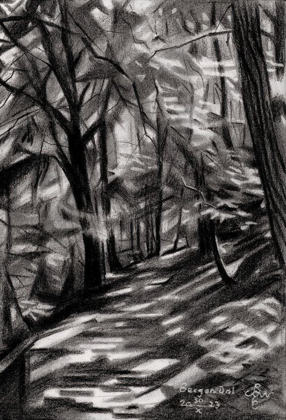
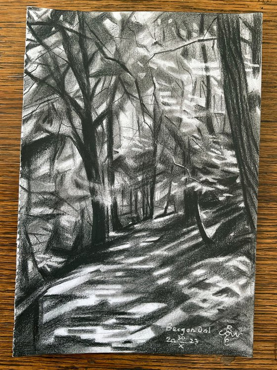
This graphite pencil drawing ‘Berg en Dal – 30-10-23’ is my next one in the series of the same name. Doing the last one I really got the hang of it. That one was rather impressionistic than cubistic but I really don’t mind. I like the result nonetheless. However, a former drawing lingered in my mind, a scenery much more abstracted. That’s how it goes, from a more realistic approach to abstract. Years ago I also drew a cubist forest in the same municipality. It happens to be that I found the perfect reference picture. Therefor I was very eager to turn it into something beautiful.
Sparkling Diamonds
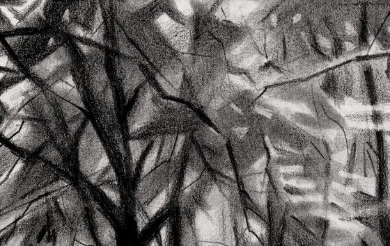
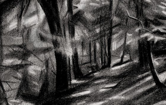
You see, last weekend I went to the actual place. There I took some pictures of wonderful hillsides with trees in Autumn colors. Not the abovemeant picture though. That one I took in the Summertime. It was in my folder of ideas on my computer still waiting to be used. The actual scenery was full of leafy structures. I believe it’s somewhere between the Jan Dommer van Polderveldtsweg and the Boterberg. Though leaves light was scattered across a narrow path lingering through the hills with tall trees marking it. They resembled sparkling diamonds waiting for me to pluck them with a pencil.
Blinded by the Light
My cubist forest interpretation of the Valley of the Philosophers from 2015 was done in the same style. Personally, I think this one might be a more refined. There are plenty of cubist planes alright but when I compared the two I spot differences. Planary distribution is more subtle without getting to fragmented though. It’s what you see when you walk down a leafy path anyway. Sometimes you almost get blinded my the light, disturbed by restless patterns of dark and light. What do you say, does it lean more to the impressionist side than cubist? Not that I care much.
Graphite pencil drawing (Faber Castell, Pitt Graphite Matt, 14B) on Winsor & Newton Bristol board paper (21 x 14.8 x 0.1 cm – A5 format)
Artist: Corné Akkers
Materials used:
Graphite pencil drawing (Faber Castell, Pitt Graphite Matt, 14B) on Winsor & Newton Bristol board paper (21 x 14.8 x 0.1 cm – A5 format)
Tags:
#landscape #impressionism #art #cubism #treescapeBerg en Dal – 30-10-23 (2023)
Pencil drawing
by Corné Akkers
8 Artist Reviews
£769.3
- Pencil drawing on Paper
- One of a kind artwork
- Size: 14.8 x 21 x 0.1cm (unframed) / 14.8 x 21cm (actual image size)
- Signed on the front
- Style: Geometric
- Subject: Landscapes, sea and sky
Original artwork description
Something More Cubist
This graphite pencil drawing ‘Berg en Dal – 30-10-23’ is my next one in the series of the same name. Doing the last one I really got the hang of it. That one was rather impressionistic than cubistic but I really don’t mind. I like the result nonetheless. However, a former drawing lingered in my mind, a scenery much more abstracted. That’s how it goes, from a more realistic approach to abstract. Years ago I also drew a cubist forest in the same municipality. It happens to be that I found the perfect reference picture. Therefor I was very eager to turn it into something beautiful.
Sparkling Diamonds
You see, last weekend I went to the actual place. There I took some pictures of wonderful hillsides with trees in Autumn colors. Not the abovemeant picture though. That one I took in the Summertime. It was in my folder of ideas on my computer still waiting to be used. The actual scenery was full of leafy structures. I believe it’s somewhere between the Jan Dommer van Polderveldtsweg and the Boterberg. Though leaves light was scattered across a narrow path lingering through the hills with tall trees marking it. They resembled sparkling diamonds waiting for me to pluck them with a pencil.
Blinded by the Light
My cubist forest interpretation of the Valley of the Philosophers from 2015 was done in the same style. Personally, I think this one might be a more refined. There are plenty of cubist planes alright but when I compared the two I spot differences. Planary distribution is more subtle without getting to fragmented though. It’s what you see when you walk down a leafy path anyway. Sometimes you almost get blinded my the light, disturbed by restless patterns of dark and light. What do you say, does it lean more to the impressionist side than cubist? Not that I care much.
Graphite pencil drawing (Faber Castell, Pitt Graphite Matt, 14B) on Winsor & Newton Bristol board paper (21 x 14.8 x 0.1 cm – A5 format)
Artist: Corné Akkers
Materials used:
Graphite pencil drawing (Faber Castell, Pitt Graphite Matt, 14B) on Winsor & Newton Bristol board paper (21 x 14.8 x 0.1 cm – A5 format)
Tags:
#landscape #impressionism #art #cubism #treescapeReturns and refunds
We want you to love your art! If you are not completely satisfied with your purchase you can return it free within 14 days, no questions asked. Learn more
Artist Reviews (8)
This artwork is sold by Corné Akkers from Netherlands

Corné Akkers
Netherlands
About
Born in 1969 at Nijmegen. Corné's work can be seen in many countries all over the world.
Corné employs a variety of styles that all have one thing in common:... Read more

