Original artwork description:
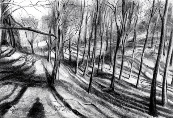
A Sort of Try-out
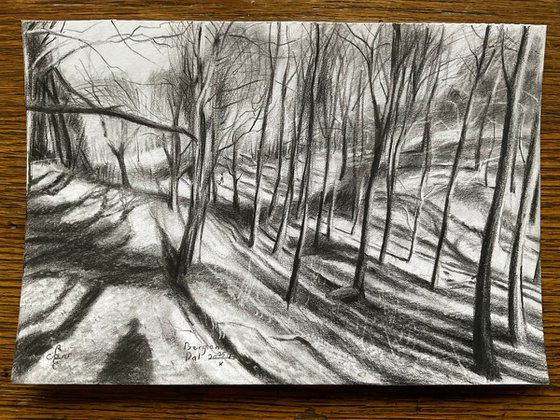
This graphite pencil drawing ‘Berg en Dal – 25-10-23’ puts me back on track. Lately I was planning to do some more cityscapes, treescapes and landscapes. Throughout my career as artist I consider, together with my cubist female forms, them the cement of my art. Surely, once in a while a bigger painting comes up. That’s the grand tale I have to tell from time to time. This little drawing at hand I completed today by definition is a sort of try-out. I like to experiment with slight changes in style in order to see if can get away with it.
Boterberg
You see, I drew one last May, almost the same spot. In Berg en Dal, Gelderland, Netherlands that is. I was curious if I could get the same quality again. I liked it and I like the very spot that is most dear to me as well. Same treelines and hilly outlook, slightly differently rendered though. We are talking about the Boterberg, part of Beek-Ubbergen. Higher up it could be Berg en Dal. I’m not sure. As stated before, dutch hills in the eyes of foreigners look ridiculous. However, any elevation in The Netherlands is good enough to spend some time on. Besides that, I don’t need extented forest like the Big Sur, California. I was there once and it seemed I could get lost there forever. The hills outside Nijmegen offer me just the right amount of artistic motifs.
Impressionism or Cubism?
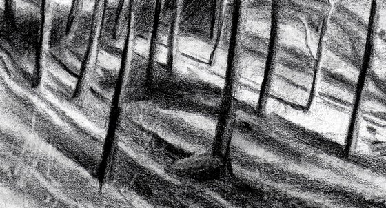
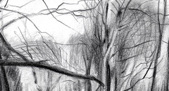
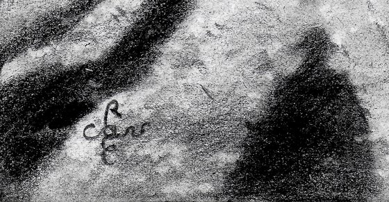
As to the style, I must confess I didn’t get a cubist quality again. Although there are some cubist or roundistic elements in it, I missed a couple of big trees. In the other drawing there were some big striking trees at the right. Somehow I felt a more abstract cubist approach wouldn’t work in this one. I feared the scenery otherwise would have become a bit too much amorph looking. The artwork tends more to impressionism than cubism. What do you think? Last but not least, the shadow in the lower left corner is me. I remember I felt like one of those small figures straight out of a Caspar David Friedrich paintings.
Graphite pencil drawing (Faber Castell, Pitt Graphite Matt, 14B) on Winsor & Newton Bristol board paper (21 x 14.8 x 0.1 cm – A5 format)
Artist: Corné Akkers
Materials used:
Graphite pencil drawing (Faber Castell, Pitt Graphite Matt, 14B) on Winsor & Newton Bristol board paper (21 x 14.8 x 0.1 cm – A5 format)
Tags:
#landscape #impressionism #art #cubism #treescapeBerg en Dal – 25-10-23 (2023)
Pencil drawing
by Corné Akkers
8 Artist Reviews
£769.3
- Pencil drawing on Paper
- One of a kind artwork
- Size: 21 x 14.8 x 0.1cm (unframed) / 21 x 14.8cm (actual image size)
- Signed on the front
- Style: Impressionistic
- Subject: Landscapes, sea and sky
Original artwork description
A Sort of Try-out
This graphite pencil drawing ‘Berg en Dal – 25-10-23’ puts me back on track. Lately I was planning to do some more cityscapes, treescapes and landscapes. Throughout my career as artist I consider, together with my cubist female forms, them the cement of my art. Surely, once in a while a bigger painting comes up. That’s the grand tale I have to tell from time to time. This little drawing at hand I completed today by definition is a sort of try-out. I like to experiment with slight changes in style in order to see if can get away with it.
Boterberg
You see, I drew one last May, almost the same spot. In Berg en Dal, Gelderland, Netherlands that is. I was curious if I could get the same quality again. I liked it and I like the very spot that is most dear to me as well. Same treelines and hilly outlook, slightly differently rendered though. We are talking about the Boterberg, part of Beek-Ubbergen. Higher up it could be Berg en Dal. I’m not sure. As stated before, dutch hills in the eyes of foreigners look ridiculous. However, any elevation in The Netherlands is good enough to spend some time on. Besides that, I don’t need extented forest like the Big Sur, California. I was there once and it seemed I could get lost there forever. The hills outside Nijmegen offer me just the right amount of artistic motifs.
Impressionism or Cubism?
As to the style, I must confess I didn’t get a cubist quality again. Although there are some cubist or roundistic elements in it, I missed a couple of big trees. In the other drawing there were some big striking trees at the right. Somehow I felt a more abstract cubist approach wouldn’t work in this one. I feared the scenery otherwise would have become a bit too much amorph looking. The artwork tends more to impressionism than cubism. What do you think? Last but not least, the shadow in the lower left corner is me. I remember I felt like one of those small figures straight out of a Caspar David Friedrich paintings.
Graphite pencil drawing (Faber Castell, Pitt Graphite Matt, 14B) on Winsor & Newton Bristol board paper (21 x 14.8 x 0.1 cm – A5 format)
Artist: Corné Akkers
Materials used:
Graphite pencil drawing (Faber Castell, Pitt Graphite Matt, 14B) on Winsor & Newton Bristol board paper (21 x 14.8 x 0.1 cm – A5 format)
Tags:
#landscape #impressionism #art #cubism #treescapeReturns and refunds
We want you to love your art! If you are not completely satisfied with your purchase you can return it free within 14 days, no questions asked. Learn more
Artist Reviews (8)
This artwork is sold by Corné Akkers from Netherlands

Corné Akkers
Netherlands
About
Born in 1969 at Nijmegen. Corné's work can be seen in many countries all over the world.
Corné employs a variety of styles that all have one thing in common:... Read more

