Original artwork description:
A Perfect Mixture
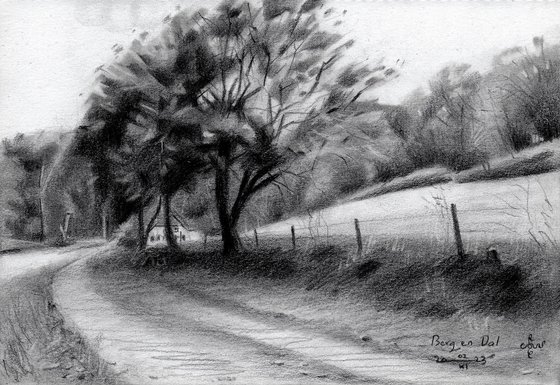
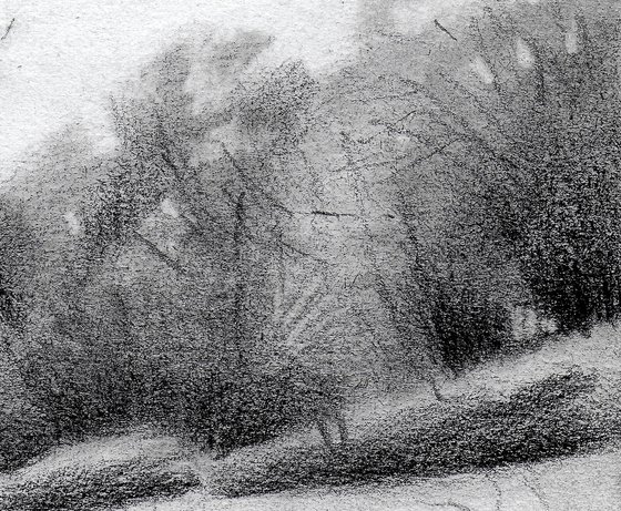
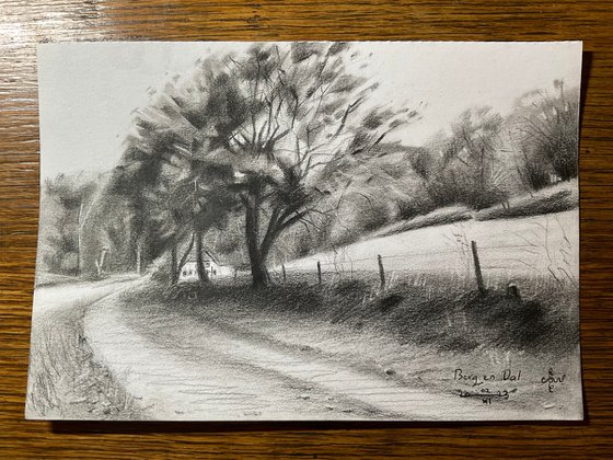
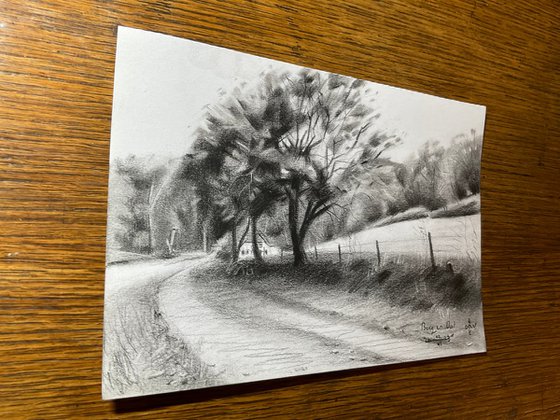
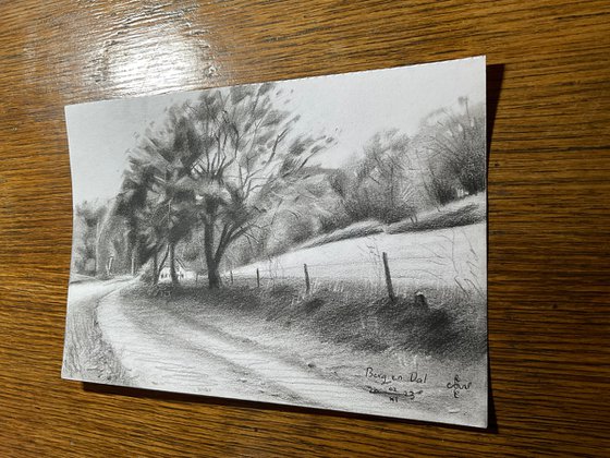
This graphite pencil drawing ‘Berg en Dal – 02-11-23’ is a sort of mixture of cubism and impressionism. Less abstracted than the previous one but more cubist than the one before. That was my very aim. I’m still searching for the perfect balance between both styles. In fact, throughout the years my quest has been to prevent people from detecting a certain style. In the past I have been accused for being the new Picasso. In earlier days: “Hey, your style resembles Edward Hopper’s or Dali’s”. More than any other artist I long for creating a style to call my own, like Van Gogh or Cézanne did. My gut feeling still tells me to let both styles converge so they cancel eachother out, becoming one entirely new. What do you say? I think, it’s the only way to come up with something new.
The Very Spot
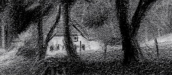
The motif is situated in Berg en Dal, Gelderland, Netherlands. At least, I guess it is. I couldn’t see it clearly on the map. I think Beek-Ubbergen is just around the corner. In fact, the very spot is at the end of the second-last path to the right from the Rijksstraatweg. There is this white house you can see behind the dominant tree. They rent it out as a vacation home. Anyway, the Duivelsberg is to the left and it’s a lovely valley that I frequently visit. Nearby I made a small drawing in 2019.
Grainy Structure
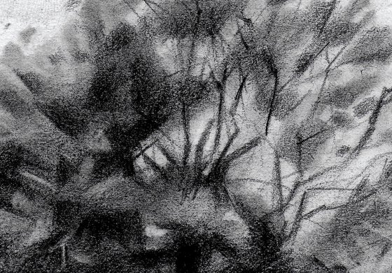
I like how the Winsor & Newton paper reacts to the Pitt Graphite Matt pencil made by Faber Castell. It’s rather grainy. When I draw a plane I can either rub it out or enjoy the ribbled structure. It favors an impressionist look but it’s still good enough for cubism though. These kinds of paper are conducive to vague contour delineations in the back. That’s something harder to achieve using Bristol paper. Its structure is rather dense and suited for fine detailing. Hence, there is a nice sketchy feel to these kinds of drawings. Don’t you agree?
Graphite pencil drawing (Faber Castell, Pitt Graphite Matt, 14B) on Winsor & Newton Bristol board paper (21 x 14.8 x 0.1 cm – A5 format)
Artist: Corné Akkers
Materials used:
Graphite pencil drawing (Faber Castell, Pitt Graphite Matt, 14B) on Winsor & Newton Bristol board paper (21 x 14.8 x 0.1 cm – A5 format)
Tags:
#landscape #impressionism #art #cubism #treescapeBerg en Dal – 02-11-23 (2023)
Pencil drawing
by Corné Akkers
8 Artist Reviews
£769.3
- Pencil drawing on Paper
- One of a kind artwork
- Size: 21 x 14.8 x 0.1cm (unframed) / 21 x 14.8cm (actual image size)
- Signed on the front
- Style: Impressionistic
- Subject: Landscapes, sea and sky
Original artwork description
A Perfect Mixture
This graphite pencil drawing ‘Berg en Dal – 02-11-23’ is a sort of mixture of cubism and impressionism. Less abstracted than the previous one but more cubist than the one before. That was my very aim. I’m still searching for the perfect balance between both styles. In fact, throughout the years my quest has been to prevent people from detecting a certain style. In the past I have been accused for being the new Picasso. In earlier days: “Hey, your style resembles Edward Hopper’s or Dali’s”. More than any other artist I long for creating a style to call my own, like Van Gogh or Cézanne did. My gut feeling still tells me to let both styles converge so they cancel eachother out, becoming one entirely new. What do you say? I think, it’s the only way to come up with something new.
The Very Spot
The motif is situated in Berg en Dal, Gelderland, Netherlands. At least, I guess it is. I couldn’t see it clearly on the map. I think Beek-Ubbergen is just around the corner. In fact, the very spot is at the end of the second-last path to the right from the Rijksstraatweg. There is this white house you can see behind the dominant tree. They rent it out as a vacation home. Anyway, the Duivelsberg is to the left and it’s a lovely valley that I frequently visit. Nearby I made a small drawing in 2019.
Grainy Structure
I like how the Winsor & Newton paper reacts to the Pitt Graphite Matt pencil made by Faber Castell. It’s rather grainy. When I draw a plane I can either rub it out or enjoy the ribbled structure. It favors an impressionist look but it’s still good enough for cubism though. These kinds of paper are conducive to vague contour delineations in the back. That’s something harder to achieve using Bristol paper. Its structure is rather dense and suited for fine detailing. Hence, there is a nice sketchy feel to these kinds of drawings. Don’t you agree?
Graphite pencil drawing (Faber Castell, Pitt Graphite Matt, 14B) on Winsor & Newton Bristol board paper (21 x 14.8 x 0.1 cm – A5 format)
Artist: Corné Akkers
Materials used:
Graphite pencil drawing (Faber Castell, Pitt Graphite Matt, 14B) on Winsor & Newton Bristol board paper (21 x 14.8 x 0.1 cm – A5 format)
Tags:
#landscape #impressionism #art #cubism #treescapeReturns and refunds
We want you to love your art! If you are not completely satisfied with your purchase you can return it free within 14 days, no questions asked. Learn more
Artist Reviews (8)
This artwork is sold by Corné Akkers from Netherlands

Corné Akkers
Netherlands
About
Born in 1969 at Nijmegen. Corné's work can be seen in many countries all over the world.
Corné employs a variety of styles that all have one thing in common:... Read more

