- By medium
- By subject
- By budget
- Sales
- Gift cards
- Discover all art
- Artists
- Editors’ picks
- Ideas
Original artwork description:
Back to Hatch
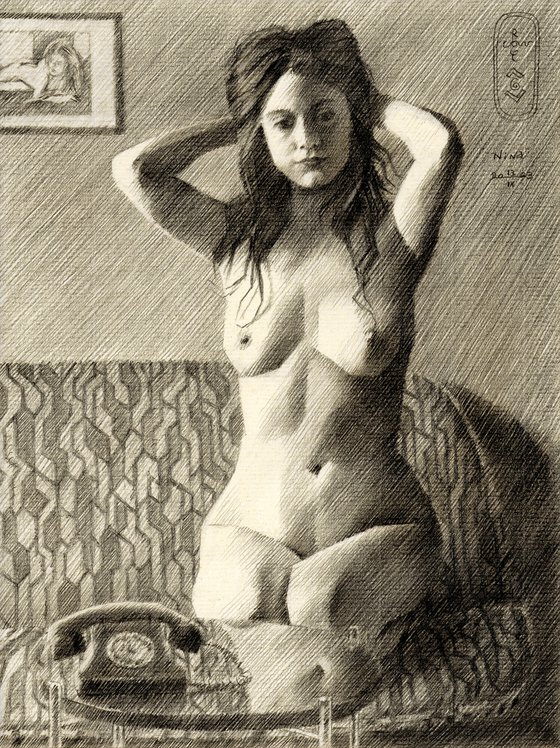
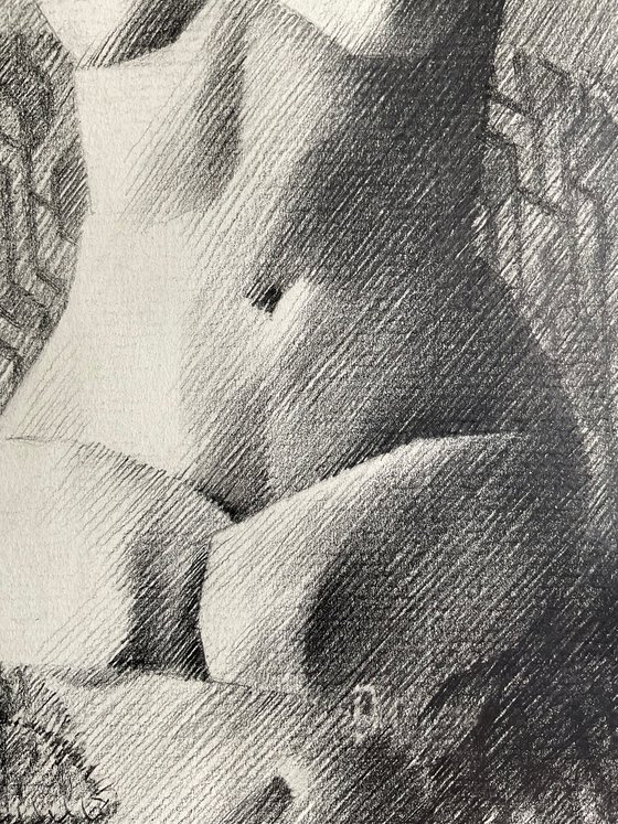
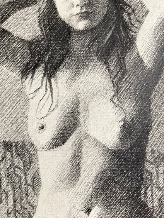
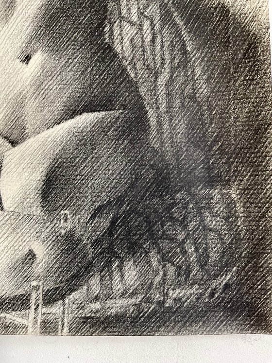
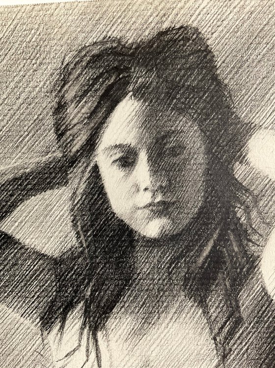
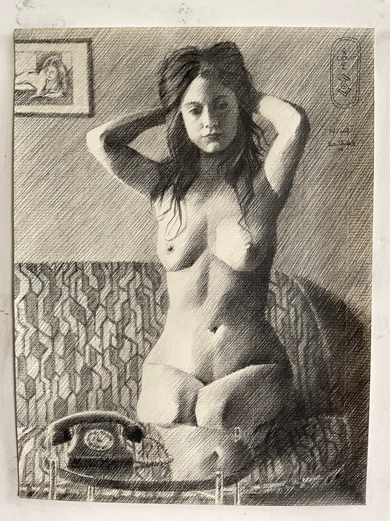
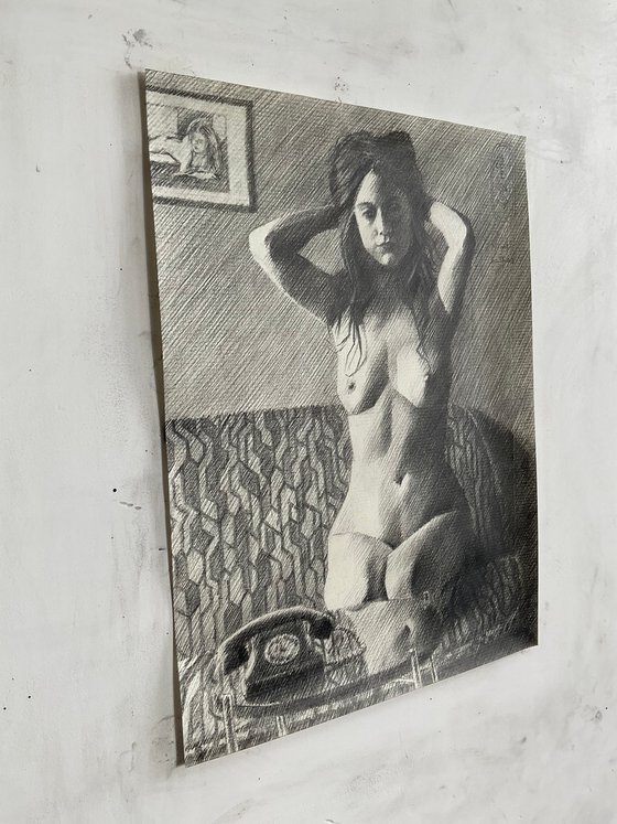
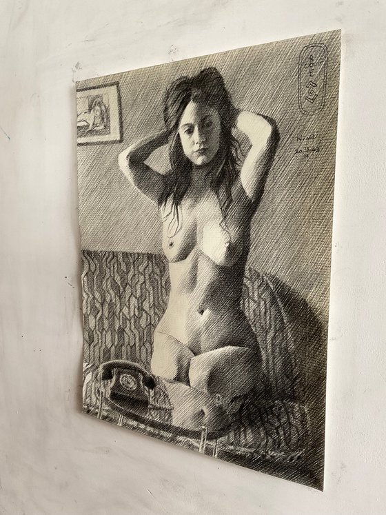
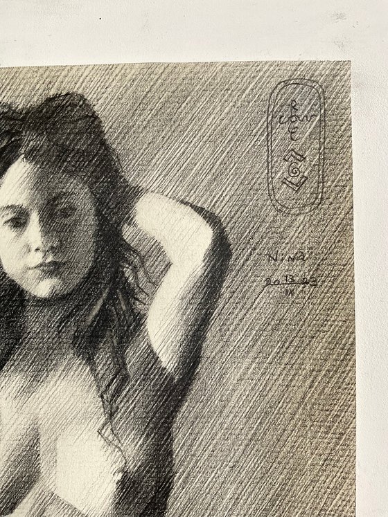
This graphite pencil drawing ‘Nina – 13-09-23’ a return to black and white but also to the technique of hatching. Last Spring I did a couple of landscapes and I remember ‘Marlot – 27-03-23’ was also executed in hatched strokes. Strange how these different styles linger about in my head. Then all of a sudden and for no particular reason one takes the lead. Or does it? Perhaps my rationality matched my gut feel in this particular situation. I asked Nina if she had some photos with true chiaroscuro tonal distributions. She referred me to this beautiful picture and I guess I saw the potential of the lighting. It certainly would be a match for my hatching skills. You see, througout the years I found out this technique renders me most sutble tonal transitions. This having decided, what’s next on the menu?
Cubist Styling
Last one of Nina was in done in color. My ambition was to match realism to cubist styling inasmuch people would feel the cubist styling to be real. That lead me to a full array of emotions. 90% found the artwork great. However, there were some nit-pickers that thought I shouldn’t mix up these two styles. Others found the neck particularly bulged, looking like goiter. I don’t mind. Although I have to admit combining styles can lead to confusion. Lovely! I like that and now I know I’m really on to something. Hence, the incorporation of cubism once more in the drawing at hand. Not that much but slightly in order to keep viewers on their toes, catch them off guard. Personally, I think the subtle styling looks a bit similar to the one applied in ‘Julia – 11-09-18’.
Jan Veth
The hatched strokes were also motivated by something else when I come to think of it. In my previous art statement I mentioned Jan Veth and his works on display in the Dordrechts Museum. One particular pen drawing I remembered, called ‘Louw the Gardener’. Rarely have I seen such gossamer lines meticulasly drawn in inkt. You know, using pencil I simply can erase some lines and start anew. Using inkt there no room for error. Yet, he managed to put all strokes horizontally without noticeable flaws. Then I knew I must do my best even more. We’re speaking of an artist living in an era without daylight lamps and running water. There was no flushable toilet. Transportation sucked big time. So there it is, I have cold and warm water, all the light I need and internet. There are plenty reference pictures and ideas on my screen. Keep going!
Erwin Olaf
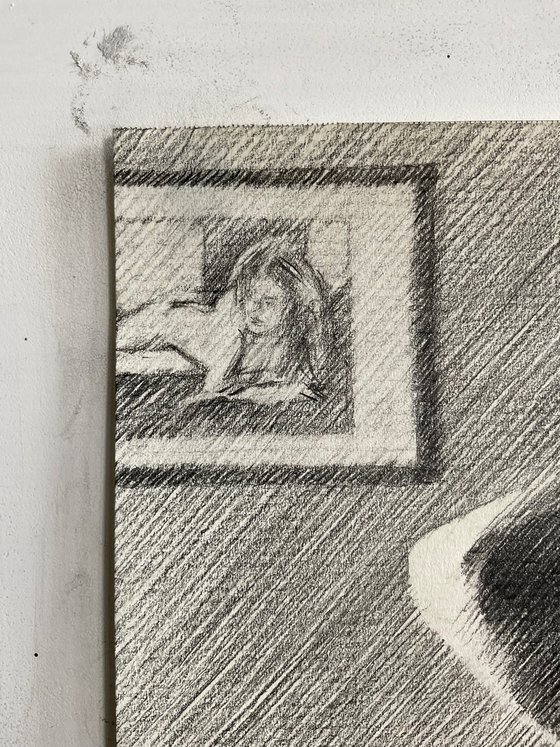
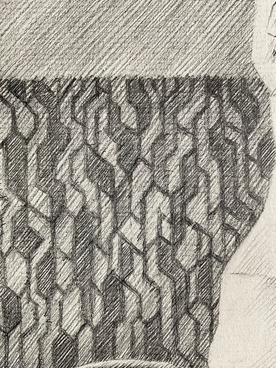
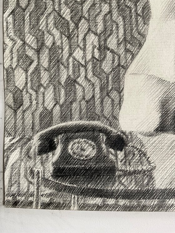
Setting out proportions and laying strokes came all very fine but as the drawing progressed something was missing. Just as with all smashing reference pictures taken by others, put in hunter words: it’s not my kill! So there it was, a void felt inside me that needed filling. In other words, I had to add something to the mix, putting my mark on the composition. Gradually I noticed I associated her and the couch with Erwin Olaf’s Hope series. That was all about women put in 60s and 70s settings. The pattern in the couch surely was conducive to that association. Last but not least I added a framed version of a previous drawing of her in the left uppercorner. The bakelite telephone is a direct reference to Erwin. All in all a bit of a double homage to two great artists.
Graphite pencil (Faber Castell Pitt Graphite Matt pencil 14B) drawing on Fabriano Ingres paper (21 x 29.7 x 0.1 cm)
Artist: Corné Akkers
Materials used:
Pitt Graphite Matt pencil (Faber-Castell) drawing on Fabriano Ingres paper (21 x 28.2 x 0.1 cm)
Tags:
#nude #cubism #art deco #roundism #neo decoNina - 13-09-23 (2023) Pencil drawing
by Corné Akkers
8 Artist Reviews
£1,288.2
- Pencil drawing on Paper
- One of a kind artwork
- Size: 21 x 28.2 x 0.1cm (unframed) / 21 x 28.2cm (actual image size)
- Signed on the front
- Style: Geometric
- Subject: Nudes and erotic
Loading
Original artwork description
Back to Hatch
This graphite pencil drawing ‘Nina – 13-09-23’ a return to black and white but also to the technique of hatching. Last Spring I did a couple of landscapes and I remember ‘Marlot – 27-03-23’ was also executed in hatched strokes. Strange how these different styles linger about in my head. Then all of a sudden and for no particular reason one takes the lead. Or does it? Perhaps my rationality matched my gut feel in this particular situation. I asked Nina if she had some photos with true chiaroscuro tonal distributions. She referred me to this beautiful picture and I guess I saw the potential of the lighting. It certainly would be a match for my hatching skills. You see, througout the years I found out this technique renders me most sutble tonal transitions. This having decided, what’s next on the menu?
Cubist Styling
Last one of Nina was in done in color. My ambition was to match realism to cubist styling inasmuch people would feel the cubist styling to be real. That lead me to a full array of emotions. 90% found the artwork great. However, there were some nit-pickers that thought I shouldn’t mix up these two styles. Others found the neck particularly bulged, looking like goiter. I don’t mind. Although I have to admit combining styles can lead to confusion. Lovely! I like that and now I know I’m really on to something. Hence, the incorporation of cubism once more in the drawing at hand. Not that much but slightly in order to keep viewers on their toes, catch them off guard. Personally, I think the subtle styling looks a bit similar to the one applied in ‘Julia – 11-09-18’.
Jan Veth
The hatched strokes were also motivated by something else when I come to think of it. In my previous art statement I mentioned Jan Veth and his works on display in the Dordrechts Museum. One particular pen drawing I remembered, called ‘Louw the Gardener’. Rarely have I seen such gossamer lines meticulasly drawn in inkt. You know, using pencil I simply can erase some lines and start anew. Using inkt there no room for error. Yet, he managed to put all strokes horizontally without noticeable flaws. Then I knew I must do my best even more. We’re speaking of an artist living in an era without daylight lamps and running water. There was no flushable toilet. Transportation sucked big time. So there it is, I have cold and warm water, all the light I need and internet. There are plenty reference pictures and ideas on my screen. Keep going!
Erwin Olaf
Setting out proportions and laying strokes came all very fine but as the drawing progressed something was missing. Just as with all smashing reference pictures taken by others, put in hunter words: it’s not my kill! So there it was, a void felt inside me that needed filling. In other words, I had to add something to the mix, putting my mark on the composition. Gradually I noticed I associated her and the couch with Erwin Olaf’s Hope series. That was all about women put in 60s and 70s settings. The pattern in the couch surely was conducive to that association. Last but not least I added a framed version of a previous drawing of her in the left uppercorner. The bakelite telephone is a direct reference to Erwin. All in all a bit of a double homage to two great artists.
Graphite pencil (Faber Castell Pitt Graphite Matt pencil 14B) drawing on Fabriano Ingres paper (21 x 29.7 x 0.1 cm)
Artist: Corné Akkers
Materials used:
Pitt Graphite Matt pencil (Faber-Castell) drawing on Fabriano Ingres paper (21 x 28.2 x 0.1 cm)
Tags:
#nude #cubism #art deco #roundism #neo deco14 day money back guaranteeLearn more
