- By medium
- By subject
- By budget
- Sales
- Gift cards
- Discover all art
- Artists
- Editors’ picks
- Ideas
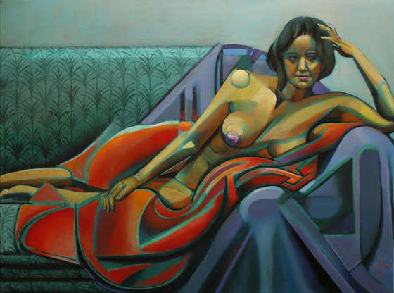
Original artwork description:
My New Style
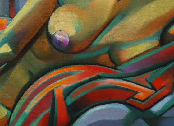
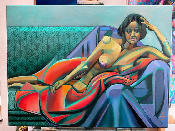
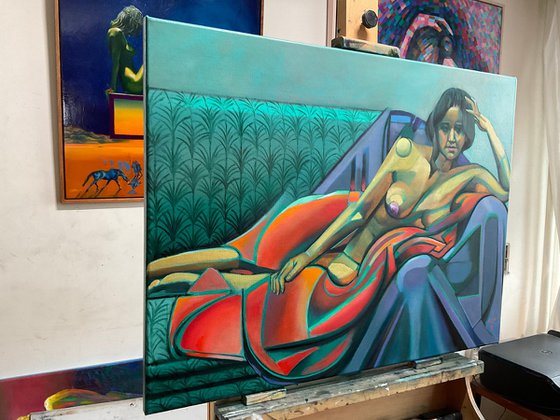
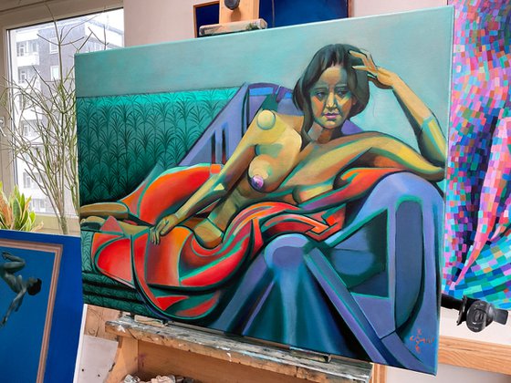
This oil painting ‘Neo Deco – 12-01-23’ incorporates new elements. Motivated as I was to continue my search after my last one I tried out something new. You see, some time ago I made a graphite pencil drawing ‘Woman in a Red Kimono – 03-11-22’. To my opinion that one already shows all the necessary elements for my new Neo Deco style. An intricate linear play, repetition of forms and foremost a contrast between straight structures and curves. Maybe I realized what I actually to want to get out of the style. It resembles art deco closely but I think there is a difference. The latter was merely focused on architecture, apparel and sculptures. There were some typical deco painters like Tamara de Lempicka. Surely I didn’t see all of them but they merely focus on exaggerating and manipulating body proportions. I have different plans!
Woman in a Red Kimono
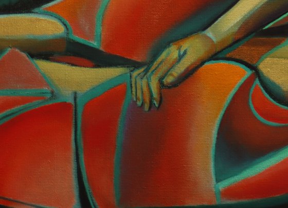
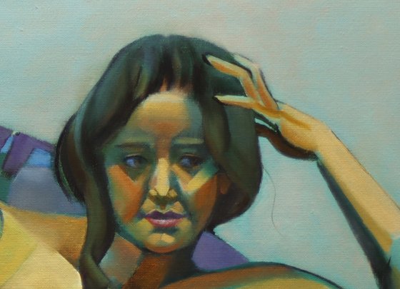
Aforementioned drawing became the artistic motif for this one. The goal was to enforce linear structures almost as if I would treat this piece as a drawing. Together with my paradigm ‘variation in repetition and repetition in variation’ I pursued a result sound yet vibrant. Obviously the challenge was to find a suitable color scheme. Originally I planned the satin cloth to be blue. However, during the process of painting this started to become a drag. Of couse I was stuck to the theme and had to paint the kimono red. Hence a green underlayer and I even kept a lot green in the attire, cloth and couch. My regular model is of indian descendance and in certain lighting her skin complexion turns golden yellow. Conclusion: the satin had to become purplish.
Color Balance
Last dots on the i’s were to soften the background a bit with muted oranges. In honor of art deco I decorated the couch with a typical pattern from that era. All in all, I think the composition is in balance now. Reds and yellows are engirdled by greens and purples. The unsaturated black lines serve as ligaments, tying but also separating planes of colors. This way weaker colors act as a counterbalance of the pungent kimono red. On to the next!
Oil on linen (60 x 80 cm)
Artist: Corné Akkers
Materials used:
Oil on linen (60 x 80 cm)
Tags:
#colorful #cubism #art deco #roundism #neo decoNeo Deco – 12-01-23 (2023) Oil painting
by Corné Akkers
8 Artist Reviews
£4,747.6
- Oil painting on Canvas
- One of a kind artwork
- Size: 80 x 60 x 0.9cm (unframed) / 80 x 60cm (actual image size)
- Signed on the front
- Style: Geometric
- Subject: Nudes and erotic
Loading
Original artwork description
My New Style
This oil painting ‘Neo Deco – 12-01-23’ incorporates new elements. Motivated as I was to continue my search after my last one I tried out something new. You see, some time ago I made a graphite pencil drawing ‘Woman in a Red Kimono – 03-11-22’. To my opinion that one already shows all the necessary elements for my new Neo Deco style. An intricate linear play, repetition of forms and foremost a contrast between straight structures and curves. Maybe I realized what I actually to want to get out of the style. It resembles art deco closely but I think there is a difference. The latter was merely focused on architecture, apparel and sculptures. There were some typical deco painters like Tamara de Lempicka. Surely I didn’t see all of them but they merely focus on exaggerating and manipulating body proportions. I have different plans!
Woman in a Red Kimono
Aforementioned drawing became the artistic motif for this one. The goal was to enforce linear structures almost as if I would treat this piece as a drawing. Together with my paradigm ‘variation in repetition and repetition in variation’ I pursued a result sound yet vibrant. Obviously the challenge was to find a suitable color scheme. Originally I planned the satin cloth to be blue. However, during the process of painting this started to become a drag. Of couse I was stuck to the theme and had to paint the kimono red. Hence a green underlayer and I even kept a lot green in the attire, cloth and couch. My regular model is of indian descendance and in certain lighting her skin complexion turns golden yellow. Conclusion: the satin had to become purplish.
Color Balance
Last dots on the i’s were to soften the background a bit with muted oranges. In honor of art deco I decorated the couch with a typical pattern from that era. All in all, I think the composition is in balance now. Reds and yellows are engirdled by greens and purples. The unsaturated black lines serve as ligaments, tying but also separating planes of colors. This way weaker colors act as a counterbalance of the pungent kimono red. On to the next!
Oil on linen (60 x 80 cm)
Artist: Corné Akkers
Materials used:
Oil on linen (60 x 80 cm)
Tags:
#colorful #cubism #art deco #roundism #neo deco14 day money back guaranteeLearn more
Artist Reviews (8)

Corné Akkers
Netherlands
About
Born in 1969 at Nijmegen. Corné's work can be seen in many countries all over the world.
Corné employs a variety of styles that all have one thing in common:... Read more