- By medium
- By subject
- By budget
- Sales
- Gift cards
- Discover all art
- Artists
- Editors’ picks
- Ideas
Original artwork description:
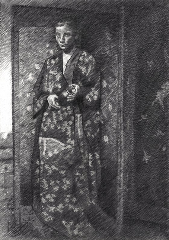
Hatching against the Form
My previous graphite pencil drawing ‘Geesje Kwak – 25-08-21’ was executed in my hatched strokes style and I kinda like it. Sometimes you just feel like doing this or that but in this particular case I understand better why. The textures in the reference picture are so delicate. Any attempt to draw them in the direction of the forms would render them too harsh. It would lead only to unwanted symbolism and as to me: I am a disciple of the light. The play of light and darkness impressionists that once characterized impressionists is a key factor I will celebrate always. Hatching against the form I would like to call it. It gives me forms that, though they look broken against the grain, show the exact impressionist or even realist view. In many only subtle tonal shifts is the only thing it takes.
Tonal Subtleties
The actual reference picture I used did not show these tonal subtleties at all. Geesje’s portrait almost seems like a puzzle piece, forelorn and astray across a landscape scattered by decorative flowery patterns. It is almost too much of a good thing and perhaps that is why Breitner did not use the picture for one of his paintings. Patterns and textures like these I can say from experience can lead to a messy look that convey nothing but a rubble pile. That is why I did two things. I introduced some darker linear structures throughout the depiction and I rendered most of the flowers a bit darker. The darker structures next to the Japanese screen at the right I also darkened up. They were poking in my eyes too much. The result of this all is a crossover between impressionism and cubism, just as my initial plan was.
Graphite pencil (Sakura 0.5 mm, Pentel 4B) drawing Talens Bristol paper (21 x 29.7 x 0.1 cm)
Artist: Corné Akkers
Materials used:
Graphite pencil drawing (Sakura 0.5 mm, 4B) on Talens Bristol paper (21 x 29.7 cm - A4 format)
Tags:
#cubism #roundism #akkers #corne #geesje kwakGeesje Kwak – 04-09-21 (2021) Pencil drawing
by Corné Akkers
8 Artist Reviews
£1,279.05
- Pencil drawing on Paper
- One of a kind artwork
- Size: 21 x 29.7 x 0.1cm (unframed) / 21 x 29.7cm (actual image size)
- Signed on the front
- Style: Geometric
- Subject: People and portraits
Loading
Original artwork description
Hatching against the Form
My previous graphite pencil drawing ‘Geesje Kwak – 25-08-21’ was executed in my hatched strokes style and I kinda like it. Sometimes you just feel like doing this or that but in this particular case I understand better why. The textures in the reference picture are so delicate. Any attempt to draw them in the direction of the forms would render them too harsh. It would lead only to unwanted symbolism and as to me: I am a disciple of the light. The play of light and darkness impressionists that once characterized impressionists is a key factor I will celebrate always. Hatching against the form I would like to call it. It gives me forms that, though they look broken against the grain, show the exact impressionist or even realist view. In many only subtle tonal shifts is the only thing it takes.
Tonal Subtleties
The actual reference picture I used did not show these tonal subtleties at all. Geesje’s portrait almost seems like a puzzle piece, forelorn and astray across a landscape scattered by decorative flowery patterns. It is almost too much of a good thing and perhaps that is why Breitner did not use the picture for one of his paintings. Patterns and textures like these I can say from experience can lead to a messy look that convey nothing but a rubble pile. That is why I did two things. I introduced some darker linear structures throughout the depiction and I rendered most of the flowers a bit darker. The darker structures next to the Japanese screen at the right I also darkened up. They were poking in my eyes too much. The result of this all is a crossover between impressionism and cubism, just as my initial plan was.
Graphite pencil (Sakura 0.5 mm, Pentel 4B) drawing Talens Bristol paper (21 x 29.7 x 0.1 cm)
Artist: Corné Akkers
Materials used:
Graphite pencil drawing (Sakura 0.5 mm, 4B) on Talens Bristol paper (21 x 29.7 cm - A4 format)
Tags:
#cubism #roundism #akkers #corne #geesje kwak14 day money back guaranteeLearn more
Artist Reviews (8)

Corné Akkers
Netherlands
About
Born in 1969 at Nijmegen. Corné's work can be seen in many countries all over the world.
Corné employs a variety of styles that all have one thing in common:... Read more