- By medium
- By subject
- By budget
- Sales
- Gift cards
- Discover all art
- Artists
- Editors’ picks
- Ideas
Artwork description:
This one is a limited edition variation to my original 'Anémone Animée' (please see separate listing) and I am very pleased with it - I hope you like it too.
'Anémone Animée 2' was hand-printed by me in four stages. I used 'blends', which is when you have two colours on the inking slab and you pick up and blend both colours on your roller. I don't have a roller that is long enough to ink the entire block in one go (and probably wouldn't buy one, as I would seldom use it) so I had to do both the background and foreground blocks in two stages.
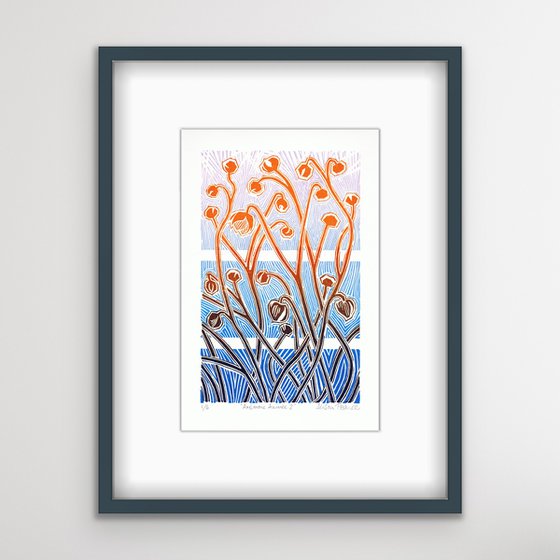
This is an original limited-edition print produced by hand in artists' quality oil-based inks on 130 gsm acid-free archival Clairefontaine Simili Japon paper. Only the best!
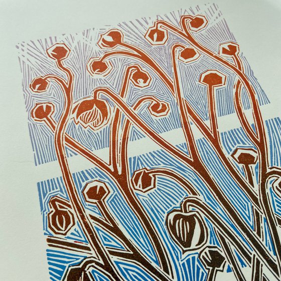
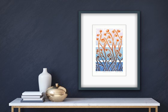
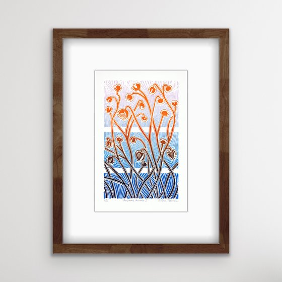
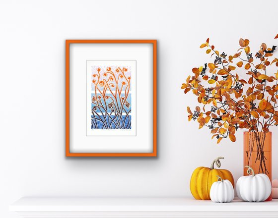
The artwork is sold unframed for ease and economy of shipping, but I have included some app-generated images showing it framed, for visualisation purposes. I have also included some photos of the print, taken at various angles, so that you get a feel for the special texture of a hand print, often lost in the flat scans of the artwork, if you know what I mean!
And if you're interested in the inspiration for this artwork:
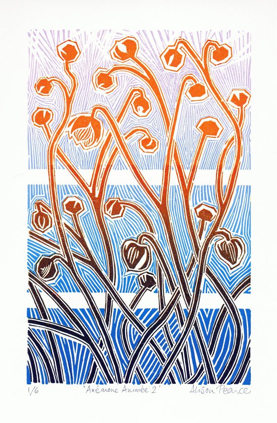
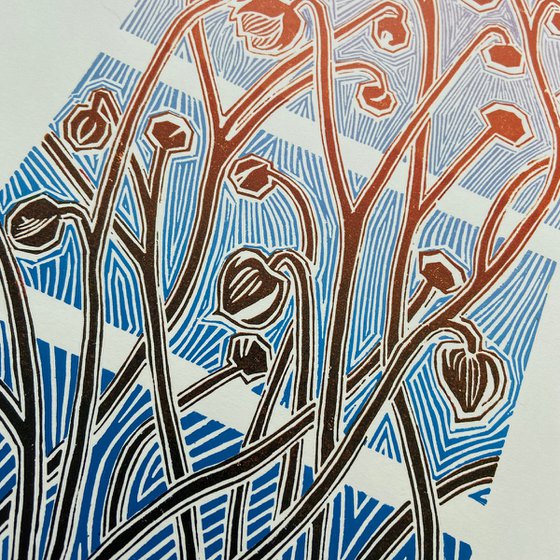
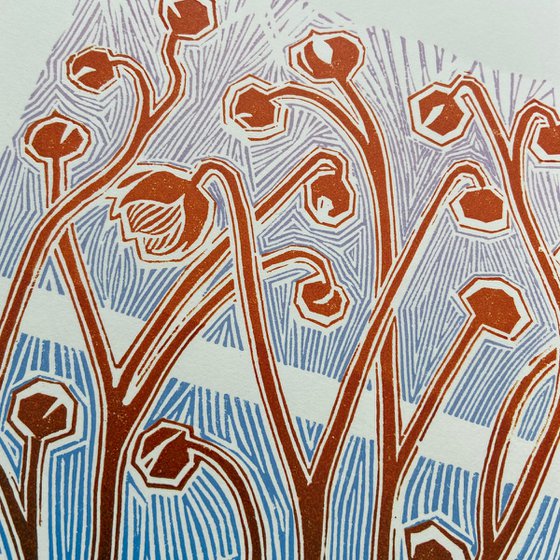
Nature offers endless design inspiration, don't you agree? Here, I began by leafing (yes, leafing, excuse the pun) through images of plant forms. I was looking for something peripheral, something suggested by an image, rather than an image to copy. I came across a photograph of Japanese anemones (also known as windflowers) and what immediately caught my eye was the blurry stems catching the sunlight in the background. The camera had diffused the stems into a fat central line with brighter (or sometimes darker) and thinner parallel lines either side. So I decided to make my design about the effect of lines next to lines. The stems have buds on the end or, once the flower is gone, the seed head, which the camera had again blurred and diffused into an orb with a halo.
All I now had to do was convert this into linocut! The linocut technique offers so many opportunities for incorporating different ways of cutting into the design. I didn't want it to look like it had been drawn with a stylus on a touchscreen. I wanted to make the most of the chiselled, sharp-edged shapes left by the physical tools. The lines parallel to the stems were fiendishly difficult to cut. Despite my best efforts, I often waivered off course and cut away too much, so there was no line left. As this kept happening, I realised that a line that is sometimes there, and sometimes not, creates a sense of movement.
With the background block (this being a two-block linocut) I divided it into three sections, as a graphic device. Do you see that the lino-cutting is gradated? The lines are widest-spaced at the bottom, medium-spaced in the middle and finest at the top, eventually dispersing into just light and movement.
Materials used:
Oil-based artists' quality printing inks on high quality acid-free archival paper
Tags:
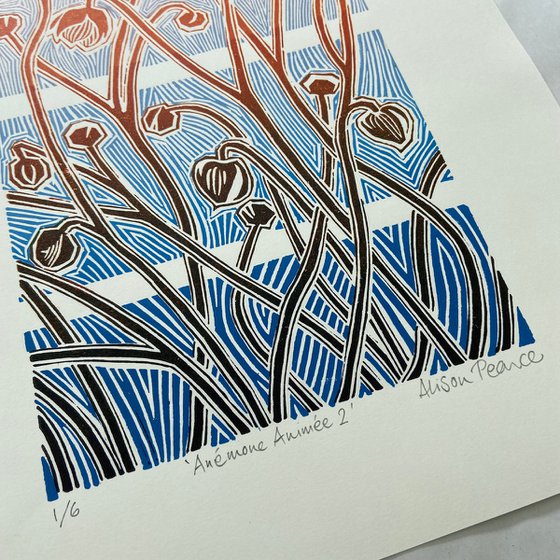
#flowers #blue #nature #orange #lines #pattern #movement #design #anemone #stemsAnémone Animée 2 (2022)
Linocut
by Alison Pearce
10 Artist Reviews
£79
- Linocut on Paper
- From a limited edition of 6
- Size: 24 x 32cm (unframed) / 14.5 x 23cm (actual image size)
- Signed and numbered on the front
- Style: Unspecified
- Subject: Flowers and plants
Artwork description
This one is a limited edition variation to my original 'Anémone Animée' (please see separate listing) and I am very pleased with it - I hope you like it too.
'Anémone Animée 2' was hand-printed by me in four stages. I used 'blends', which is when you have two colours on the inking slab and you pick up and blend both colours on your roller. I don't have a roller that is long enough to ink the entire block in one go (and probably wouldn't buy one, as I would seldom use it) so I had to do both the background and foreground blocks in two stages.
This is an original limited-edition print produced by hand in artists' quality oil-based inks on 130 gsm acid-free archival Clairefontaine Simili Japon paper. Only the best!
The artwork is sold unframed for ease and economy of shipping, but I have included some app-generated images showing it framed, for visualisation purposes. I have also included some photos of the print, taken at various angles, so that you get a feel for the special texture of a hand print, often lost in the flat scans of the artwork, if you know what I mean!
And if you're interested in the inspiration for this artwork:
Nature offers endless design inspiration, don't you agree? Here, I began by leafing (yes, leafing, excuse the pun) through images of plant forms. I was looking for something peripheral, something suggested by an image, rather than an image to copy. I came across a photograph of Japanese anemones (also known as windflowers) and what immediately caught my eye was the blurry stems catching the sunlight in the background. The camera had diffused the stems into a fat central line with brighter (or sometimes darker) and thinner parallel lines either side. So I decided to make my design about the effect of lines next to lines. The stems have buds on the end or, once the flower is gone, the seed head, which the camera had again blurred and diffused into an orb with a halo.
All I now had to do was convert this into linocut! The linocut technique offers so many opportunities for incorporating different ways of cutting into the design. I didn't want it to look like it had been drawn with a stylus on a touchscreen. I wanted to make the most of the chiselled, sharp-edged shapes left by the physical tools. The lines parallel to the stems were fiendishly difficult to cut. Despite my best efforts, I often waivered off course and cut away too much, so there was no line left. As this kept happening, I realised that a line that is sometimes there, and sometimes not, creates a sense of movement.
With the background block (this being a two-block linocut) I divided it into three sections, as a graphic device. Do you see that the lino-cutting is gradated? The lines are widest-spaced at the bottom, medium-spaced in the middle and finest at the top, eventually dispersing into just light and movement.
Materials used:
Oil-based artists' quality printing inks on high quality acid-free archival paper
Tags:
#flowers #blue #nature #orange #lines #pattern #movement #design #anemone #stemsReturns and refunds
We want you to love your art! If you are not completely satisfied with your purchase you can return it free within 14 days, no questions asked. Learn more
Artist Reviews (10)
This artwork is sold by Alison Pearce from United Kingdom

Alison Pearce
United Kingdom
About
What is it about printmaking? It's a combination of the artistic and the technical, and there's an element of. . . chance! When I gently peel that print off the... Read more

