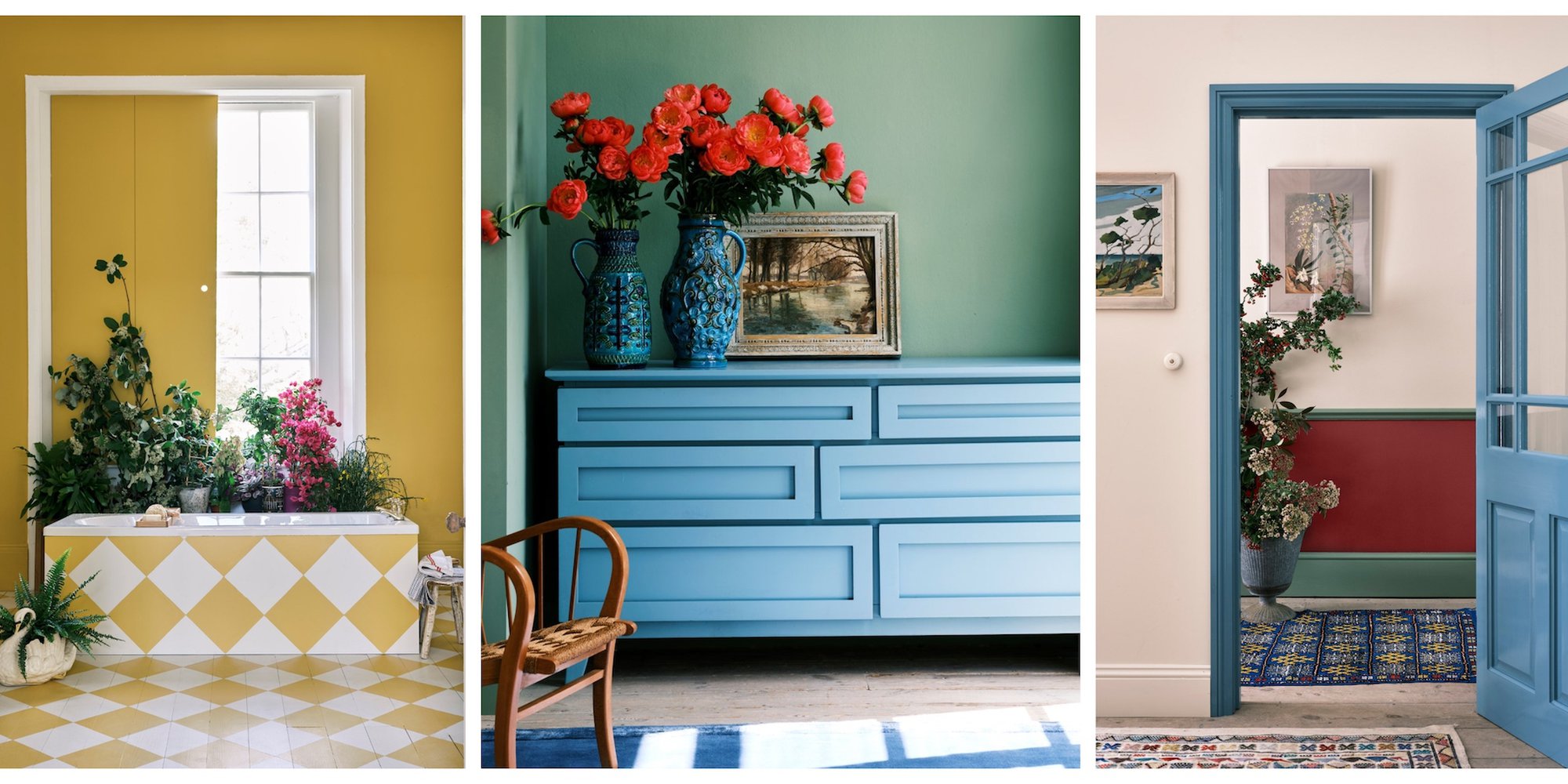
Much-loved paint brand, Farrow & Ball have revealed what they see as the colours that will define 2022. The company’s new collection was carefully chosen by expert colour consultant, Joa Studholme, and are revealed to be Babouche; a cheerful sunshine yellow, Breakfast Room Green, Stone Blue, Incarnadine; a deep crimson, and School House White.
Studholme picked up on a collective shift towards “the modest character of folk and craft.” The end result is “an eclectic mix of the pure and humble” tones that use colour “in unusual ways to celebrate the principles of utility, kindness, and honesty.”
The collection’s five hues have strong nostalgic resonance, representing the primary colours of red, blue and yellow, but with muted tones that create a vintage feel. The colours have a certain playfulness to them, whilst echoing the traditional and exploring how colour can be a meeting ground between the past and the present.
Matching your art
If you decide to take inspiration from Farrow & Ball to give your walls a fresh lick of paint, you may be wondering how you can select art that works with your new wall colour, rather than clashing horribly against it.
There are essentially two ways that you can go; choose similar or neutral tones to bring cohesion to your decor, or create a bold statement by choosing opposing colours, allowing the artwork to make more of an impact in the room.
A monochromatic design brings a uniform, harmonious look to your space by making use of just one colour in different shades. For example, layering predominantly white or neutral-toned artworks on top of School House White will create a layering of different textures and create a luxurious, contemporary feel.
Analogous colours are ones that are next to each other on the colour wheel. Using different shades of a similar hue will create a balance between your wall colour and artwork. Try to pick one dominant colour and use the other two or three as accents.
Complementary colours are those that appear opposite on the colour wheel, such as yellow and blue. Whilst these colours are technically opposites, they will work together whilst creating a more bold, exciting look for your decor.
As one of Farrow & Ball’s colours is a vivid red, you may want to choose pops of this shade across the room. Accents of Incarnadine will also work well against Breakfast Room Green and Stone Blue.
Inspired by Farrow & Ball’s colour selections, our Curator Helen has created a collection of artworks that pull these themes together; vintage nostalgia, artworks with a folksy feel, traditional landscapes and still lifes, and artworks featuring bold colours to really draw out or complement the different hues.
Shop The Collection
Cover image c.James Merrell/Farrow & Ball