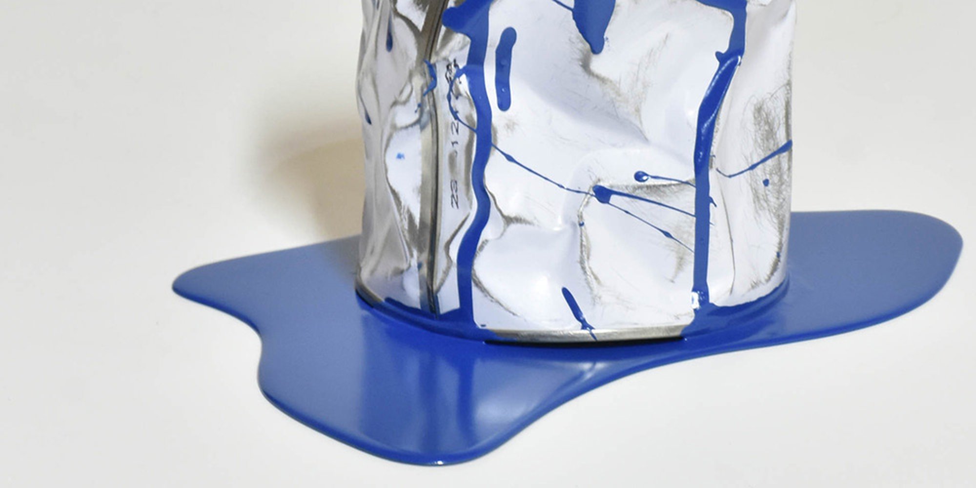
Just as plein air painting, nude art and Surrealism are deeply rooted in art history, so is the colour blue.
Blue is a favourite colour across the world and its significance in society extends all the way back to the beginning of time and the days of the hunter-gatherer. It’s a colour that has inspired many, from Picasso’s Blue Period to Katharina Fritsch’s Hahn / Cock’ sculpture in London's Trafalgar Square.
What's the significance of blue?
Research proves the the colour blue has the ability to reduce blood pressure, heartbeat and respiration as well as create a calming atmosphere.
But why? Way back in the day of hunter-gatherers, it was believed that those attracted to positive, blue things such as the clear skies and suitable drinking water were more likely to survive. Therefore, our attraction to blue has been declared as something that has been ingrained in our being and the product of evolution. Mind blowing, isn’t it?
As the colour of the sky, blue has adopted a connection to the spiritual world throughout its usage in history. This also has roots in art history. In the early 1300s, Italian artist, Giotto, painted the ceiling of the Arena Chapel blue as a way of representing the heavens. Art historians therefore mark the Arena Chapel as the reference point for the beginning of the usage of blue by artists to represent the spiritual world.
History of blue pigment
The colour blue was also associated with the divine due to its rarity.
In nature, the colour blue can be found in the form of water and the sky which are both elements of nature that cannot be crushed into a pigment. Therefore, the first synthetic blue was quite the feat to make.
Egyptian blue was invented in 2,000 B.C. by combining limestone and sand with a copper-containing mineral which was then heated to temperatures up to 900 degrees celsius. The result was a blue glass that was then crushed up and mixed with materials like egg whites to create paint. Starting to feel a bit more appreciative of a tube of blue paint?
In the 13th century, ultramarine, which is made from the gemstone lapis lazuli, arrived in Venice from Afghanistan and instantly rose to the top of everyone’s wish list as the most sought after pigment on the continent.
As it was so rare and therefore highly expensive, this pigment was typically reserved for the important people being depicted, such as the Virgin Mary. The result was the continuation of the usage of the colour blue to reference the spiritual world but also the usage of the colour in royalty to signify wealth.
Yves Klein and blue
Following the discovery of ultramarine blue were a number of others, such as Indigo and Prussian blue, both of which also have an extensive history. But even in the 20th century there still existed a fixation with ultramarine blue, particularly seen in the work of French artist, Yves Klein.
Klein’s deeply rooted fixation on the sky and love for Giotto’s work both paved a natural path for his passion for the colour blue, particularly ultramarine. His work, be it sculptures or canvas paintings, are all monochrome (artwork that is a single colour) with a sole focus on blue after 1957 following his discovery of International Klein Blue (IKB).
Klein found that mixing the ultramarine pigment with traditional binders to turn it into paint actually dulled the striking colour that he fell in love with. Following much investigation, in 1957 Klein discovered that mixing the pigment with a synthetically produced binder preserved its luminosity, and alas, Klein’s self named patented colour was born.
While controversial at the time as monochromes tended to be, Klein’s work offers a spiritual, contemplative experience for the viewer. Remember Rothko’s Chapel? Kind of like that.
In 1999, Pantone selected Cerulean Blue as the colour of the year, and therefore, the colour of the new millennium. Stating that Cerulean’s connection to the sky promotes a calming effect as it reminds us of holidays at the beach and moments of relaxation, Pantone asserted that this blue is the colour of the masses. Not far off from our hunter-gathering ancestors right?
The evolution of the colour blue proves that role of colour in art history is just as important as any art movements or new art-making technologies. In fact, the colour has the capability to tell us more about the social histories of peoples than one would think.
In essence, art history has the blues, but it’s not sad about it.
Cover image via Yannick Bouillault


