Original artwork description:
Clairobscur – 06-10-20
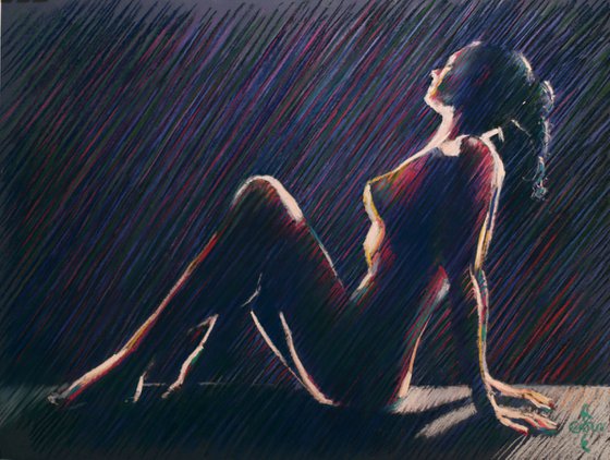
Clairobscur
In 2013 I started this clairobscur lit nude and tucked it in one of pastel maps, only to forget about it for years and years. I remembered I was not quite satisfied by the color saturation and the color scheme itself. It leaned too much on the red and purple side. Besides that, the proportions were slightly off.
Mishaps
If you become curious right now, I have a whole bag of mishaps loitering about. It is one of the long and winding roads an artist has to take, especially when frantically looking for a style to call my own. In the meantime this kind of impressionism in hatched strokes I did a lot but once in a while it is fun to take it up once again. In fact posting ‘Pastel Study 04 (2013)’ reminded me to finish this one.
Second Chance
Sometimes you have to give a pastel a second chance or in other worlds, give myself a new shot at it. The solution was fairly simple. I adjusted the foreshortening a bit and added green to the scene, compensating for the deep dark purples and reds that come from Schmincke and Unison. Sometimes the color it is too dire and hatching some greens in might do the trick, resulting in almost a kind of divisionism as employed by pointillists.
Pastel drawing on Canson Mi-Teintes Touch paper (50 x 65 x 0.1 cm)
Artist: Corné Akkers
Materials used:
Pastel drawing on Canson Mi-Teintes Touch paper (50 x 65 x 0.1 cm)
Tags:
#impressionism #nude #akkers #corne #clairobscurClairobscur – 06-10-20 (2020)
Pencil drawing
by Corné Akkers
8 Artist Reviews
£1,290.75
- Pencil drawing on Paper
- One of a kind artwork
- Size: 65 x 50 x 0.1cm (unframed) / 62 x 47cm (actual image size)
- Signed on the front
- Style: Impressionistic
- Subject: Nudes and erotic
Original artwork description
Clairobscur – 06-10-20
Clairobscur
In 2013 I started this clairobscur lit nude and tucked it in one of pastel maps, only to forget about it for years and years. I remembered I was not quite satisfied by the color saturation and the color scheme itself. It leaned too much on the red and purple side. Besides that, the proportions were slightly off.
Mishaps
If you become curious right now, I have a whole bag of mishaps loitering about. It is one of the long and winding roads an artist has to take, especially when frantically looking for a style to call my own. In the meantime this kind of impressionism in hatched strokes I did a lot but once in a while it is fun to take it up once again. In fact posting ‘Pastel Study 04 (2013)’ reminded me to finish this one.
Second Chance
Sometimes you have to give a pastel a second chance or in other worlds, give myself a new shot at it. The solution was fairly simple. I adjusted the foreshortening a bit and added green to the scene, compensating for the deep dark purples and reds that come from Schmincke and Unison. Sometimes the color it is too dire and hatching some greens in might do the trick, resulting in almost a kind of divisionism as employed by pointillists.
Pastel drawing on Canson Mi-Teintes Touch paper (50 x 65 x 0.1 cm)
Artist: Corné Akkers
Materials used:
Pastel drawing on Canson Mi-Teintes Touch paper (50 x 65 x 0.1 cm)
Tags:
#impressionism #nude #akkers #corne #clairobscurReturns and refunds
We want you to love your art! If you are not completely satisfied with your purchase you can return it free within 14 days, no questions asked. Learn more
Artist Reviews (8)
This artwork is sold by Corné Akkers from Netherlands

Corné Akkers
Netherlands
About
Born in 1969 at Nijmegen. Corné's work can be seen in many countries all over the world.
Corné employs a variety of styles that all have one thing in common:... Read more

