Original artwork description:
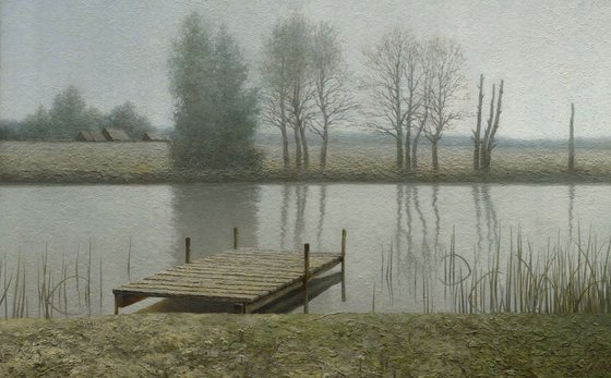
This artwork had begun year and a half ago, on the summer plein air at the village Stupinka, Kaluga Region. We loaded in the cars in the morning and drove away from the camp, searching for the good views. Speaking honestly, nobody knew where to drive. We just drove somewhere. For no reason, at random.
We turned to the river. The morning haze, which covered the sky, barely sieved the dim sun. The riversides were plunging into the spilled water and stretched far away into the width. The reflections of the trees were floating evenly by the river. The shape, the lighting and the colors were quiet and lyric. And all in that place was under some smooth, calm rhythm.
When I was at the dock, there was not much time to work, so I decided to fix the things in the study that a camera wasn’t able to express: tones and coloring. When I came back to Moscow, I decided to try to make a painting from this study. The main idea was to paint a calm, measured, wide painting, and the coloring was helping that. I decided that the frame aspect of the painting should be wide, the lines should be horizontal and vertical, the coloring should be narrow, light-grey, a bit warm, and the colors should softly blend with each other.
In the autumn I ordered a frame sized 75×120 cm (30×47 inches), stretched a canvas and started to work. For me it was a giant size, because even a small study, 20×30 cm (8×12 inches), takes up to a week of work. I had transferred the drawing precisely from the study, did an underpainting, and did a texture layer on the foreground. When I started to set the colors of the trees, the foreground and the background, I encountered the problems: it was dark, too contrasting, and the colors were too saturated. Ok, nothing awful, I would make it right later!
When I started to work on the sky, it appeared that with the time I had to work, I not only could not pick up the right color of this sky, but I couldn’t even paint it. In several days the paint dried and became a dense mess.
I somehow finished the sky, but when I tried to paint the water, I encountered the same problems again: I didn’t have enough time. Moreover, I had to paint the reflections softly! I barely managed to paint the water so that the paint wouldn’t dry, never mind the reflections. But I didn’t give up hope that I would be able to plunge them softly into the water.
How to paint the reflections was also a riddle. In the study I had done them as smoothly blurred vertical lines, but I didn’t paint a branch. In the photo there were also only the trunks. I was lucky: I had just bought a book about light and found that the weather like it was creates waves on the surface of the river, such that from the river bank a viewer could only see the reflection of the vertical trunks of the trees, but not the horizontal branches.
In the end I made the reflections, but I wasn’t satisfied with the result. I didn’t manage to paint them softly in the water, and all the relations in the painting were rough. The study was better. Furthermore, on such a big canvas the right side of the field seemed empty and boring. I understood that if I wanted to change that, I needed to start all the work again from the beginning. In the spring I decided to start the work from the beginning, despite the time I had already spent on it.
I had taken the mistakes into account and this time I ordered a smaller frame in order to have time to paint big spaces while they were still wet. At the end of the summer I started working on the painting. I changed the positions of the trees, filling the riverside with them. I did the underpainting once again, and put down a dense layer of paint to depict the texture of the grass and the leaves in the foreground. Then I made the approximate color of the riverbanks. To work thoroughly I started with the sky. I painted the light part with the light-grey, almost white color. This spot became a tuning fork, a reference point, for the other tones. Compared to that part, the rest should slightly, barely perceptively, get darker. Then I painted the water, slightly darker than the sky, and picked up the rest of the tones, comparing them to the water.
Working on the color happened to be really exhausting. Of all my work, in this one I felt how the neighboring colors influenced the perception. Just adding a bit more green and the color breaks away from the coloring. I had to add many layers to the first plane, but I was pleased that the mess of the paint turned into the leaves and the grass, which were interesting to view by themselves. And, finally I managed to paint big spaces while they were wet.
Whether I managed to express the image is for you to decide!
-----------
Please note that I'll be able to dispatch the work for shipping in two weeks. I need adequate time to get the official documents to pass customs control, and it's hard to influence this timing. If you need it really fast, please contact me via message on Artfinder and I'll see if I can speed it up.
I can add a frame personally chosen by me to it, but it will increase the price and some people like to choose frames on their own. If you are interested in that, write me a personal message and we'll discuss it.
If your country isn't in the shipping list, you can contact me via private messages.
P.s. Feel free to contact me if you have any questions
Materials used:
Oil
Tags:
#landscape #nature #landscape painting #impressionism #water #forest #realism #river #impressionistic #realistic #village #calm #field #landscape oil painting #grass #calming #serenity #river painting #pier #quiet #riverside #dock #landscape oil painting on canvas #landscape oil #water flow #water flowingCalm Dock (2014)
Oil painting
by Daniil Belov
3 Artist Reviews
£3,417.6
- Oil painting on Canvas
- One of a kind artwork
- Size: 120 x 85 x 2cm (framed) / 90 x 55cm (actual image size)
- Framed and ready to hang
- Signed on the front
- Style: Photorealistic
- Subject: Landscapes, sea and sky
Original artwork description
This artwork had begun year and a half ago, on the summer plein air at the village Stupinka, Kaluga Region. We loaded in the cars in the morning and drove away from the camp, searching for the good views. Speaking honestly, nobody knew where to drive. We just drove somewhere. For no reason, at random.
We turned to the river. The morning haze, which covered the sky, barely sieved the dim sun. The riversides were plunging into the spilled water and stretched far away into the width. The reflections of the trees were floating evenly by the river. The shape, the lighting and the colors were quiet and lyric. And all in that place was under some smooth, calm rhythm.
When I was at the dock, there was not much time to work, so I decided to fix the things in the study that a camera wasn’t able to express: tones and coloring. When I came back to Moscow, I decided to try to make a painting from this study. The main idea was to paint a calm, measured, wide painting, and the coloring was helping that. I decided that the frame aspect of the painting should be wide, the lines should be horizontal and vertical, the coloring should be narrow, light-grey, a bit warm, and the colors should softly blend with each other.
In the autumn I ordered a frame sized 75×120 cm (30×47 inches), stretched a canvas and started to work. For me it was a giant size, because even a small study, 20×30 cm (8×12 inches), takes up to a week of work. I had transferred the drawing precisely from the study, did an underpainting, and did a texture layer on the foreground. When I started to set the colors of the trees, the foreground and the background, I encountered the problems: it was dark, too contrasting, and the colors were too saturated. Ok, nothing awful, I would make it right later!
When I started to work on the sky, it appeared that with the time I had to work, I not only could not pick up the right color of this sky, but I couldn’t even paint it. In several days the paint dried and became a dense mess.
I somehow finished the sky, but when I tried to paint the water, I encountered the same problems again: I didn’t have enough time. Moreover, I had to paint the reflections softly! I barely managed to paint the water so that the paint wouldn’t dry, never mind the reflections. But I didn’t give up hope that I would be able to plunge them softly into the water.
How to paint the reflections was also a riddle. In the study I had done them as smoothly blurred vertical lines, but I didn’t paint a branch. In the photo there were also only the trunks. I was lucky: I had just bought a book about light and found that the weather like it was creates waves on the surface of the river, such that from the river bank a viewer could only see the reflection of the vertical trunks of the trees, but not the horizontal branches.
In the end I made the reflections, but I wasn’t satisfied with the result. I didn’t manage to paint them softly in the water, and all the relations in the painting were rough. The study was better. Furthermore, on such a big canvas the right side of the field seemed empty and boring. I understood that if I wanted to change that, I needed to start all the work again from the beginning. In the spring I decided to start the work from the beginning, despite the time I had already spent on it.
I had taken the mistakes into account and this time I ordered a smaller frame in order to have time to paint big spaces while they were still wet. At the end of the summer I started working on the painting. I changed the positions of the trees, filling the riverside with them. I did the underpainting once again, and put down a dense layer of paint to depict the texture of the grass and the leaves in the foreground. Then I made the approximate color of the riverbanks. To work thoroughly I started with the sky. I painted the light part with the light-grey, almost white color. This spot became a tuning fork, a reference point, for the other tones. Compared to that part, the rest should slightly, barely perceptively, get darker. Then I painted the water, slightly darker than the sky, and picked up the rest of the tones, comparing them to the water.
Working on the color happened to be really exhausting. Of all my work, in this one I felt how the neighboring colors influenced the perception. Just adding a bit more green and the color breaks away from the coloring. I had to add many layers to the first plane, but I was pleased that the mess of the paint turned into the leaves and the grass, which were interesting to view by themselves. And, finally I managed to paint big spaces while they were wet.
Whether I managed to express the image is for you to decide!
-----------
Please note that I'll be able to dispatch the work for shipping in two weeks. I need adequate time to get the official documents to pass customs control, and it's hard to influence this timing. If you need it really fast, please contact me via message on Artfinder and I'll see if I can speed it up.
I can add a frame personally chosen by me to it, but it will increase the price and some people like to choose frames on their own. If you are interested in that, write me a personal message and we'll discuss it.
If your country isn't in the shipping list, you can contact me via private messages.
P.s. Feel free to contact me if you have any questions
Materials used:
Oil
Tags:
#landscape #nature #landscape painting #impressionism #water #forest #realism #river #impressionistic #realistic #village #calm #field #landscape oil painting #grass #calming #serenity #river painting #pier #quiet #riverside #dock #landscape oil painting on canvas #landscape oil #water flow #water flowingReturns and refunds
We want you to love your art! If you are not completely satisfied with your purchase you can return it free within 14 days, no questions asked. Learn more
Artist Reviews (3)
This artwork is sold by Daniil Belov from Russia
Daniil Belov
Russia
About
Fear and bravery, beauty and ugliness are felt in different ways. I have different ideas and impressions. I have different feelings, ideas and impressions. That's why I try not to... Read more

