Original artwork description:
Beek-Ubbergen – 01-10-20
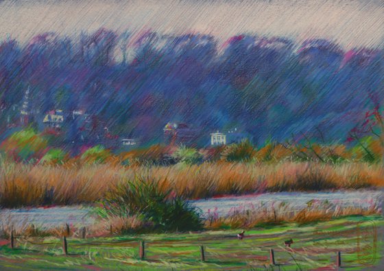
50 Hues of Pink
Beek-Ubbergen again and 50 shades of pink in honour of the fact that colour is highly underestimated in landscapes and outdoors in general. The more I look at woods, forest, meadows and all things natural under the light of the sky, the more I come to realize daylight seems to become scattered and torn apart and show all kinds of hues, no matter what hue a substance holds initially. All things green like trees and grasses do not show green only and if they do (for the untrained eye) from an artistic point of view all that green violence has to be counterbalanced by other colors. Ipse Dixit!
The Actual Spot
When I was driving along ’t Meertje (see my last drawing Beek 28-09-20) I decided to head to Persingen where I took this photo. At the left there this is baroque kind of tower that is part of Villa Waalheuvel, which serves as a kind of landmark of Ubbergen, just as the former monastery Notre Dame des Anges. In the front ’t Meertje is lingering, the former river Rhine where Romans transported their roof tiles on.
50 Hues of Blue, Purple and Green
The view on the Lower Rhine Heights (see previous drawing) creates a kind of blue screen when you look at it from a distance for the first time, especially on the brink of Spring when there are not much green leafs to be seen. When you take the time to let it all sink down and scrutinize, then a world seems to open up in front of your eyes. There is some much color to discover: hints of green, blue, purple, even faint yellow and pink. Basically I put them all in only to put them under a kind of blue pencil coat. My hatches strokes proved to become handy as contour delineations from a distance will not be depicted in the right way by drawing in the direction of the forms anyway.
The Front
I kept the front quite simple. The bush next to the middle almost serves like a repoussoir. The poles give me the opportunity to draw some sharp contrasting details in the front and the geese serve as a reference with regard tot he scaling of it all.
Colored pencil drawing on Talens Mixed Toned Color paper (21 x 29.5 x 0.1 cm) - A4 format)
Artist: Corné Akkers
Materials used:
Colored pencil and pastel drawing on Talen toned colour paper (21 x 29.7 x 0.1 cm) - A4 format)
Tags:
#landscape #impressionism #akkers #corne #clairobscurBeek-Ubbergen – 01-10-20 (2020)
Pencil drawing
by Corné Akkers
8 Artist Reviews
£1,290.75
- Pencil drawing on Paper
- One of a kind artwork
- Size: 29.7 x 21 x 0.1cm (unframed) / 29.7 x 21cm (actual image size)
- Signed on the front
- Style: Geometric
- Subject: Landscapes, sea and sky
Original artwork description
Beek-Ubbergen – 01-10-20
50 Hues of Pink
Beek-Ubbergen again and 50 shades of pink in honour of the fact that colour is highly underestimated in landscapes and outdoors in general. The more I look at woods, forest, meadows and all things natural under the light of the sky, the more I come to realize daylight seems to become scattered and torn apart and show all kinds of hues, no matter what hue a substance holds initially. All things green like trees and grasses do not show green only and if they do (for the untrained eye) from an artistic point of view all that green violence has to be counterbalanced by other colors. Ipse Dixit!
The Actual Spot
When I was driving along ’t Meertje (see my last drawing Beek 28-09-20) I decided to head to Persingen where I took this photo. At the left there this is baroque kind of tower that is part of Villa Waalheuvel, which serves as a kind of landmark of Ubbergen, just as the former monastery Notre Dame des Anges. In the front ’t Meertje is lingering, the former river Rhine where Romans transported their roof tiles on.
50 Hues of Blue, Purple and Green
The view on the Lower Rhine Heights (see previous drawing) creates a kind of blue screen when you look at it from a distance for the first time, especially on the brink of Spring when there are not much green leafs to be seen. When you take the time to let it all sink down and scrutinize, then a world seems to open up in front of your eyes. There is some much color to discover: hints of green, blue, purple, even faint yellow and pink. Basically I put them all in only to put them under a kind of blue pencil coat. My hatches strokes proved to become handy as contour delineations from a distance will not be depicted in the right way by drawing in the direction of the forms anyway.
The Front
I kept the front quite simple. The bush next to the middle almost serves like a repoussoir. The poles give me the opportunity to draw some sharp contrasting details in the front and the geese serve as a reference with regard tot he scaling of it all.
Colored pencil drawing on Talens Mixed Toned Color paper (21 x 29.5 x 0.1 cm) - A4 format)
Artist: Corné Akkers
Materials used:
Colored pencil and pastel drawing on Talen toned colour paper (21 x 29.7 x 0.1 cm) - A4 format)
Tags:
#landscape #impressionism #akkers #corne #clairobscurReturns and refunds
We want you to love your art! If you are not completely satisfied with your purchase you can return it free within 14 days, no questions asked. Learn more
Artist Reviews (8)
This artwork is sold by Corné Akkers from Netherlands

Corné Akkers
Netherlands
About
Born in 1969 at Nijmegen. Corné's work can be seen in many countries all over the world.
Corné employs a variety of styles that all have one thing in common:... Read more

