Original artwork description:
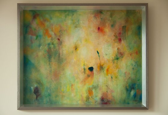
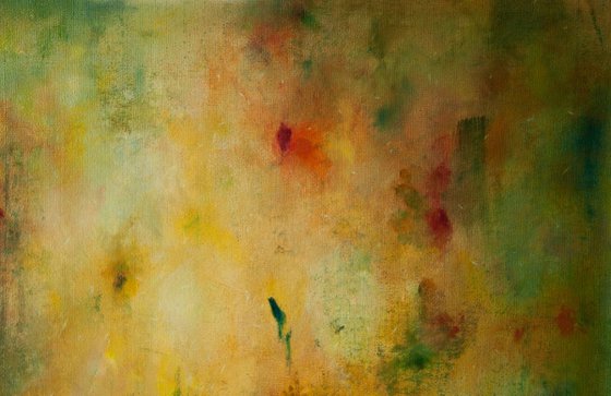
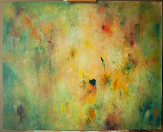
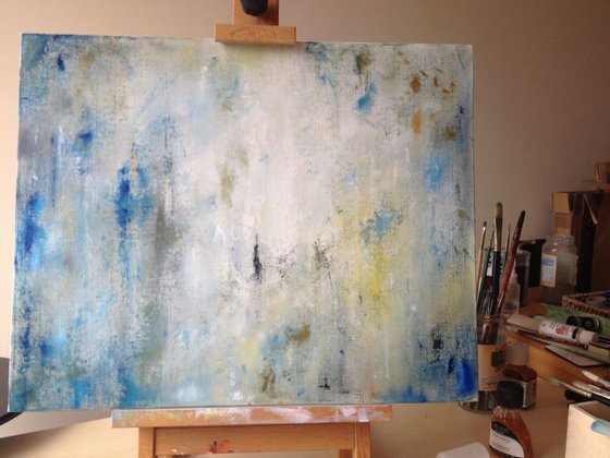
As I was painting this I was thinking about the natural lighting effects that glow: dust in sunbeams, early morning mist, sunlight through water.
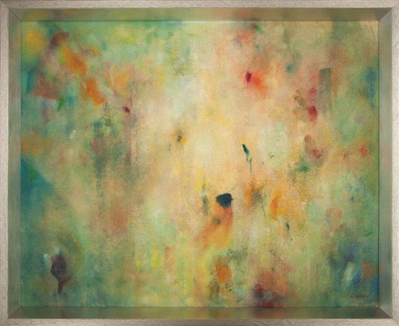
This painting is full of strong but soft colour, and subtle shifts in tone and light. Overall the tone is warm. It is framed, without glass, in a stylish grey frame, the angled plane of which is metal, which beautifully reflects the colours of the painting.
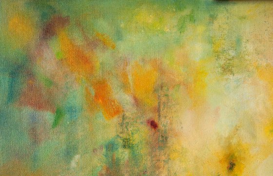
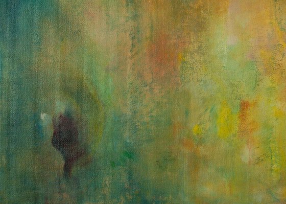
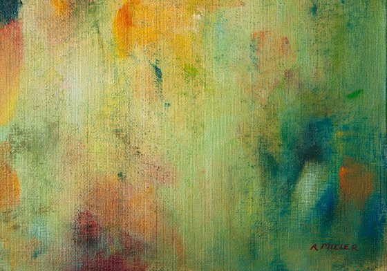
I've used the classic structure of an oil painting, darks and lights underneath with coloured glazes over the top. In the base layer I used black, white, blue, and yellow, to try to create patches of light/dark and warm/cold, aiming for a dappled sunlight effect. The basic structure is a vignette - light in the middle, dark round the outside. I made natural brush free marks using a palette knife to create texture, and smudged round the outside to emphasise the vignette composition. I am pleased with the resulting texture and blended softness.
For the top glaze I restricted myself to warm colours: yellows, reds and pinks, (with a little blue) as these were the colours I'd liked the result of most in the first experiment. I didn't use much white, as I wanted to allow as much of the tonal range of the underlayer to show through as possible. I diluted the oils with lots of linseed oil and a little solvent.
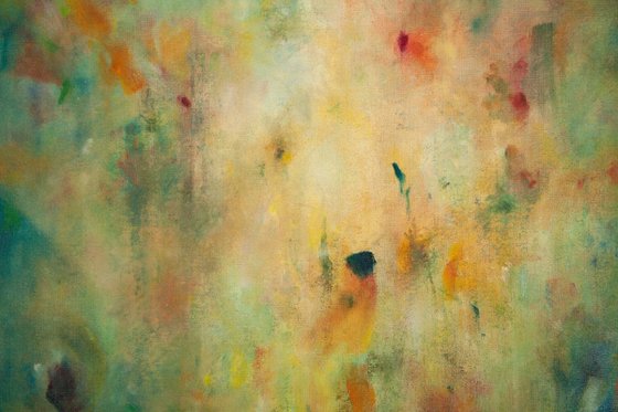
The glaze created a wonderful fullness of colour. I left some patches uncovered, as highlights. The areas that I am happiest with in terms of creating "glow" are where there is a contrast in both tone and colour, such as the greens and purples, blues and oranges in the bottom sector.
In this layer I enjoyed making the brush marks obvious, perhaps because the underlayer added texture which stopped the paint strokes from being monotonous, and suggested where they should go. To finish, I scratched out flecks of the glaze, to allow the bottom layer to show through.
This is the second painting I've made in a series studying creating glow. If you would like to know more about my reasons and methods of painting I write about it in my blog on my website.
Materials used:
Oil paint on canvas board
Tags:
#abstract #oil painting #colourful #framed #peaceful #glow #medium size #luminanceAbstract: Luminance II (2016)
Oil painting
by Rebecca Miller
2 Artist Reviews
£180 Sold
- Oil painting on Canvas
- One of a kind artwork
- Size: 54.6 x 44.6 x 4cm (framed) / 49.3 x 39.3cm (actual image size)
- Framed and ready to hang
- Signed on the front
- Style: Abstract
- Subject: Abstract and non-figurative
Do you like this artwork?
This artwork has sold, but the artist is accepting commission requests. Commissioning an artwork is easy and you get a perfectly personalised piece.
Original artwork description
As I was painting this I was thinking about the natural lighting effects that glow: dust in sunbeams, early morning mist, sunlight through water.
This painting is full of strong but soft colour, and subtle shifts in tone and light. Overall the tone is warm. It is framed, without glass, in a stylish grey frame, the angled plane of which is metal, which beautifully reflects the colours of the painting.
I've used the classic structure of an oil painting, darks and lights underneath with coloured glazes over the top. In the base layer I used black, white, blue, and yellow, to try to create patches of light/dark and warm/cold, aiming for a dappled sunlight effect. The basic structure is a vignette - light in the middle, dark round the outside. I made natural brush free marks using a palette knife to create texture, and smudged round the outside to emphasise the vignette composition. I am pleased with the resulting texture and blended softness.
For the top glaze I restricted myself to warm colours: yellows, reds and pinks, (with a little blue) as these were the colours I'd liked the result of most in the first experiment. I didn't use much white, as I wanted to allow as much of the tonal range of the underlayer to show through as possible. I diluted the oils with lots of linseed oil and a little solvent.
The glaze created a wonderful fullness of colour. I left some patches uncovered, as highlights. The areas that I am happiest with in terms of creating "glow" are where there is a contrast in both tone and colour, such as the greens and purples, blues and oranges in the bottom sector.
In this layer I enjoyed making the brush marks obvious, perhaps because the underlayer added texture which stopped the paint strokes from being monotonous, and suggested where they should go. To finish, I scratched out flecks of the glaze, to allow the bottom layer to show through.
This is the second painting I've made in a series studying creating glow. If you would like to know more about my reasons and methods of painting I write about it in my blog on my website.
Materials used:
Oil paint on canvas board
Tags:
#abstract #oil painting #colourful #framed #peaceful #glow #medium size #luminanceReturns and refunds
We want you to love your art! If you are not completely satisfied with your purchase you can return it free within 14 days, no questions asked. Learn more
Artist Reviews (2)
This artwork is sold by Rebecca Miller from United Kingdom
Rebecca Miller
United Kingdom
About
My aims when I’m making art are to create something beautiful, which creates an emotional response or mood; to make something unique, which explores a message or theme that matters... Read more

